.jpg)
Bloomingdale's
X Barbie
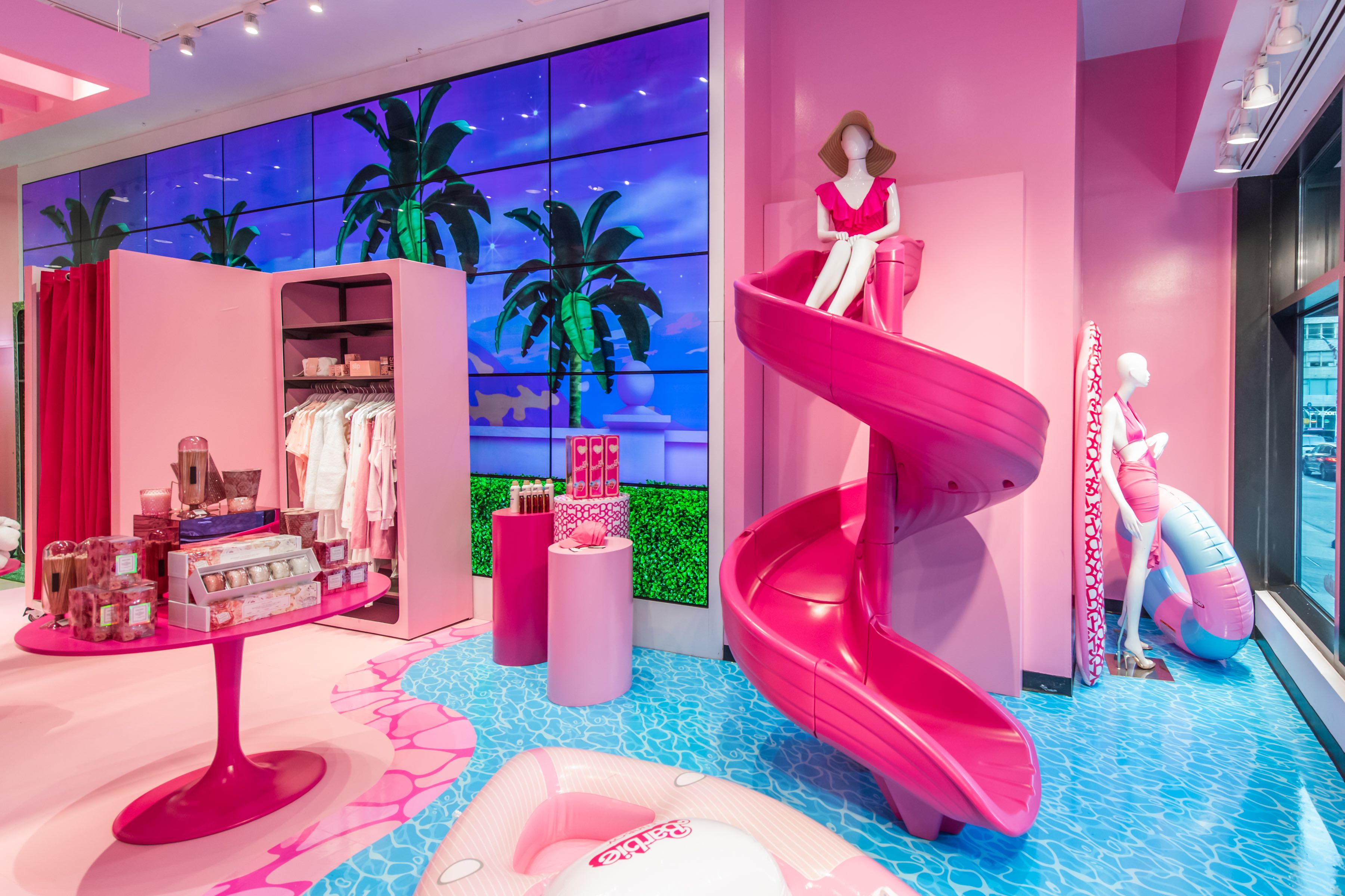
Led the art direction of an immersive pop-up shop for the Bloomingdale’s and Barbie: The Movie collaboration at the flagship store. The space reimagined Barbie’s iconic Dreamhouse within a luxury retail context, translating familiar forms and colors into a highly tactile, walk-through environment. From concept through execution, the project balanced nostalgia with polish, creating an experience that felt playful yet considered. The installation resonated in-store and across digital channels, bridging cultural iconography with Bloomingdale’s brand sensibility.
Bloomingdale's
.jpg)
Led the art direction of an immersive pop-up shop for the Bloomingdale’s and Barbie: The Movie collaboration at the flagship store. The space reimagined Barbie’s iconic Dreamhouse within a luxury retail context, translating familiar forms and colors into a highly tactile, walk-through environment. From concept through execution, the project balanced nostalgia with polish, creating an experience that felt playful yet considered. The installation resonated in-store and across digital channels, bridging cultural iconography with Bloomingdale’s brand sensibility.
Bloomingdale's
.jpg)
Led the art direction of an immersive pop-up shop for the Bloomingdale’s and Barbie: The Movie collaboration at the flagship store. The space reimagined Barbie’s iconic Dreamhouse within a luxury retail context, translating familiar forms and colors into a highly tactile, walk-through environment. From concept through execution, the project balanced nostalgia with polish, creating an experience that felt playful yet considered. The installation resonated in-store and across digital channels, bridging cultural iconography with Bloomingdale’s brand sensibility.
Bloomingdale's
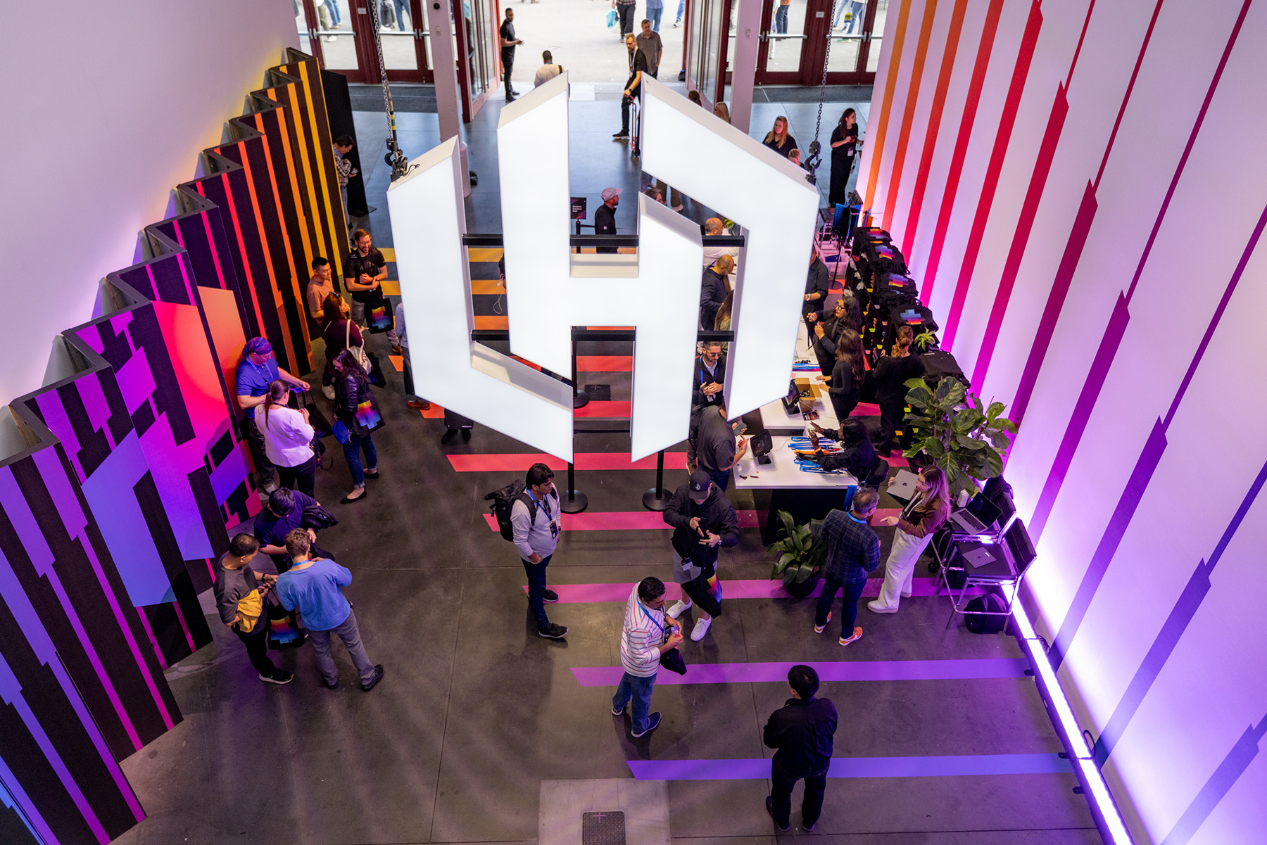
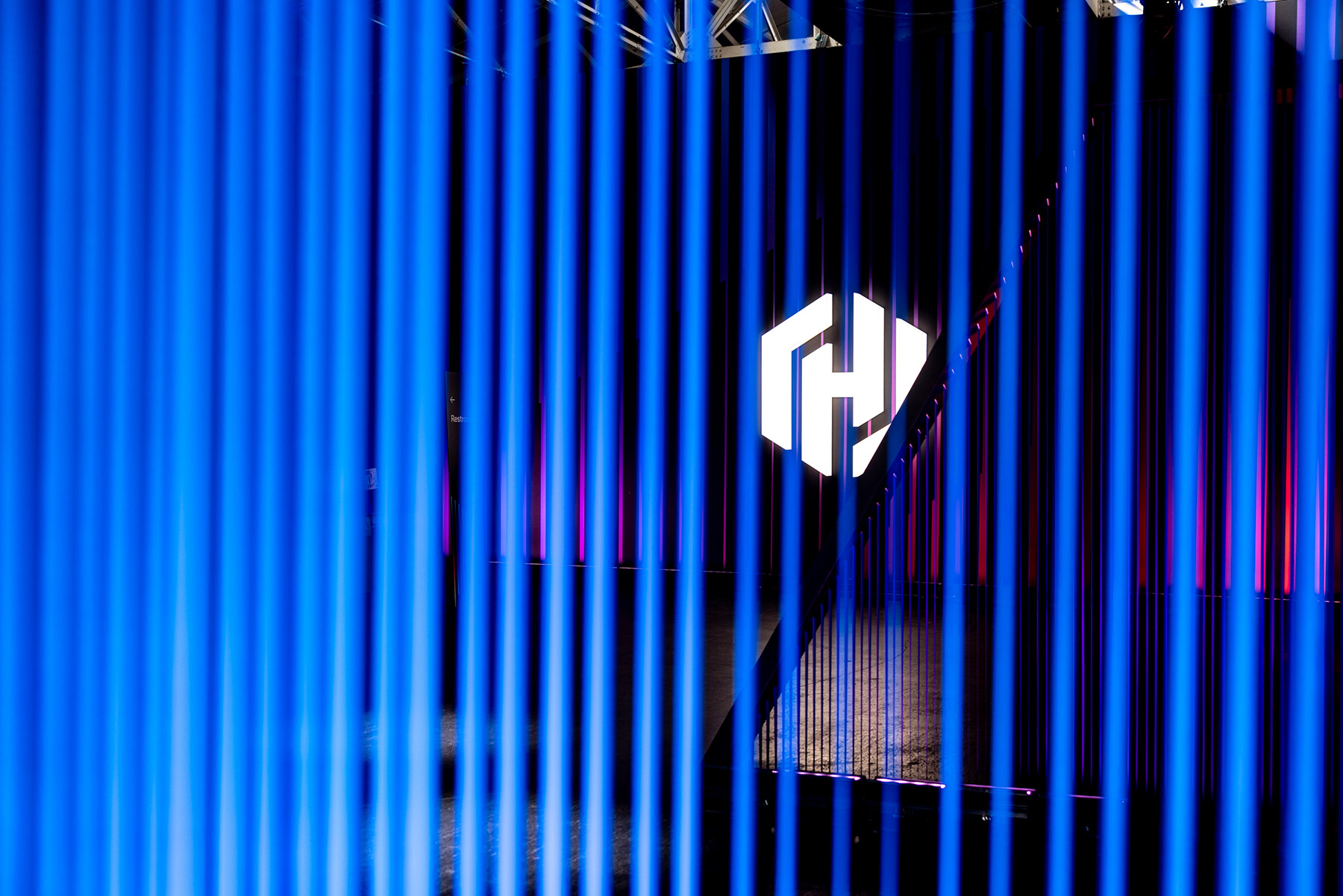
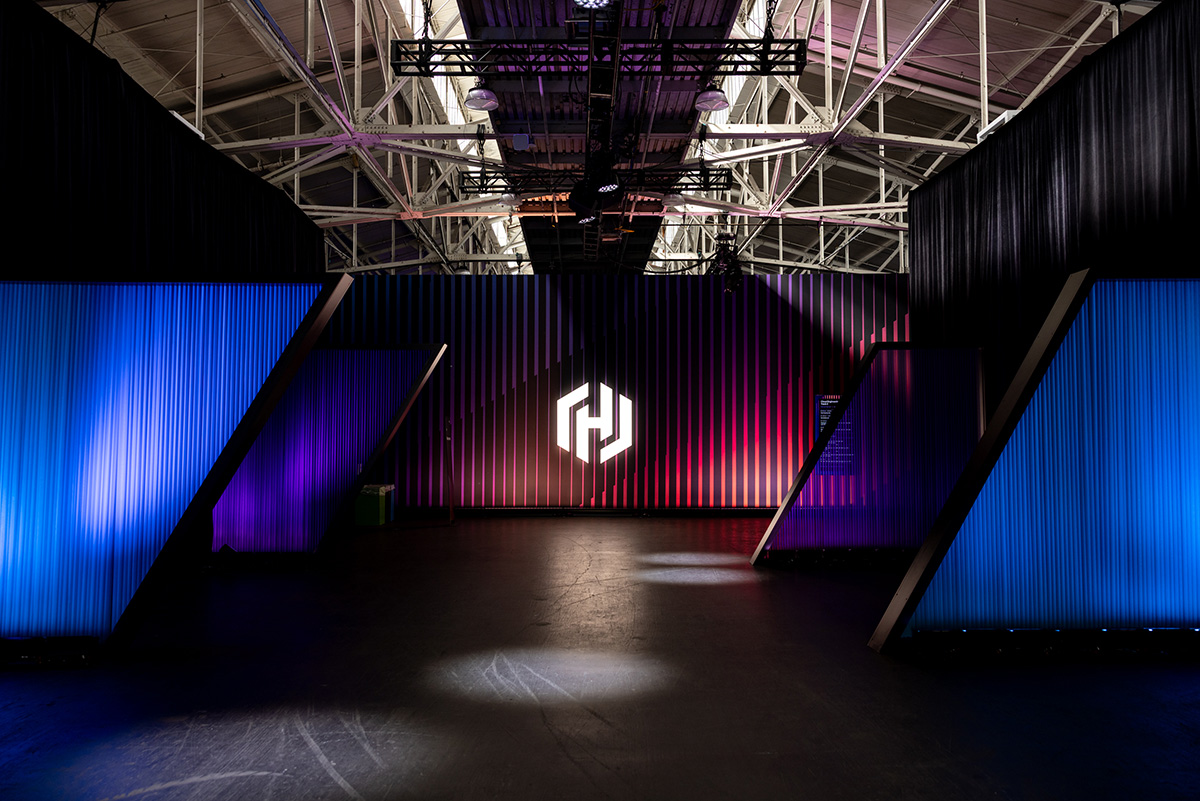
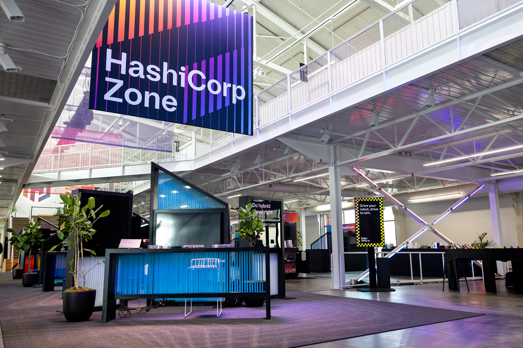
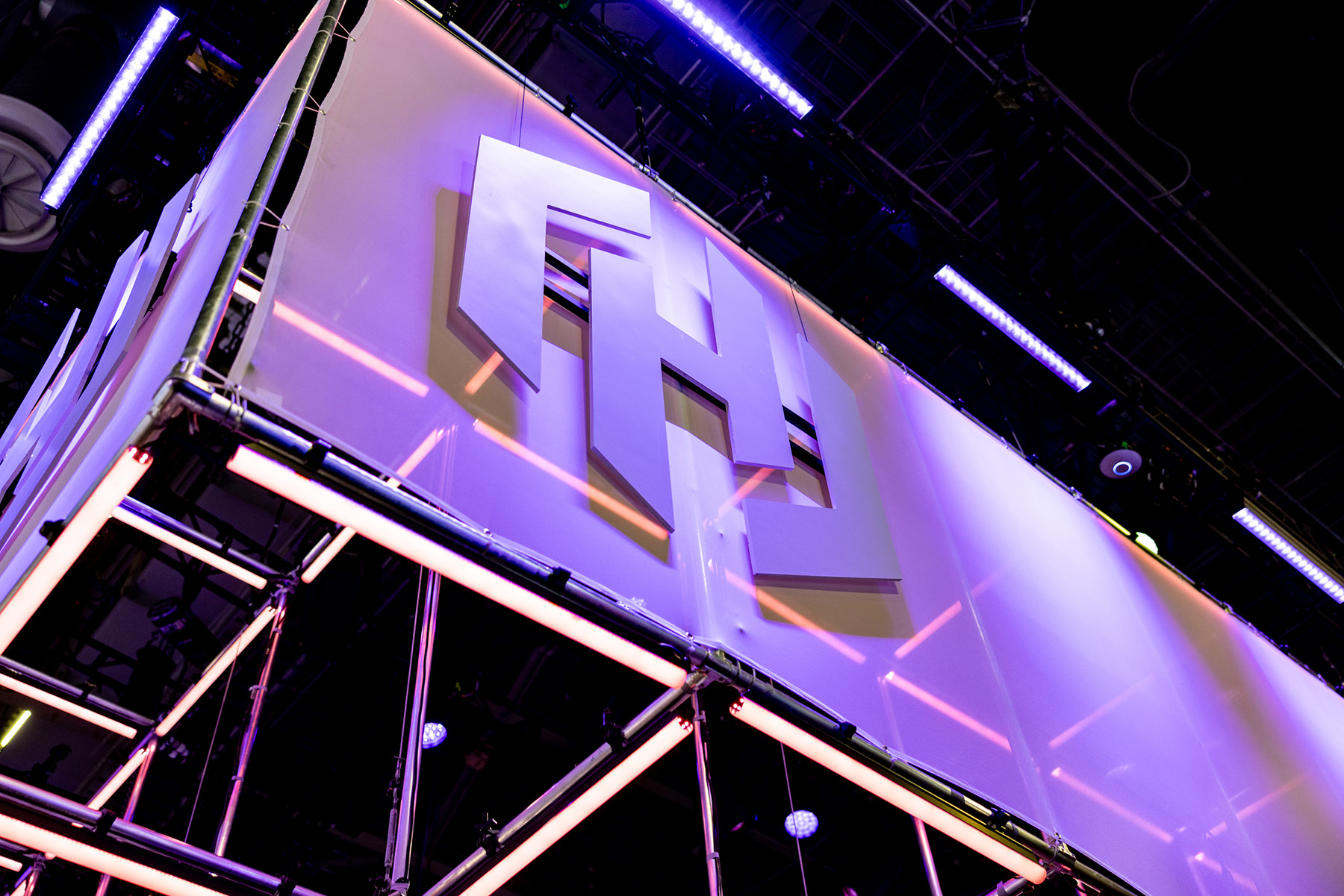
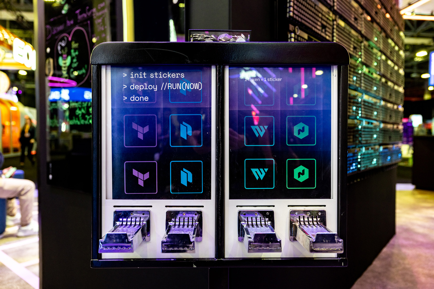
HashiCorp
HashiConf 2025

Designed the physical environment for HashiConf 2025, including the main booths, entrance structure, and a wide range of branding elements throughout the space. The work encompassed large-scale installations, hanging signs, banners, and supporting graphics, creating a clear and cohesive visual system across the conference. The design translated HashiCorp’s Beauty Works Better ethos into a physical experience that felt structured, approachable, and consistent from entry to show floor.
HashiCorp
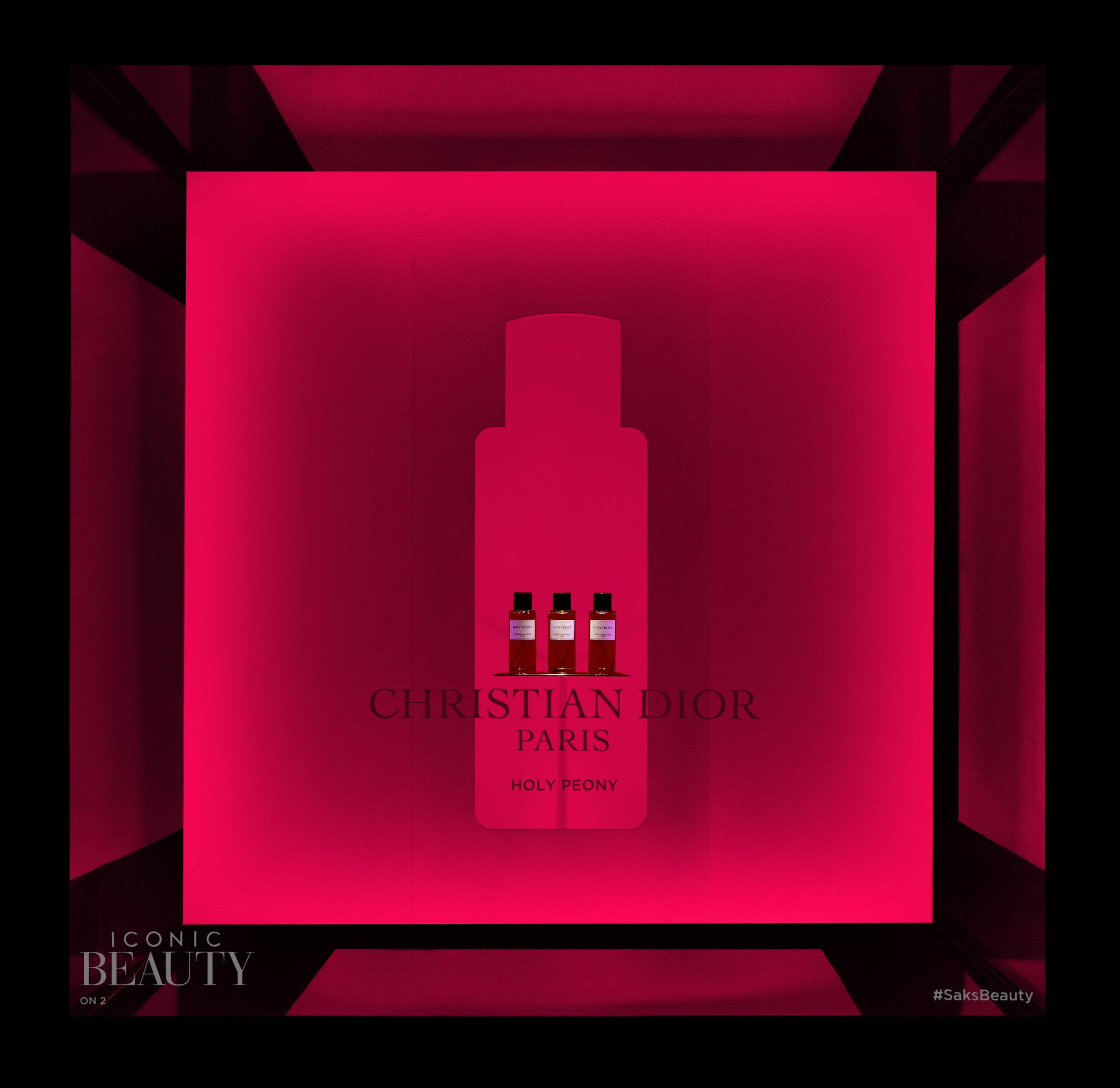
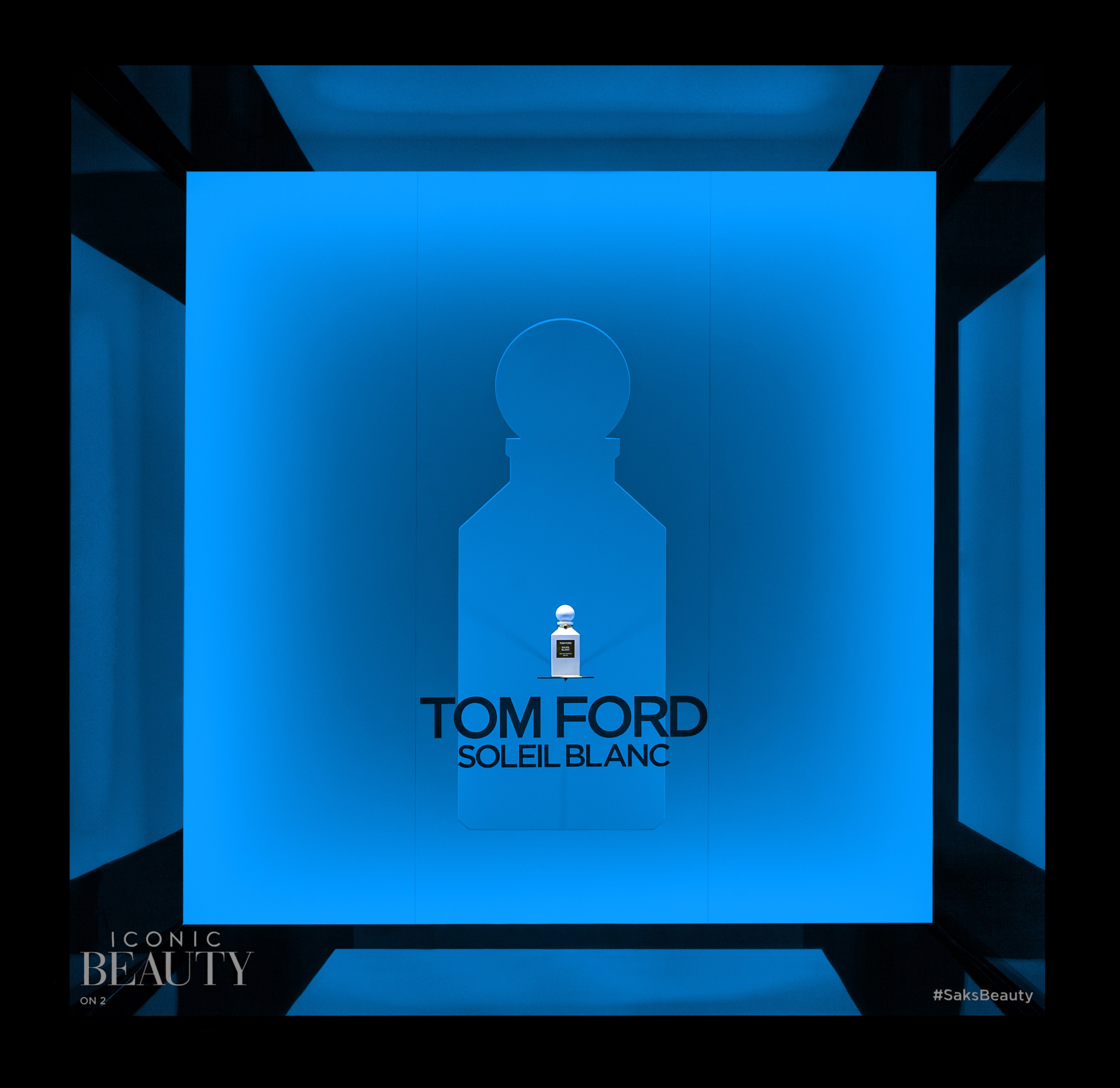
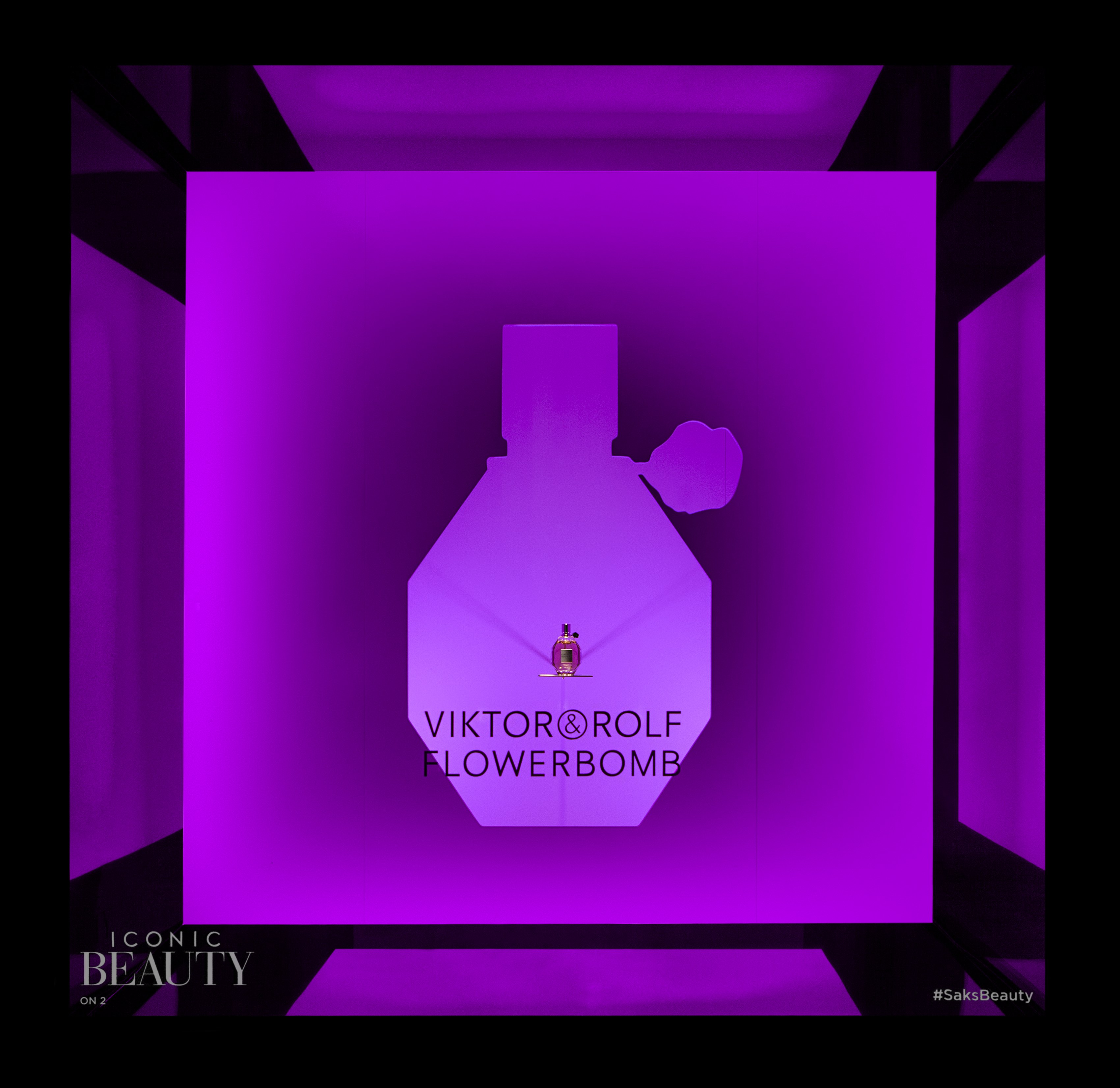
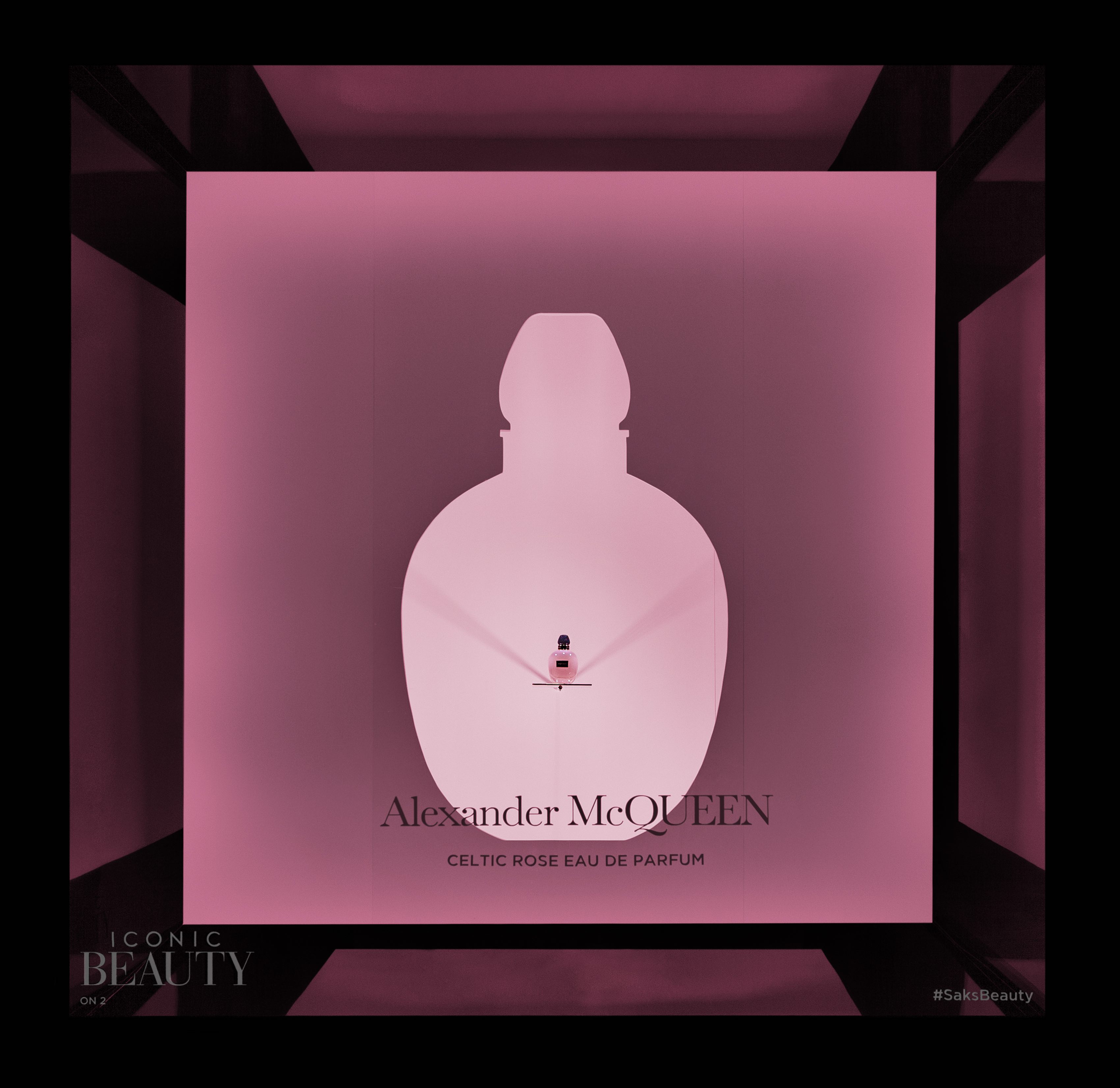
Saks Fifth Avenue
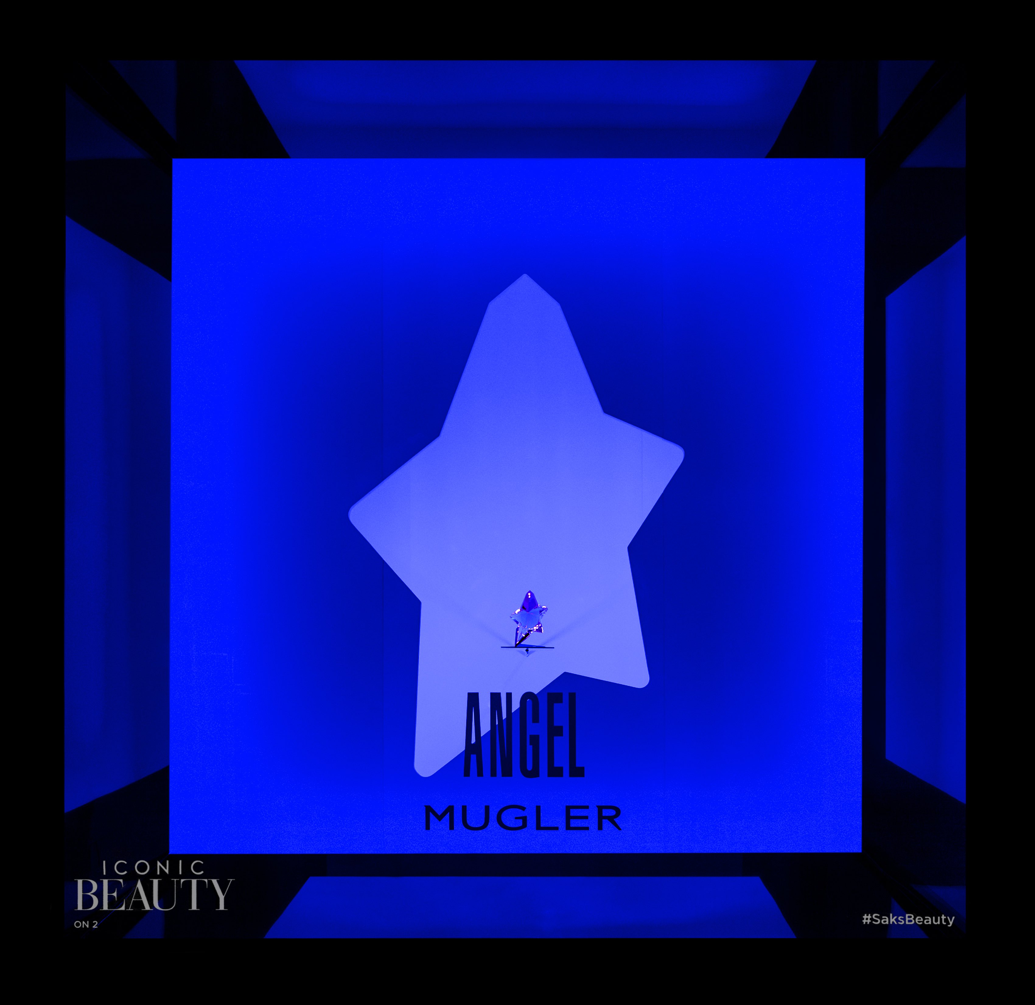
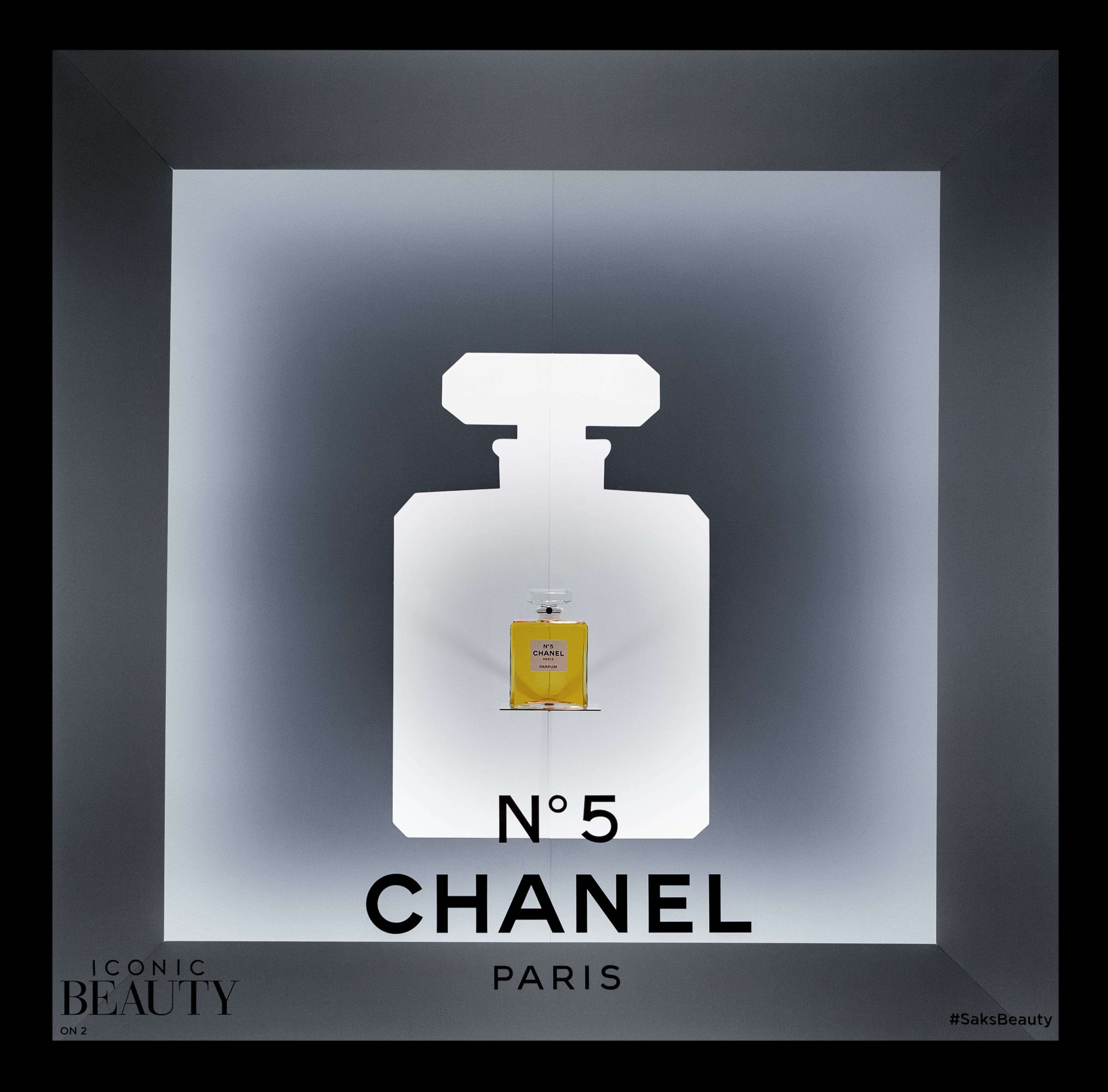
Iconic Beauty windows
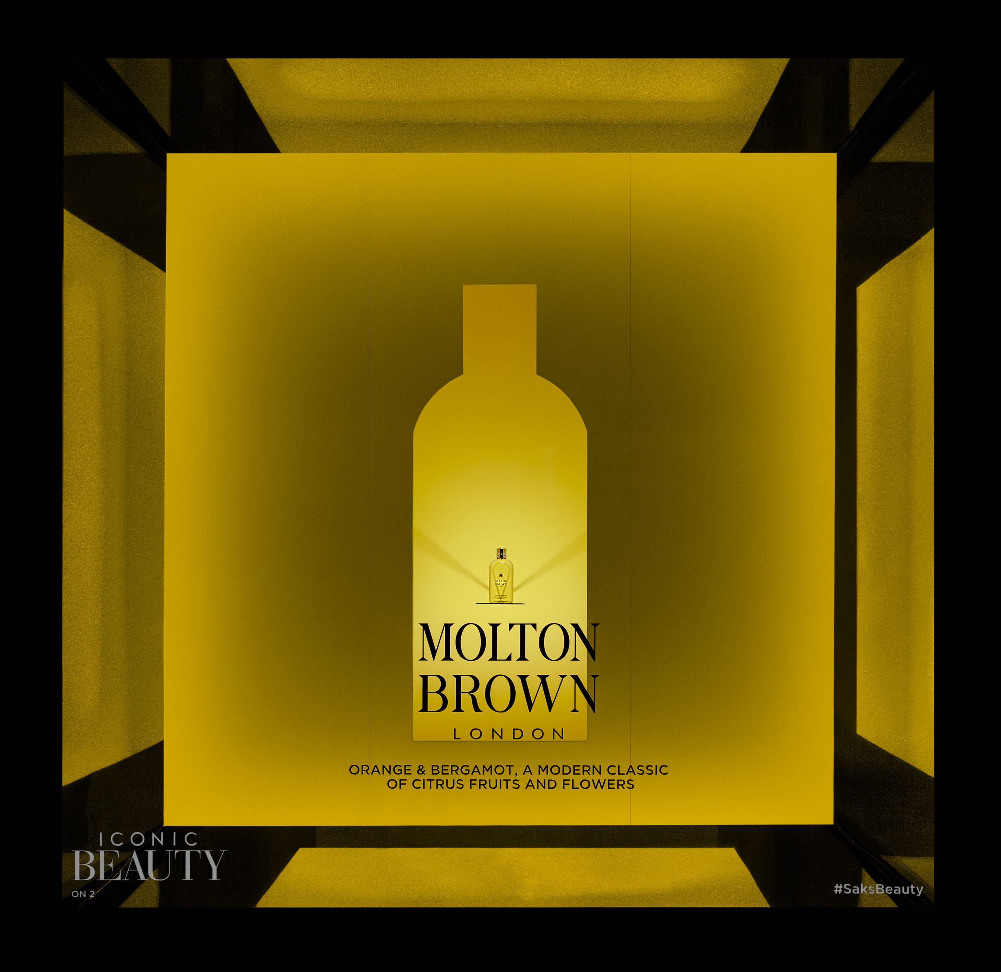
Designed window displays for the Saks Iconic Beauty celebration, highlighting the retailer’s most influential luxury beauty and fragrance brands. Drawing inspiration from the light-based installations of James Turrell, each brand was invited to select a single color and define a silhouette of its most recognizable product. The resulting windows balanced light, shadow, and color to create a bold yet restrained visual language that felt both immersive and precise, celebrating individual brand identities while maintaining a cohesive presence across the facade.
Saks Fifth Avenue
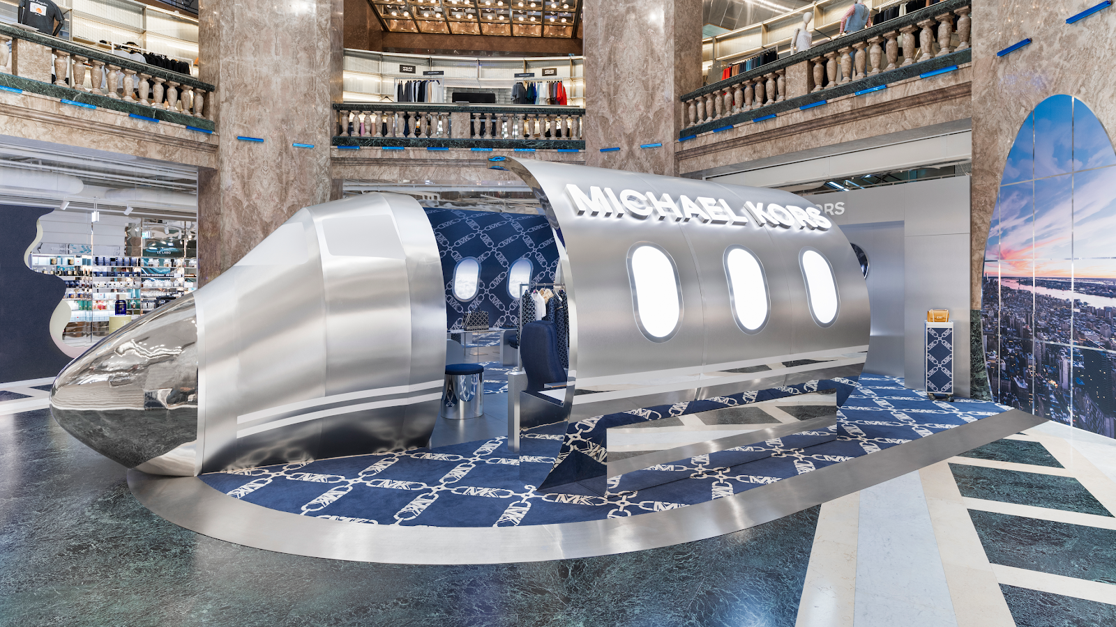
Michael Kors
Galeries Lafayette popup
As design consultant, led the concept and design of the Jetsetter Activation for Michael Kors, blending retro-futurism and luxury with references to Eero Saarinen and Hajime Sorayama. The centerpiece was a life-sized chrome jet fuselage that merged mid-century forms with a distinctly futuristic finish. The project moved from hand sketches to detailed 3D renderings, which were presented to senior leadership. The final concept translated abstract references into a clear, high-impact environment designed to elevate the brand through spectacle and precision.
Michael Kors
.png)
As design consultant, led the concept and design of the Jetsetter Activation for Michael Kors, blending retro-futurism and luxury with references to Eero Saarinen and Hajime Sorayama. The centerpiece was a life-sized chrome jet fuselage that merged mid-century forms with a distinctly futuristic finish. The project moved from hand sketches to detailed 3D renderings, which were presented to senior leadership. The final concept translated abstract references into a clear, high-impact environment designed to elevate the brand through spectacle and precision.
Michael Kors
HashiCorp
AWS re:Invent 2025
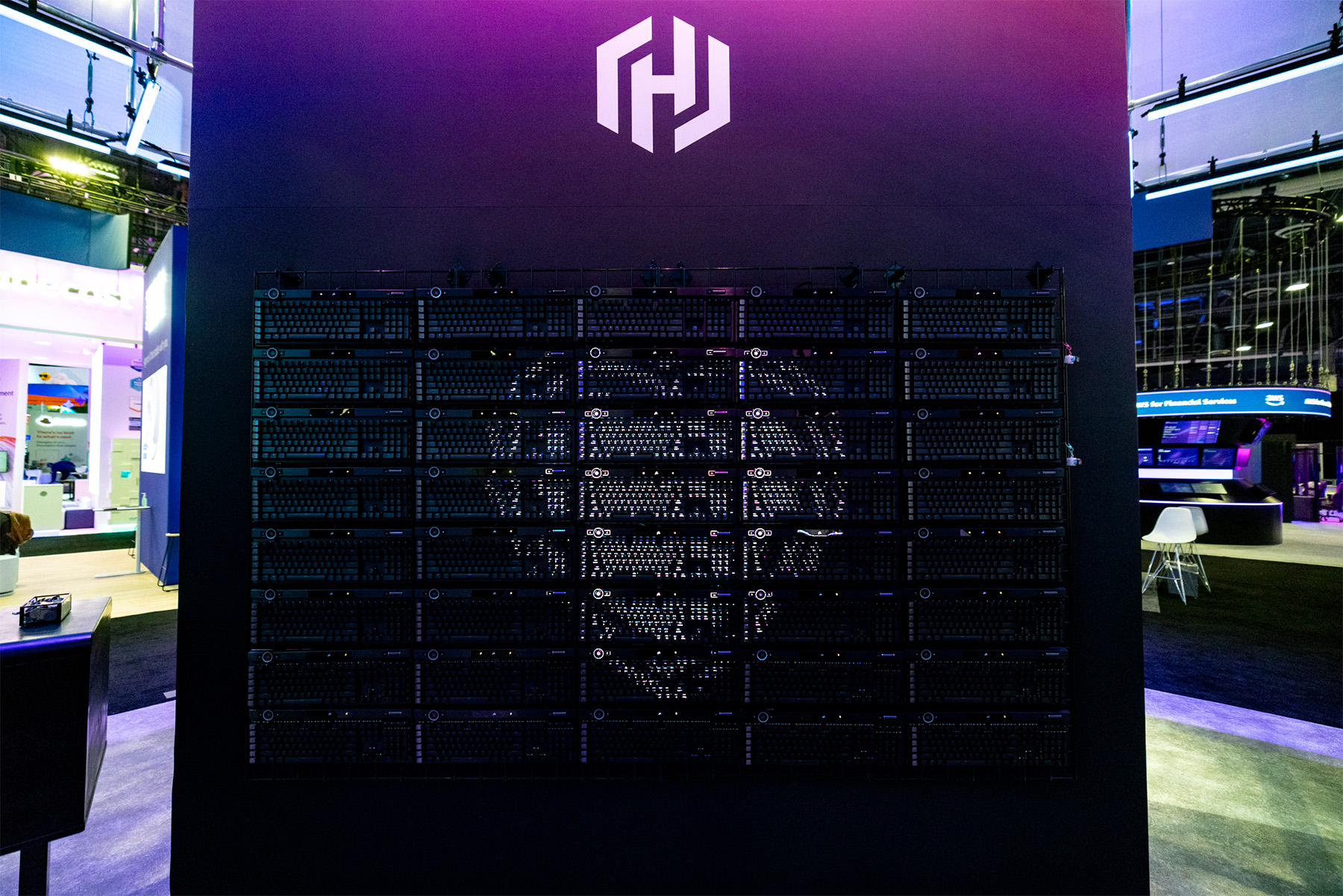
Designed and art directed a full-scale experiential booth for AWS re:Invent 2025, translating the brand’s core ideas of infrastructure, cloud, and automation into a physical environment. The centerpiece was a suspended overhead structure built from LED scaffolding and wrapped in sheer, stretched fabric, creating a layered, luminous form that shifted between solid and immaterial. The space featured interactive activations, including a functioning screen constructed from LED keyboards and a curated collection of vintage IBM computers that attendees could actively use, connecting the history of computing to its present and future. The project extended beyond the convention floor with a series of out-of-home advertisements placed throughout the Las Vegas Strip, creating a cohesive presence across the city.
HashiCorp
Bloomingdale's
X Barbie
Led the art direction of an immersive pop-up shop for the Bloomingdale’s and Barbie: The Movie collaboration at the flagship store. The space reimagined Barbie’s iconic Dreamhouse within a luxury retail context, translating familiar forms and colors into a highly tactile, walk-through environment. From concept through execution, the project balanced nostalgia with polish, creating an experience that felt playful yet considered. The installation resonated in-store and across digital channels, bridging cultural iconography with Bloomingdale’s brand sensibility.
Bloomingdale's

HashiCorp
HashiConf 2025
Designed the physical environment for HashiConf 2025, including the main booths, entrance structure, and a wide range of branding elements throughout the space. The work encompassed large-scale installations, hanging signs, banners, and supporting graphics, creating a clear and cohesive visual system across the conference. The design translated HashiCorp’s Beauty Works Better ethos into a physical experience that felt structured, approachable, and consistent from entry to show floor.
HashiCorp
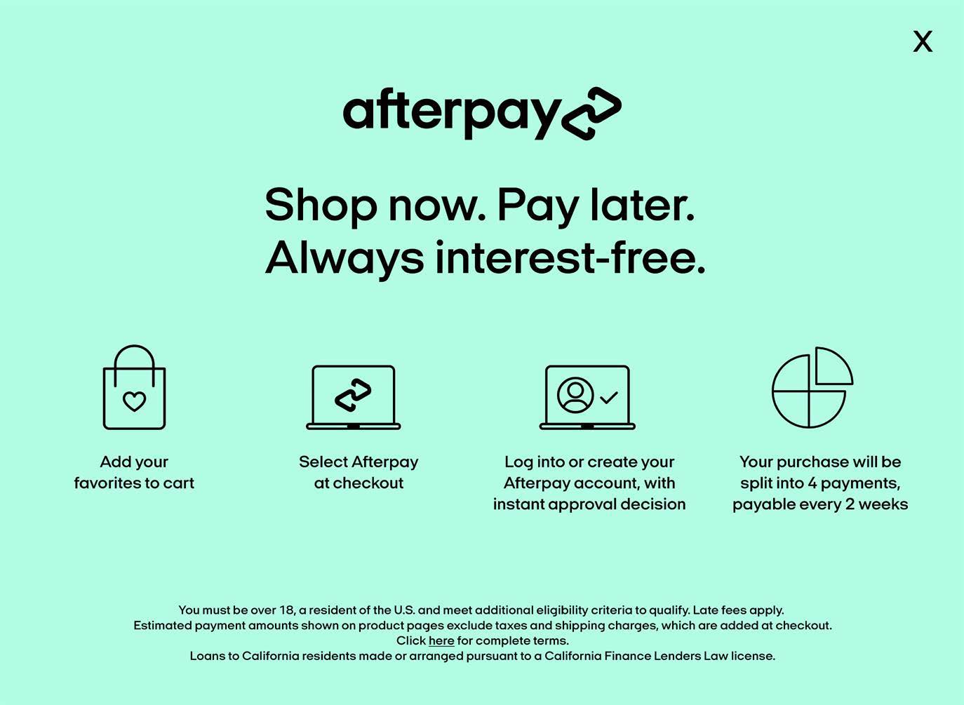
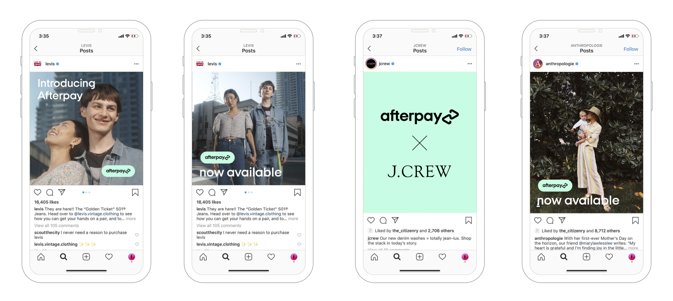
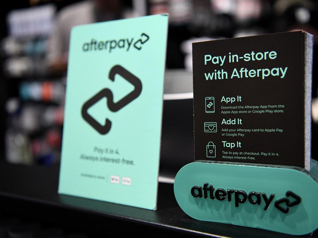
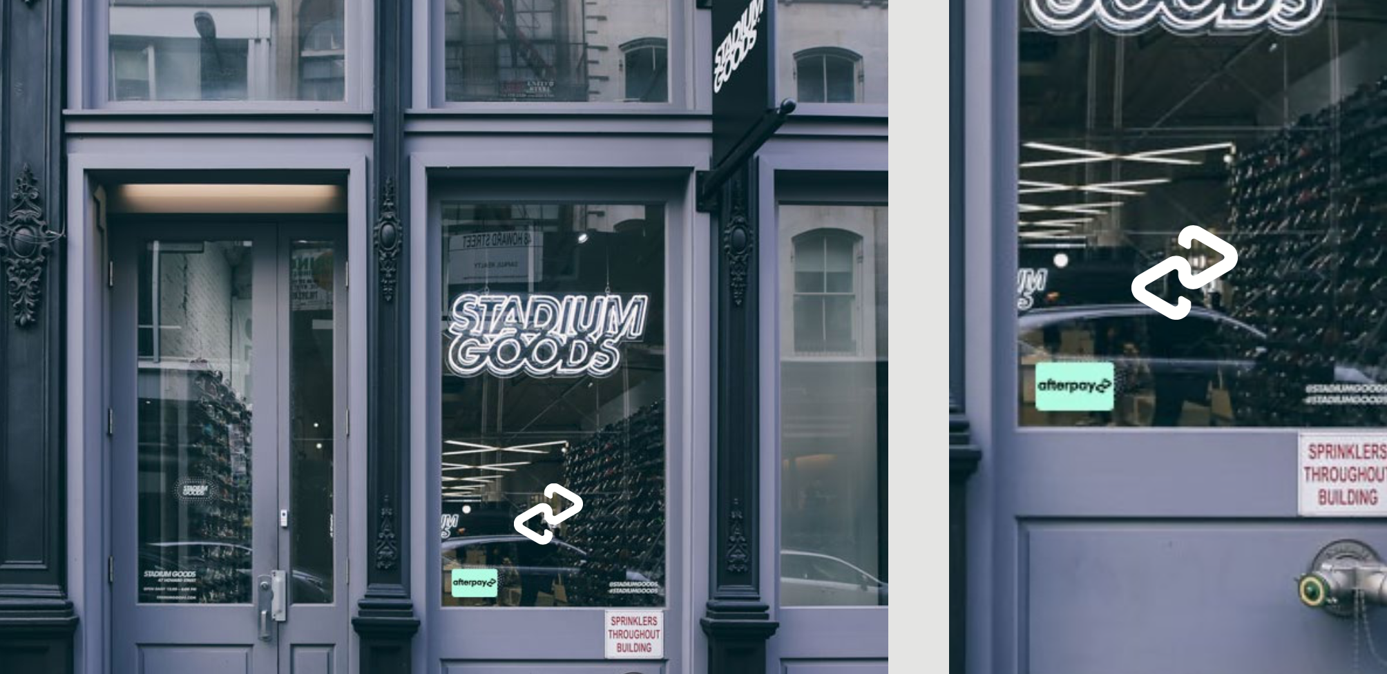
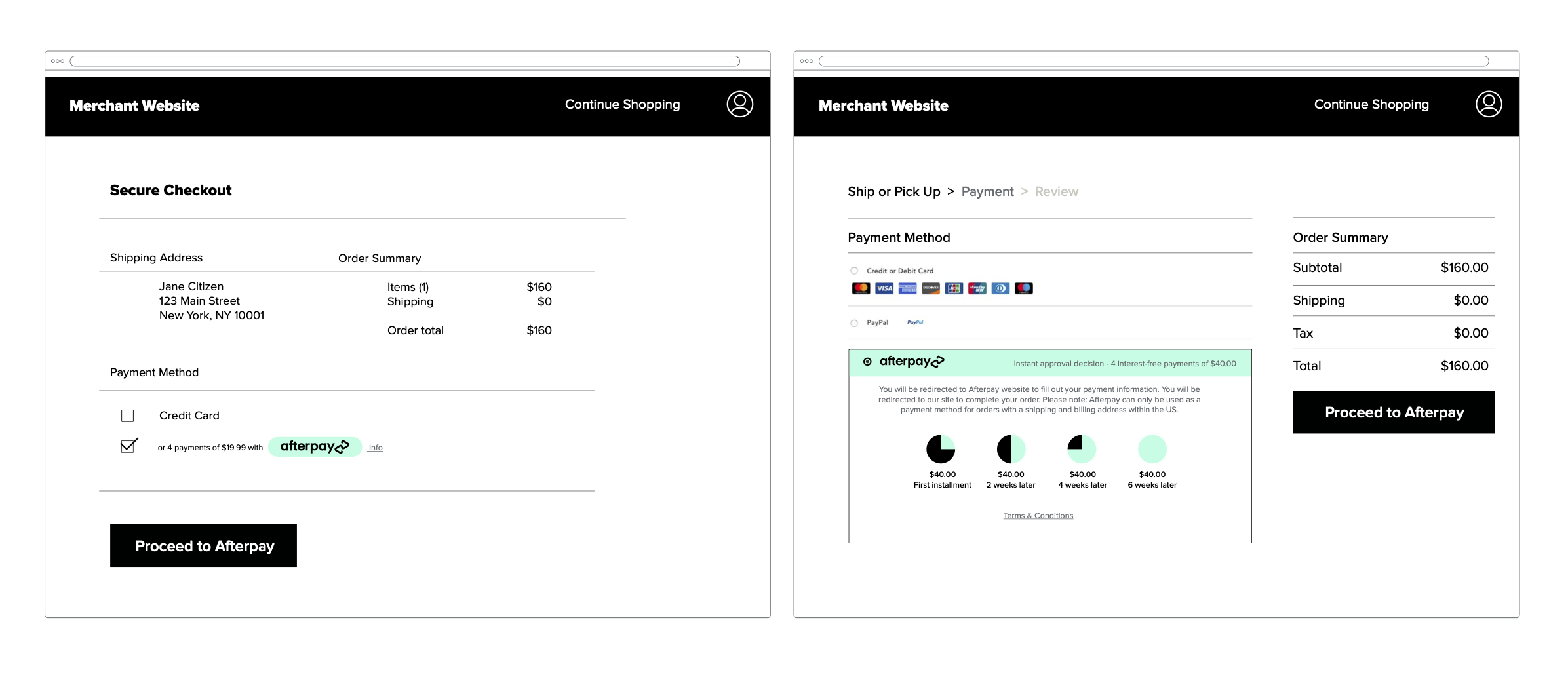
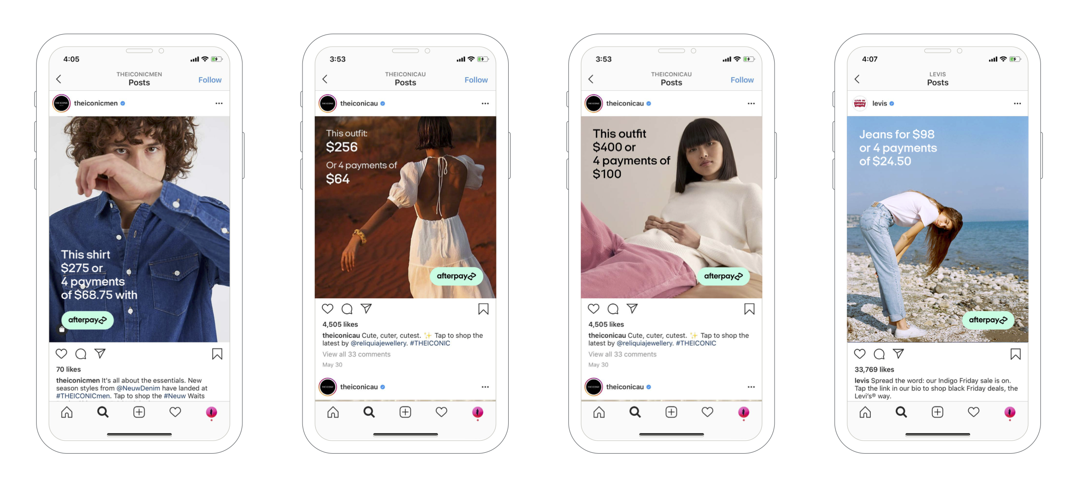
Led the development of comprehensive merchant guidelines for Afterpay, defining clear standards and visual examples across digital and physical touchpoints. The system covered web banners, checkout graphics, social media assets, in-store applications, and out-of-home advertising. The guidelines translated Afterpay’s brand consistently across platforms, balancing clarity with flexibility for partners. The project established a cohesive visual framework that strengthened brand recognition and ensured continuity across customer experiences.
Afterpay
Bloomingdale's
150th Anniversary
.jpg)
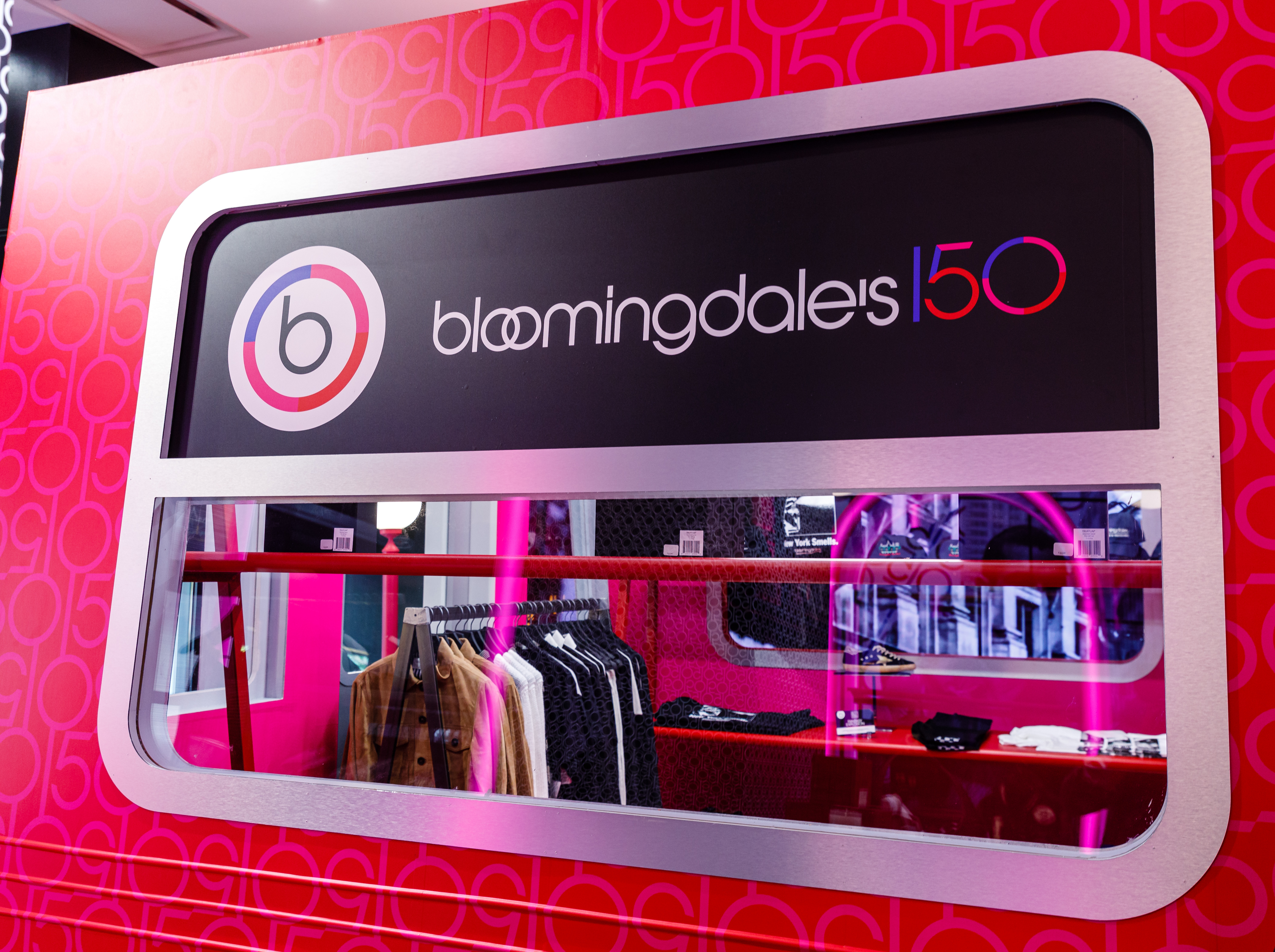
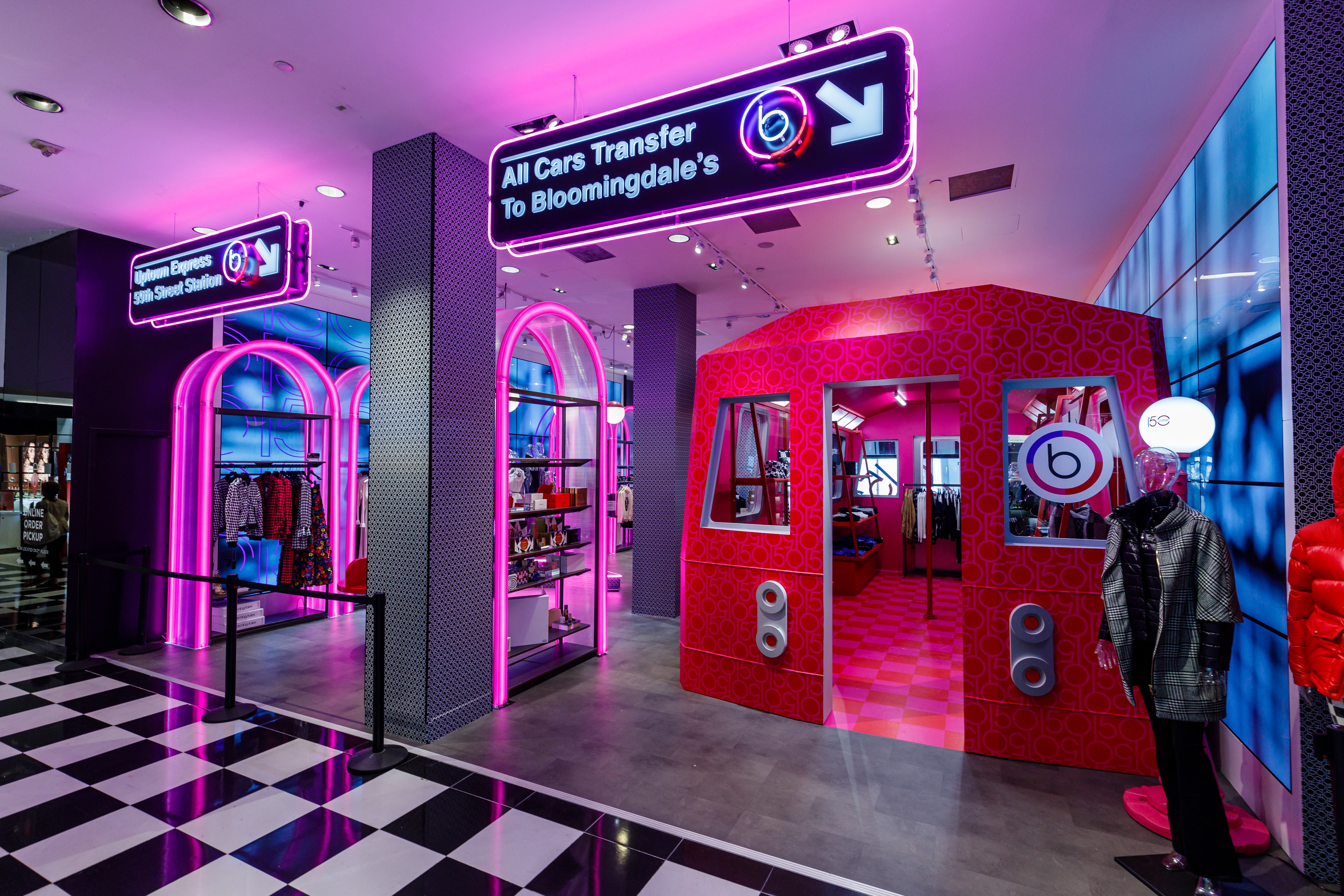
The Bloomingdale’s 150th Campaign marked the retailer’s 150th anniversary with a celebratory, forward-looking approach. As Senior Design Manager, led graphic design and art direction for the experiential pop-up, shaping a cohesive visual language across the space. The work balanced Bloomingdale’s heritage with a contemporary sensibility, creating an immersive brand experience that extended across physical and digital touchpoints. The campaign honored the brand’s legacy while remaining relevant to both longtime customers and new audiences.
Bloomingdale's
.jpg)
The Bloomingdale’s 150th Campaign marked the retailer’s 150th anniversary with a celebratory, forward-looking approach. As Senior Design Manager, led graphic design and art direction for the experiential pop-up, shaping a cohesive visual language across the space. The work balanced Bloomingdale’s heritage with a contemporary sensibility, creating an immersive brand experience that extended across physical and digital touchpoints. The campaign honored the brand’s legacy while remaining relevant to both longtime customers and new audiences.
Bloomingdale's
%2033.png)
The Bloomingdale’s 150th Campaign marked the retailer’s 150th anniversary with a celebratory, forward-looking approach. As Senior Design Manager, led graphic design and art direction for the experiential pop-up, shaping a cohesive visual language across the space. The work balanced Bloomingdale’s heritage with a contemporary sensibility, creating an immersive brand experience that extended across physical and digital touchpoints. The campaign honored the brand’s legacy while remaining relevant to both longtime customers and new audiences.
Bloomingdale's
Afterpay
Merchant guidelines
Led the development of comprehensive merchant guidelines for Afterpay, defining clear standards and visual examples across digital and physical touchpoints. The system covered web banners, checkout graphics, social media assets, in-store applications, and out-of-home advertising. The guidelines translated Afterpay’s brand consistently across platforms, balancing clarity with flexibility for partners. The project established a cohesive visual framework that strengthened brand recognition and ensured continuity across customer experiences.
Afterpay

No Place
Brand and web design

No Place is a Web3 hospitality platform rethinking short-term stays through an on-chain membership model. Access to locations and amenities is granted via a unique NFT that functions as a digital membership card, merging hospitality with blockchain-native infrastructure. The website was designed to be simple and modern, with visual cues that subtly signal Web3 without overwhelming the experience. Working closely with the client, I translated their vision into a clear, intuitive interface that balances emerging technology with approachability and reflects the brand’s forward-looking ethos.
No Place
Saks Fifth Avenue
Iconic Beauty windows
Designed window displays for the Saks Iconic Beauty celebration, highlighting the retailer’s most influential luxury beauty and fragrance brands. Drawing inspiration from the light-based installations of James Turrell, each brand was invited to select a single color and define a silhouette of its most recognizable product. The resulting windows balanced light, shadow, and color to create a bold yet restrained visual language that felt both immersive and precise, celebrating individual brand identities while maintaining a cohesive presence across the facade.
Saks Fifth Avenue

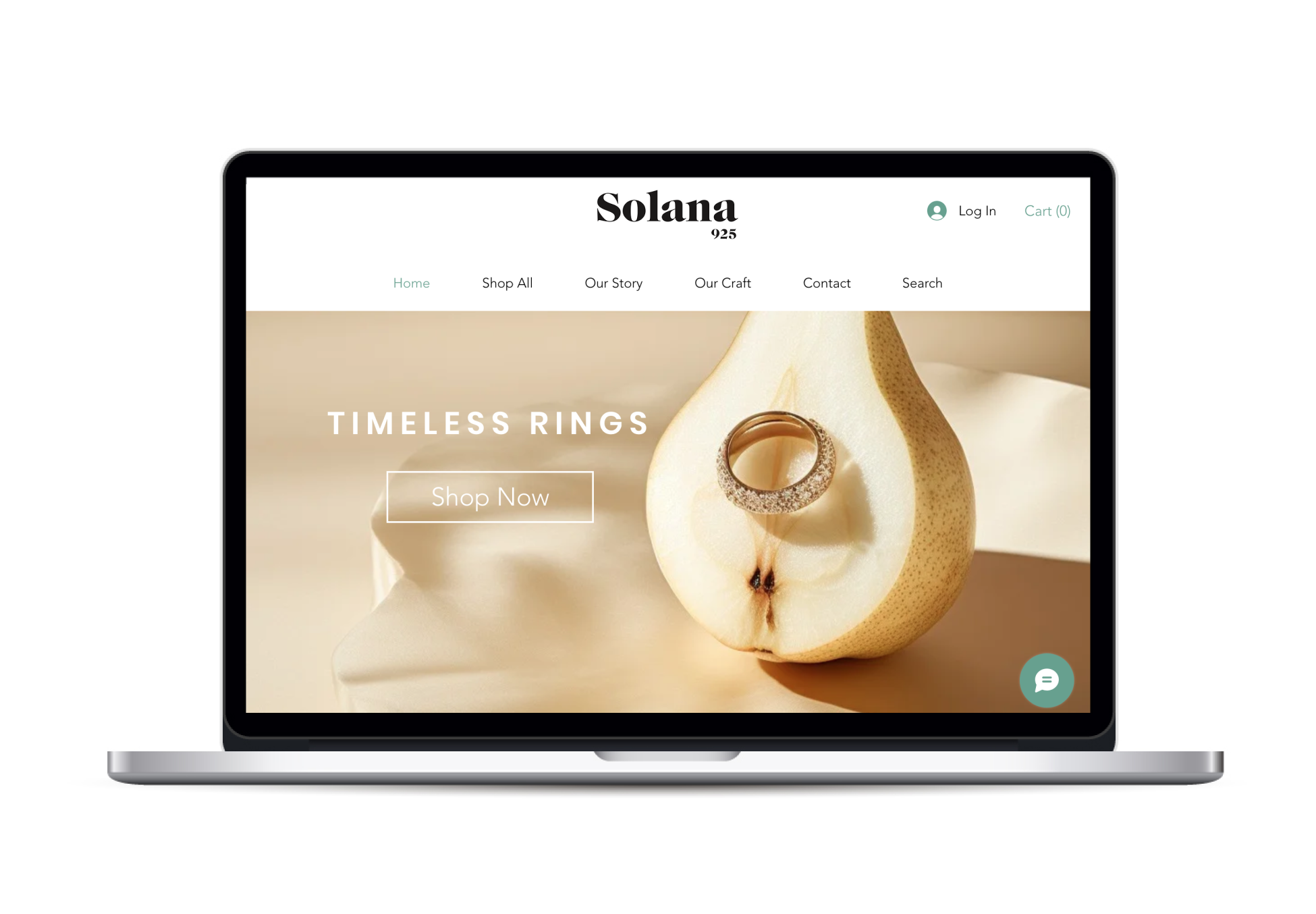
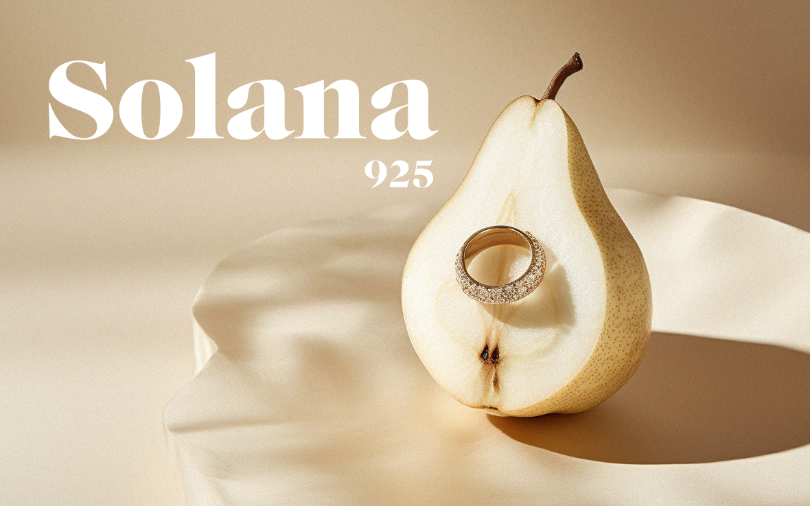
Solana
Brand, web, and packaging design
As Founder and Creative Director, led the complete creative direction for Solana, a contemporary jewelry brand. Oversaw brand identity, website design, campaign art direction, imagery, and packaging, shaping a cohesive visual system across all touchpoints. The work focused on building a clear, refined brand language that feels expressive and modern while remaining grounded in craftsmanship and authenticity.
Solana

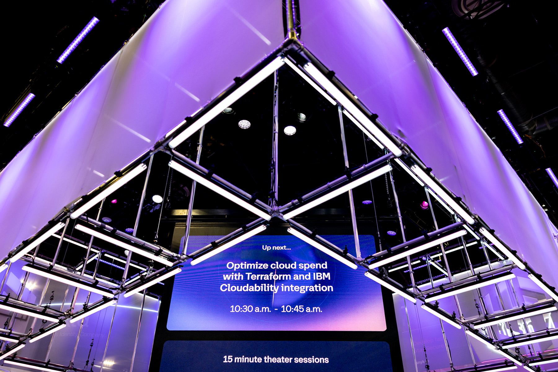
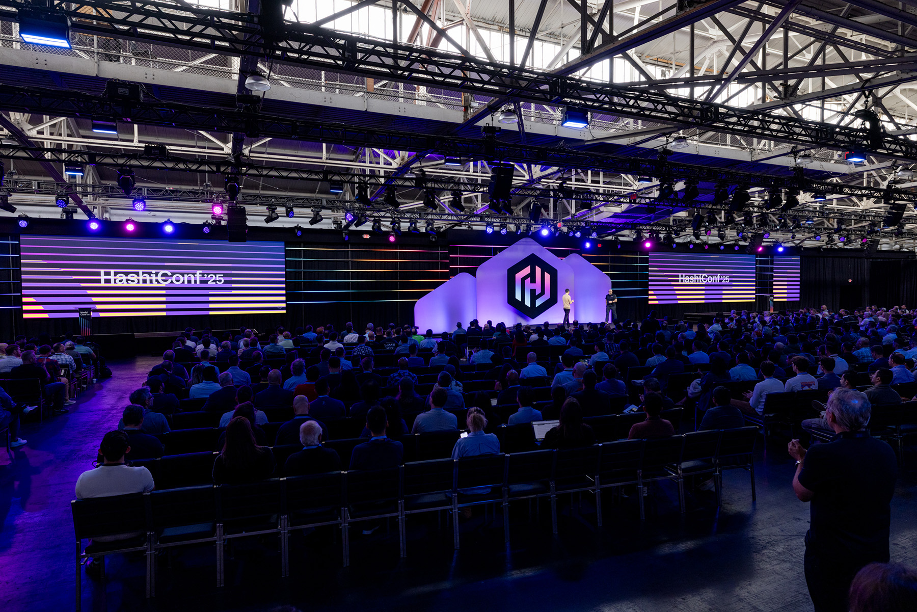
HashiCorp
HashiConf 2025
Designed the physical environment for HashiConf 2025, including the main booths, entrance structure, and a wide range of branding elements throughout the space. The work encompassed large-scale installations, hanging signs, banners, and supporting graphics, creating a clear and cohesive visual system across the conference. The design translated HashiCorp’s Beauty Works Better ethos into a physical experience that felt structured, approachable, and consistent from entry to show floor.
HashiCorp
Designed the physical environment for HashiConf 2025, including the main booths, entrance structure, and a wide range of branding elements throughout the space. The work encompassed large-scale installations, hanging signs, banners, and supporting graphics, creating a clear and cohesive visual system across the conference. The design translated HashiCorp’s Beauty Works Better ethos into a physical experience that felt structured, approachable, and consistent from entry to show floor.
HashiCorp
Designed the physical environment for HashiConf 2025, including the main booths, entrance structure, and a wide range of branding elements throughout the space. The work encompassed large-scale installations, hanging signs, banners, and supporting graphics, creating a clear and cohesive visual system across the conference. The design translated HashiCorp’s Beauty Works Better ethos into a physical experience that felt structured, approachable, and consistent from entry to show floor.
HashiCorp
Designed the physical environment for HashiConf 2025, including the main booths, entrance structure, and a wide range of branding elements throughout the space. The work encompassed large-scale installations, hanging signs, banners, and supporting graphics, creating a clear and cohesive visual system across the conference. The design translated HashiCorp’s Beauty Works Better ethos into a physical experience that felt structured, approachable, and consistent from entry to show floor.
HashiCorp
HashiCorp
HashiConf 2025
Designed the physical environment for HashiConf 2025, including the main booths, entrance structure, and a wide range of branding elements throughout the space. The work encompassed large-scale installations, hanging signs, banners, and supporting graphics, creating a clear and cohesive visual system across the conference. The design translated HashiCorp’s Beauty Works Better ethos into a physical experience that felt structured, approachable, and consistent from entry to show floor.
HashiCorp
Designed the physical environment for HashiConf 2025, including the main booths, entrance structure, and a wide range of branding elements throughout the space. The work encompassed large-scale installations, hanging signs, banners, and supporting graphics, creating a clear and cohesive visual system across the conference. The design translated HashiCorp’s Beauty Works Better ethos into a physical experience that felt structured, approachable, and consistent from entry to show floor.
HashiCorp
Designed the physical environment for HashiConf 2025, including the main booths, entrance structure, and a wide range of branding elements throughout the space. The work encompassed large-scale installations, hanging signs, banners, and supporting graphics, creating a clear and cohesive visual system across the conference. The design translated HashiCorp’s Beauty Works Better ethos into a physical experience that felt structured, approachable, and consistent from entry to show floor.
HashiCorp
Designed the physical environment for HashiConf 2025, including the main booths, entrance structure, and a wide range of branding elements throughout the space. The work encompassed large-scale installations, hanging signs, banners, and supporting graphics, creating a clear and cohesive visual system across the conference. The design translated HashiCorp’s Beauty Works Better ethos into a physical experience that felt structured, approachable, and consistent from entry to show floor.
HashiCorp
Designed the physical environment for HashiConf 2025, including the main booths, entrance structure, and a wide range of branding elements throughout the space. The work encompassed large-scale installations, hanging signs, banners, and supporting graphics, creating a clear and cohesive visual system across the conference. The design translated HashiCorp’s Beauty Works Better ethos into a physical experience that felt structured, approachable, and consistent from entry to show floor.
HashiCorp
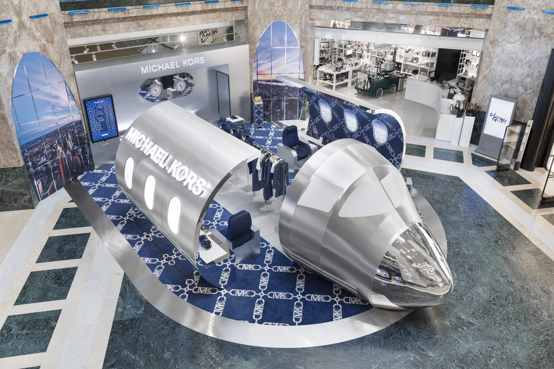
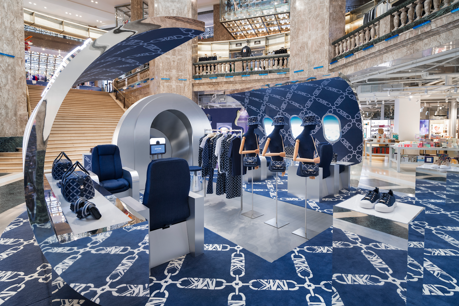
Michael Kors
Galeries Lafayette popup
As design consultant, led the concept and design of the Jetsetter Activation for Michael Kors, blending retro-futurism and luxury with references to Eero Saarinen and Hajime Sorayama. The centerpiece was a life-sized chrome jet fuselage that merged mid-century forms with a distinctly futuristic finish. The project moved from hand sketches to detailed 3D renderings, which were presented to senior leadership. The final concept translated abstract references into a clear, high-impact environment designed to elevate the brand through spectacle and precision.
Michael Kors
As design consultant, led the concept and design of the Jetsetter Activation for Michael Kors, blending retro-futurism and luxury with references to Eero Saarinen and Hajime Sorayama. The centerpiece was a life-sized chrome jet fuselage that merged mid-century forms with a distinctly futuristic finish. The project moved from hand sketches to detailed 3D renderings, which were presented to senior leadership. The final concept translated abstract references into a clear, high-impact environment designed to elevate the brand through spectacle and precision.
Michael Kors
Bloomingdale's
X Barbie
Led the art direction of an immersive pop-up shop for the Bloomingdale’s and Barbie: The Movie collaboration at the flagship store. The space reimagined Barbie’s iconic Dreamhouse within a luxury retail context, translating familiar forms and colors into a highly tactile, walk-through environment. From concept through execution, the project balanced nostalgia with polish, creating an experience that felt playful yet considered. The installation resonated in-store and across digital channels, bridging cultural iconography with Bloomingdale’s brand sensibility.
Bloomingdale's
Led the art direction of an immersive pop-up shop for the Bloomingdale’s and Barbie: The Movie collaboration at the flagship store. The space reimagined Barbie’s iconic Dreamhouse within a luxury retail context, translating familiar forms and colors into a highly tactile, walk-through environment. From concept through execution, the project balanced nostalgia with polish, creating an experience that felt playful yet considered. The installation resonated in-store and across digital channels, bridging cultural iconography with Bloomingdale’s brand sensibility.
Bloomingdale's
Led the art direction of an immersive pop-up shop for the Bloomingdale’s and Barbie: The Movie collaboration at the flagship store. The space reimagined Barbie’s iconic Dreamhouse within a luxury retail context, translating familiar forms and colors into a highly tactile, walk-through environment. From concept through execution, the project balanced nostalgia with polish, creating an experience that felt playful yet considered. The installation resonated in-store and across digital channels, bridging cultural iconography with Bloomingdale’s brand sensibility.
Bloomingdale's
Led the art direction of an immersive pop-up shop for the Bloomingdale’s and Barbie: The Movie collaboration at the flagship store. The space reimagined Barbie’s iconic Dreamhouse within a luxury retail context, translating familiar forms and colors into a highly tactile, walk-through environment. From concept through execution, the project balanced nostalgia with polish, creating an experience that felt playful yet considered. The installation resonated in-store and across digital channels, bridging cultural iconography with Bloomingdale’s brand sensibility.
Bloomingdale's
Led the art direction of an immersive pop-up shop for the Bloomingdale’s and Barbie: The Movie collaboration at the flagship store. The space reimagined Barbie’s iconic Dreamhouse within a luxury retail context, translating familiar forms and colors into a highly tactile, walk-through environment. From concept through execution, the project balanced nostalgia with polish, creating an experience that felt playful yet considered. The installation resonated in-store and across digital channels, bridging cultural iconography with Bloomingdale’s brand sensibility.
Bloomingdale's
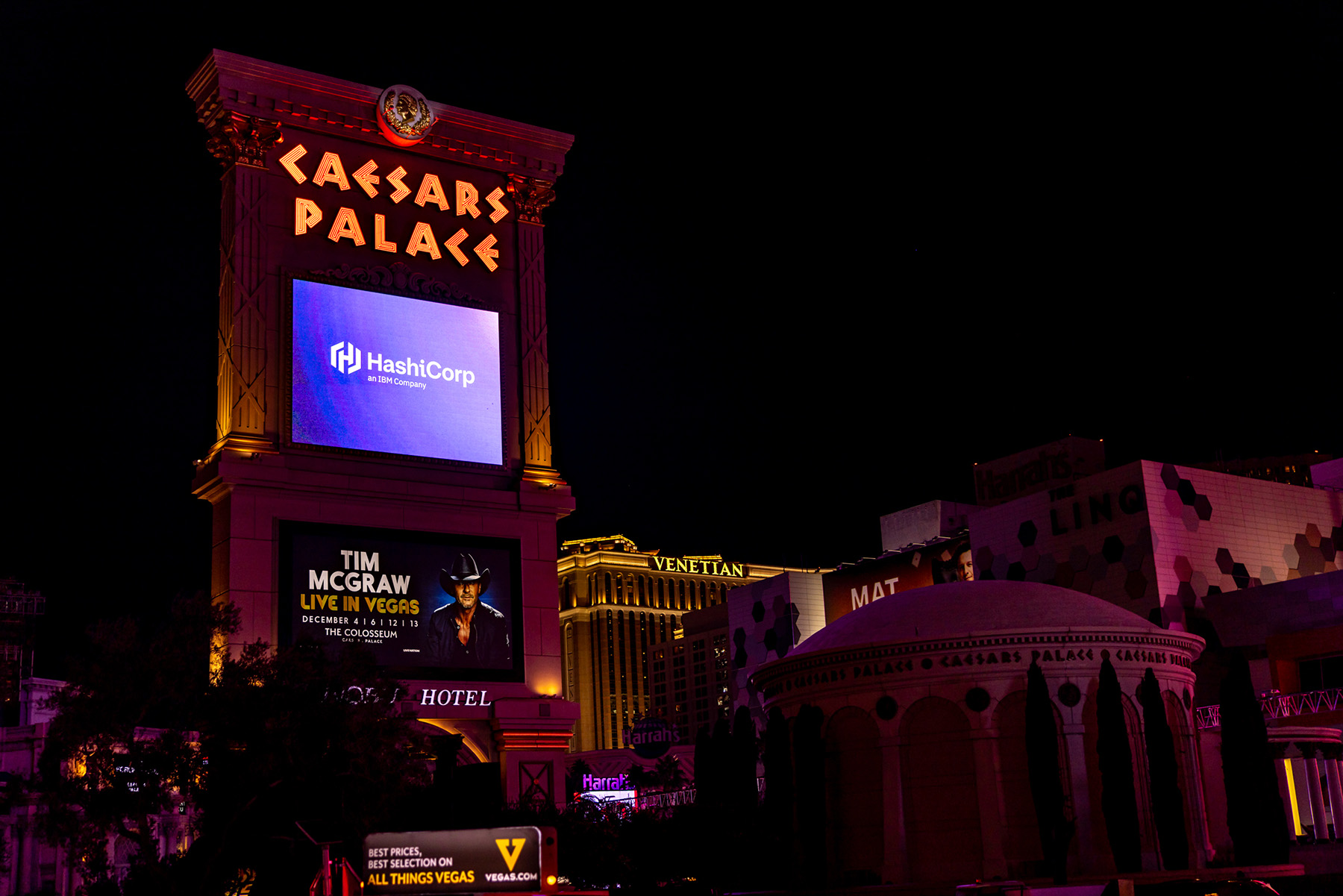
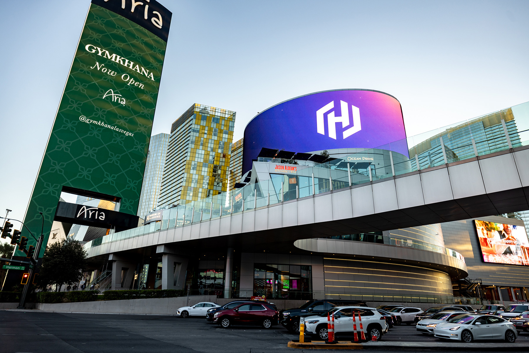
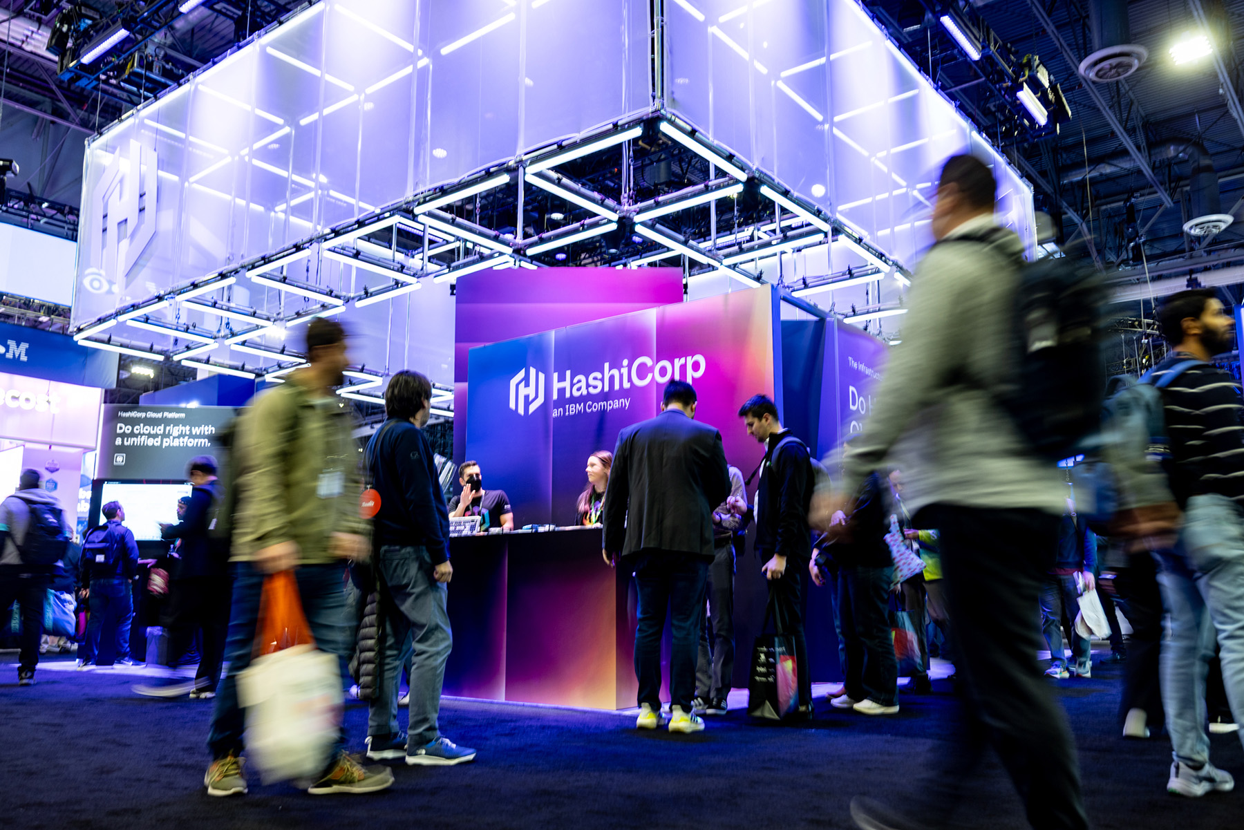
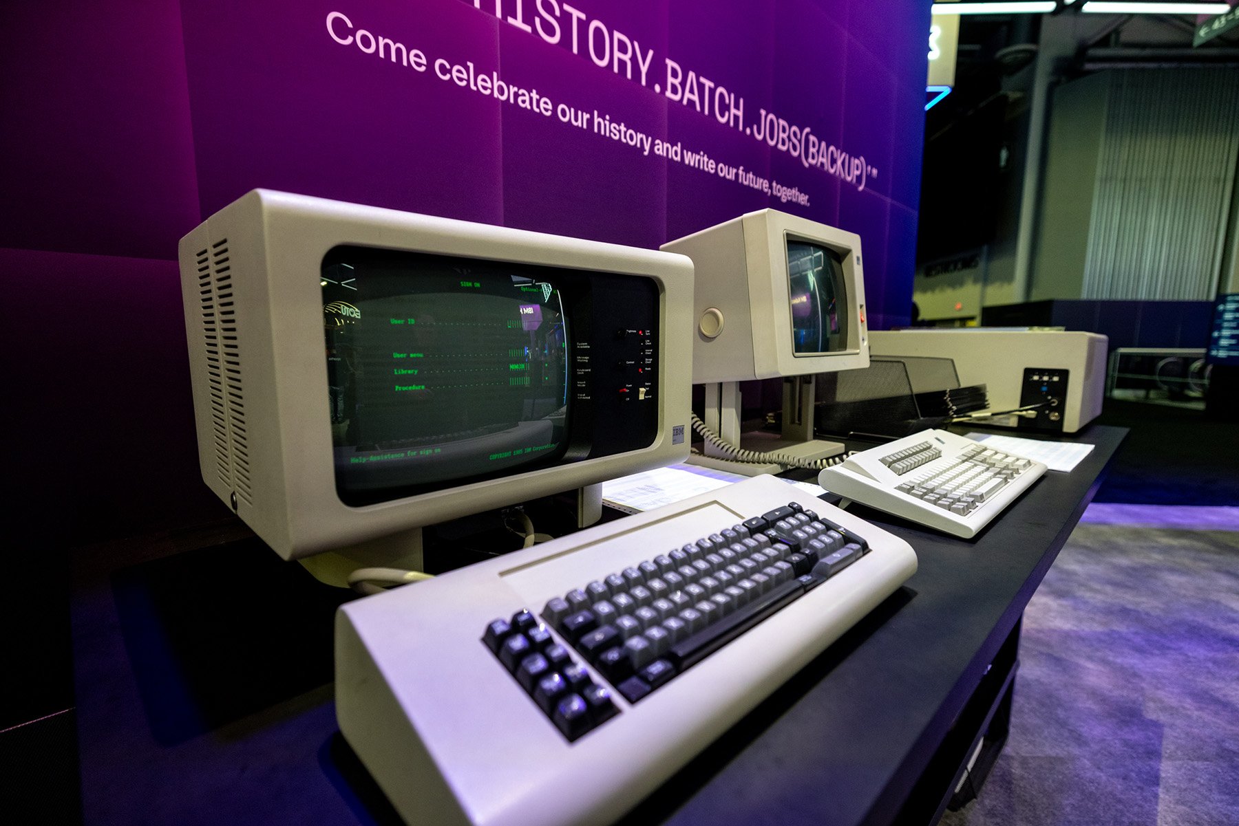
HashiCorp
AWS re:Invent 2025
Designed and art directed a full-scale experiential booth for AWS re:Invent 2025, translating the brand’s core ideas of infrastructure, cloud, and automation into a physical environment. The centerpiece was a suspended overhead structure built from LED scaffolding and wrapped in sheer, stretched fabric, creating a layered, luminous form that shifted between solid and immaterial. The space featured interactive activations, including a functioning screen constructed from LED keyboards and a curated collection of vintage IBM computers that attendees could actively use, connecting the history of computing to its present and future. The project extended beyond the convention floor with a series of out-of-home advertisements placed throughout the Las Vegas Strip, creating a cohesive presence across the city.
HashiCorp

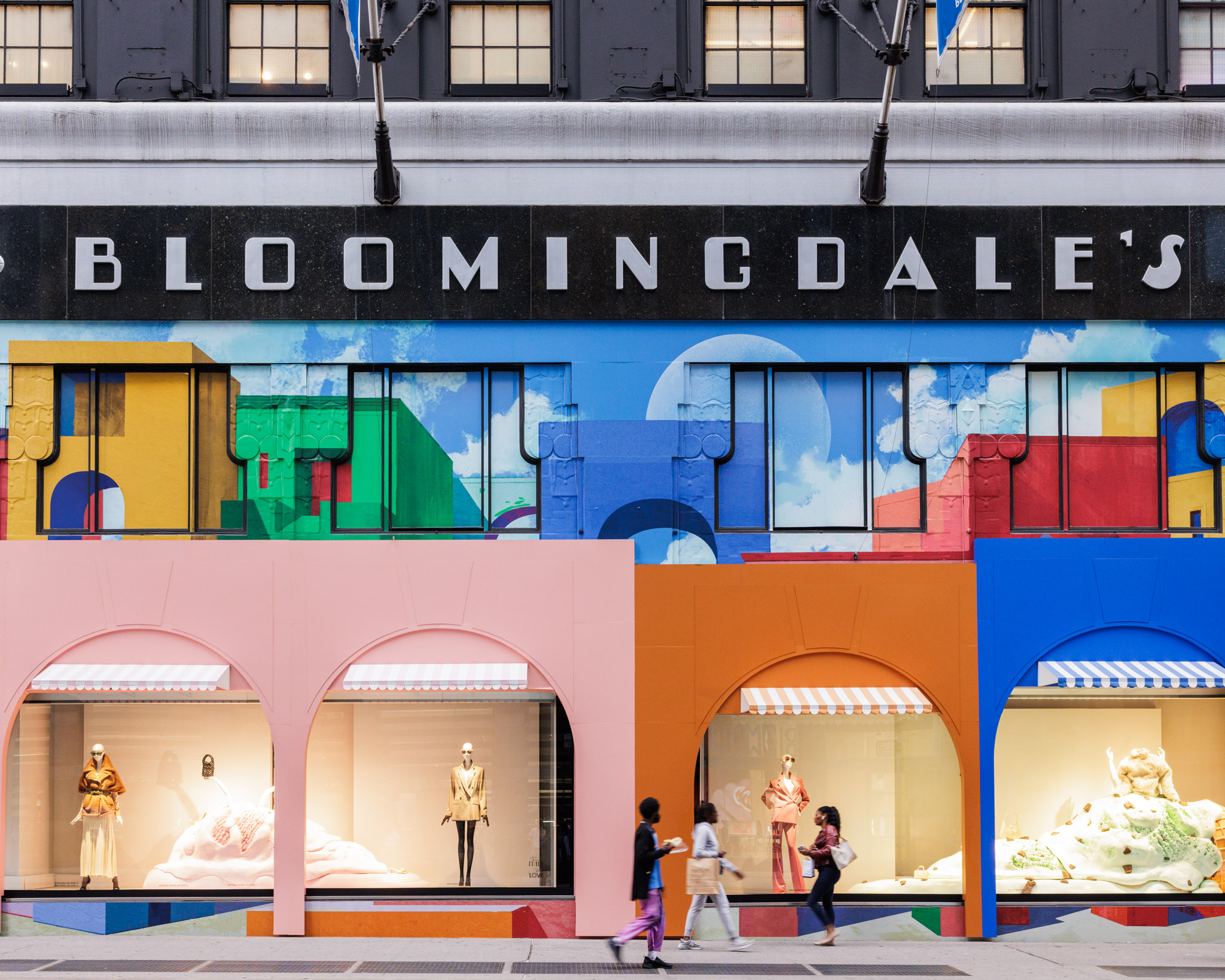
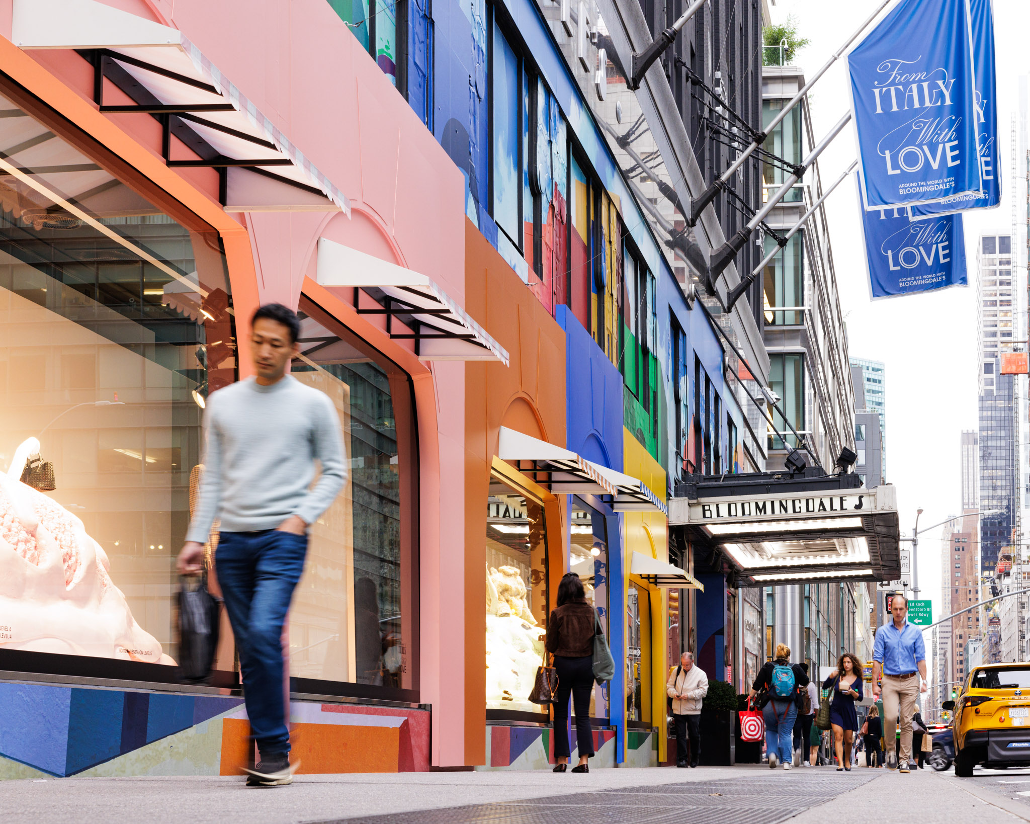
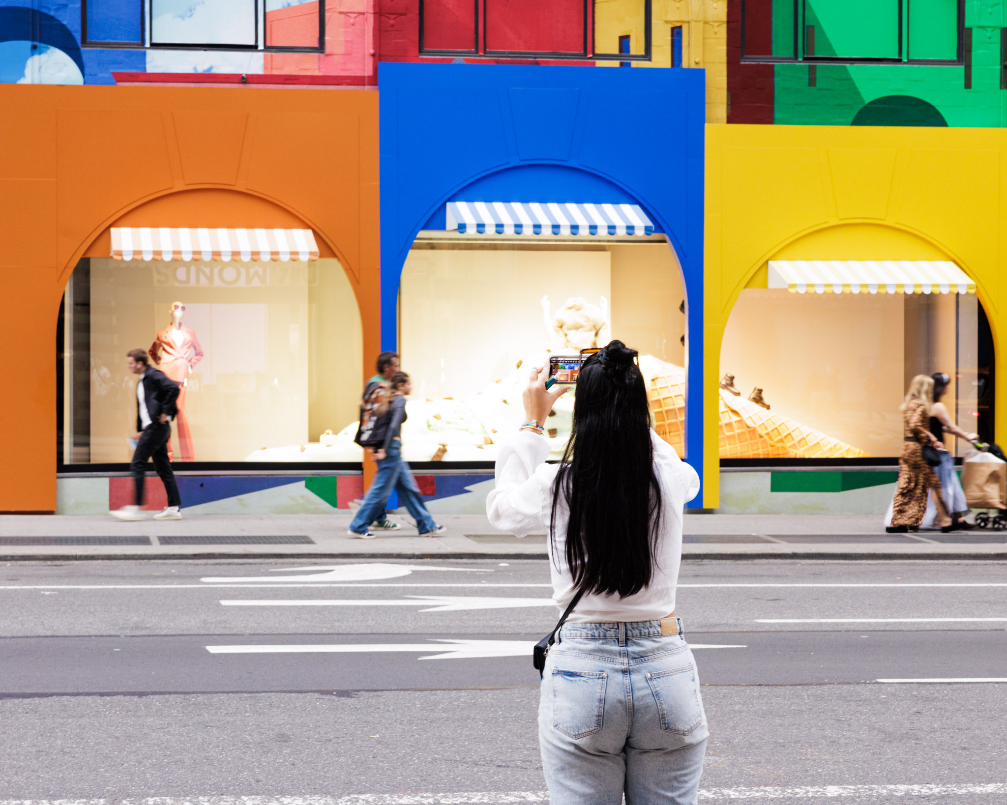
Bloomingdale's
From Italy With Love

As part of Bloomingdale’s From Italy With Love campaign, conceived and executed a full facade wrap for the New York flagship. Designed all visual elements, including a vibrant vinyl skin and dimensional archways inspired by Giorgio de Chirico, transforming the building into an immersive streetscape along Lexington Avenue. The project spanned concept, design, and on-site installation, extending the campaign beyond the store interior and into the city itself. The result elevated the brand’s presence, drove increased foot traffic, and generated meaningful press attention and sales impact.
Bloomingdale's
Afterpay
Merchant guidelines
Led the development of comprehensive merchant guidelines for Afterpay, defining clear standards and visual examples across digital and physical touchpoints. The system covered web banners, checkout graphics, social media assets, in-store applications, and out-of-home advertising. The guidelines translated Afterpay’s brand consistently across platforms, balancing clarity with flexibility for partners. The project established a cohesive visual framework that strengthened brand recognition and ensured continuity across customer experiences.
Afterpay
Led the development of comprehensive merchant guidelines for Afterpay, defining clear standards and visual examples across digital and physical touchpoints. The system covered web banners, checkout graphics, social media assets, in-store applications, and out-of-home advertising. The guidelines translated Afterpay’s brand consistently across platforms, balancing clarity with flexibility for partners. The project established a cohesive visual framework that strengthened brand recognition and ensured continuity across customer experiences.
Afterpay
Led the development of comprehensive merchant guidelines for Afterpay, defining clear standards and visual examples across digital and physical touchpoints. The system covered web banners, checkout graphics, social media assets, in-store applications, and out-of-home advertising. The guidelines translated Afterpay’s brand consistently across platforms, balancing clarity with flexibility for partners. The project established a cohesive visual framework that strengthened brand recognition and ensured continuity across customer experiences.
Afterpay
Led the development of comprehensive merchant guidelines for Afterpay, defining clear standards and visual examples across digital and physical touchpoints. The system covered web banners, checkout graphics, social media assets, in-store applications, and out-of-home advertising. The guidelines translated Afterpay’s brand consistently across platforms, balancing clarity with flexibility for partners. The project established a cohesive visual framework that strengthened brand recognition and ensured continuity across customer experiences.
Afterpay
Led the development of comprehensive merchant guidelines for Afterpay, defining clear standards and visual examples across digital and physical touchpoints. The system covered web banners, checkout graphics, social media assets, in-store applications, and out-of-home advertising. The guidelines translated Afterpay’s brand consistently across platforms, balancing clarity with flexibility for partners. The project established a cohesive visual framework that strengthened brand recognition and ensured continuity across customer experiences.
Afterpay
Michael Kors
Galeries Lafayette popup
As design consultant, led the concept and design of the Jetsetter Activation for Michael Kors, blending retro-futurism and luxury with references to Eero Saarinen and Hajime Sorayama. The centerpiece was a life-sized chrome jet fuselage that merged mid-century forms with a distinctly futuristic finish. The project moved from hand sketches to detailed 3D renderings, which were presented to senior leadership. The final concept translated abstract references into a clear, high-impact environment designed to elevate the brand through spectacle and precision.
Michael Kors
As design consultant, led the concept and design of the Jetsetter Activation for Michael Kors, blending retro-futurism and luxury with references to Eero Saarinen and Hajime Sorayama. The centerpiece was a life-sized chrome jet fuselage that merged mid-century forms with a distinctly futuristic finish. The project moved from hand sketches to detailed 3D renderings, which were presented to senior leadership. The final concept translated abstract references into a clear, high-impact environment designed to elevate the brand through spectacle and precision.
Michael Kors
As design consultant, led the concept and design of the Jetsetter Activation for Michael Kors, blending retro-futurism and luxury with references to Eero Saarinen and Hajime Sorayama. The centerpiece was a life-sized chrome jet fuselage that merged mid-century forms with a distinctly futuristic finish. The project moved from hand sketches to detailed 3D renderings, which were presented to senior leadership. The final concept translated abstract references into a clear, high-impact environment designed to elevate the brand through spectacle and precision.
Michael Kors
HashiCorp
HashiConf 2025
Designed the physical environment for HashiConf 2025, including the main booths, entrance structure, and a wide range of branding elements throughout the space. The work encompassed large-scale installations, hanging signs, banners, and supporting graphics, creating a clear and cohesive visual system across the conference. The design translated HashiCorp’s Beauty Works Better ethos into a physical experience that felt structured, approachable, and consistent from entry to show floor.
HashiCorp
Designed the physical environment for HashiConf 2025, including the main booths, entrance structure, and a wide range of branding elements throughout the space. The work encompassed large-scale installations, hanging signs, banners, and supporting graphics, creating a clear and cohesive visual system across the conference. The design translated HashiCorp’s Beauty Works Better ethos into a physical experience that felt structured, approachable, and consistent from entry to show floor.
HashiCorp
Designed the physical environment for HashiConf 2025, including the main booths, entrance structure, and a wide range of branding elements throughout the space. The work encompassed large-scale installations, hanging signs, banners, and supporting graphics, creating a clear and cohesive visual system across the conference. The design translated HashiCorp’s Beauty Works Better ethos into a physical experience that felt structured, approachable, and consistent from entry to show floor.
HashiCorp
Designed the physical environment for HashiConf 2025, including the main booths, entrance structure, and a wide range of branding elements throughout the space. The work encompassed large-scale installations, hanging signs, banners, and supporting graphics, creating a clear and cohesive visual system across the conference. The design translated HashiCorp’s Beauty Works Better ethos into a physical experience that felt structured, approachable, and consistent from entry to show floor.
HashiCorp
HashiCorp
HashiConf 2025
Designed the physical environment for HashiConf 2025, including the main booths, entrance structure, and a wide range of branding elements throughout the space. The work encompassed large-scale installations, hanging signs, banners, and supporting graphics, creating a clear and cohesive visual system across the conference. The design translated HashiCorp’s Beauty Works Better ethos into a physical experience that felt structured, approachable, and consistent from entry to show floor.
HashiCorp
Designed the physical environment for HashiConf 2025, including the main booths, entrance structure, and a wide range of branding elements throughout the space. The work encompassed large-scale installations, hanging signs, banners, and supporting graphics, creating a clear and cohesive visual system across the conference. The design translated HashiCorp’s Beauty Works Better ethos into a physical experience that felt structured, approachable, and consistent from entry to show floor.
HashiCorp
Designed the physical environment for HashiConf 2025, including the main booths, entrance structure, and a wide range of branding elements throughout the space. The work encompassed large-scale installations, hanging signs, banners, and supporting graphics, creating a clear and cohesive visual system across the conference. The design translated HashiCorp’s Beauty Works Better ethos into a physical experience that felt structured, approachable, and consistent from entry to show floor.
HashiCorp
Designed the physical environment for HashiConf 2025, including the main booths, entrance structure, and a wide range of branding elements throughout the space. The work encompassed large-scale installations, hanging signs, banners, and supporting graphics, creating a clear and cohesive visual system across the conference. The design translated HashiCorp’s Beauty Works Better ethos into a physical experience that felt structured, approachable, and consistent from entry to show floor.
HashiCorp
Afterpay
Merchant guidelines
Led the development of comprehensive merchant guidelines for Afterpay, defining clear standards and visual examples across digital and physical touchpoints. The system covered web banners, checkout graphics, social media assets, in-store applications, and out-of-home advertising. The guidelines translated Afterpay’s brand consistently across platforms, balancing clarity with flexibility for partners. The project established a cohesive visual framework that strengthened brand recognition and ensured continuity across customer experiences.
Afterpay
Led the development of comprehensive merchant guidelines for Afterpay, defining clear standards and visual examples across digital and physical touchpoints. The system covered web banners, checkout graphics, social media assets, in-store applications, and out-of-home advertising. The guidelines translated Afterpay’s brand consistently across platforms, balancing clarity with flexibility for partners. The project established a cohesive visual framework that strengthened brand recognition and ensured continuity across customer experiences.
Afterpay
Led the development of comprehensive merchant guidelines for Afterpay, defining clear standards and visual examples across digital and physical touchpoints. The system covered web banners, checkout graphics, social media assets, in-store applications, and out-of-home advertising. The guidelines translated Afterpay’s brand consistently across platforms, balancing clarity with flexibility for partners. The project established a cohesive visual framework that strengthened brand recognition and ensured continuity across customer experiences.
Afterpay
Led the development of comprehensive merchant guidelines for Afterpay, defining clear standards and visual examples across digital and physical touchpoints. The system covered web banners, checkout graphics, social media assets, in-store applications, and out-of-home advertising. The guidelines translated Afterpay’s brand consistently across platforms, balancing clarity with flexibility for partners. The project established a cohesive visual framework that strengthened brand recognition and ensured continuity across customer experiences.
Afterpay
Led the development of comprehensive merchant guidelines for Afterpay, defining clear standards and visual examples across digital and physical touchpoints. The system covered web banners, checkout graphics, social media assets, in-store applications, and out-of-home advertising. The guidelines translated Afterpay’s brand consistently across platforms, balancing clarity with flexibility for partners. The project established a cohesive visual framework that strengthened brand recognition and ensured continuity across customer experiences.
Afterpay
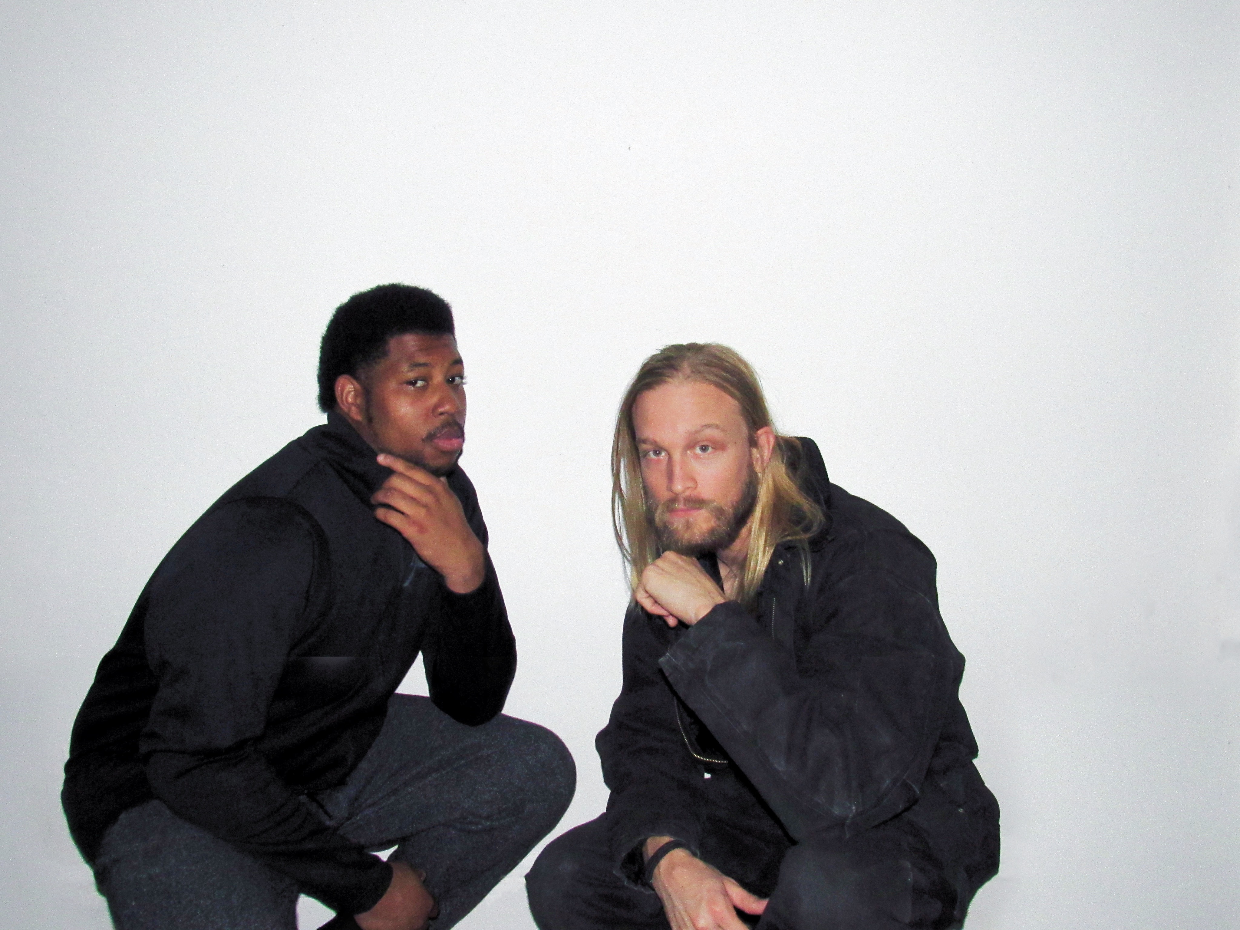
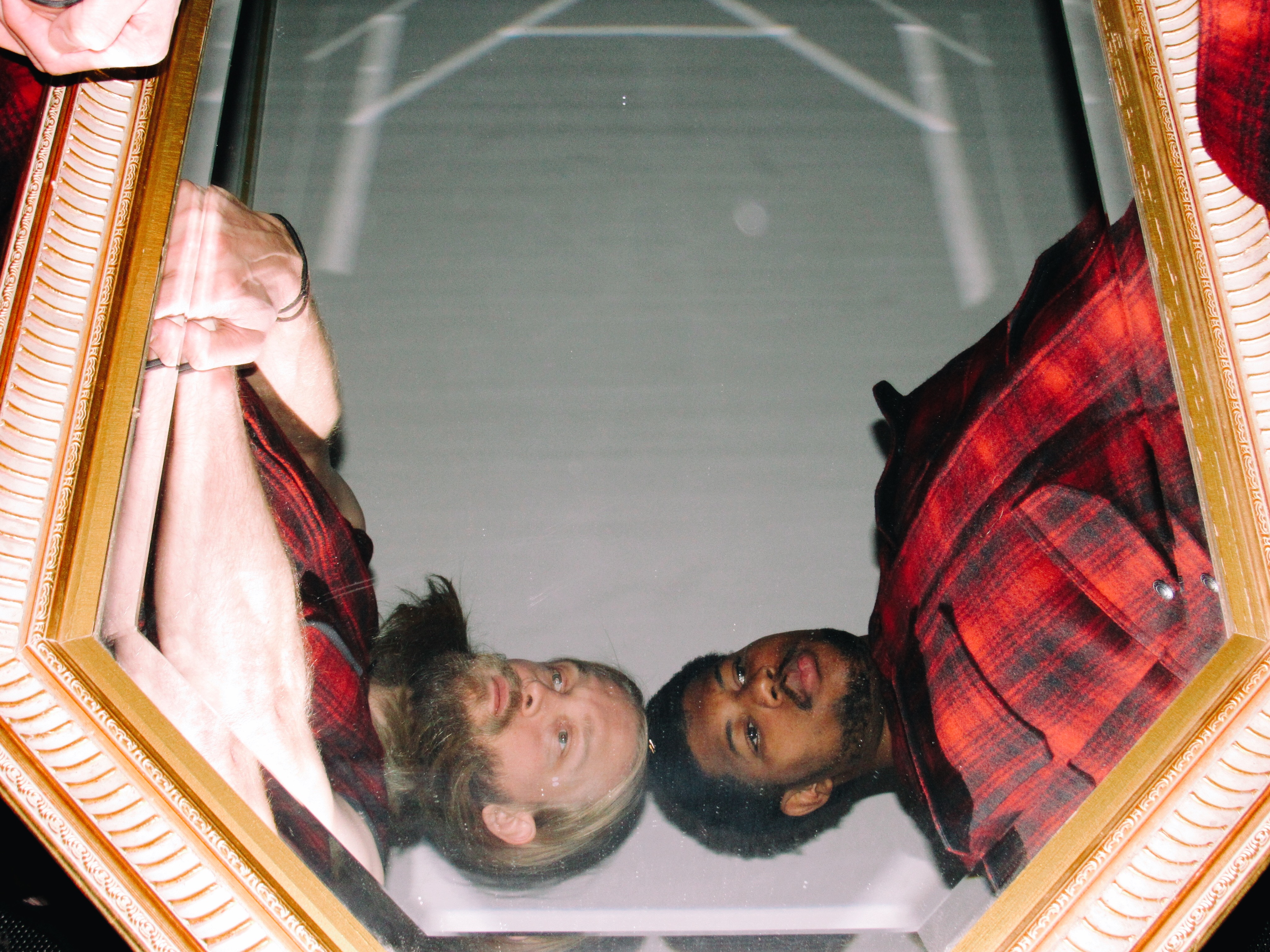
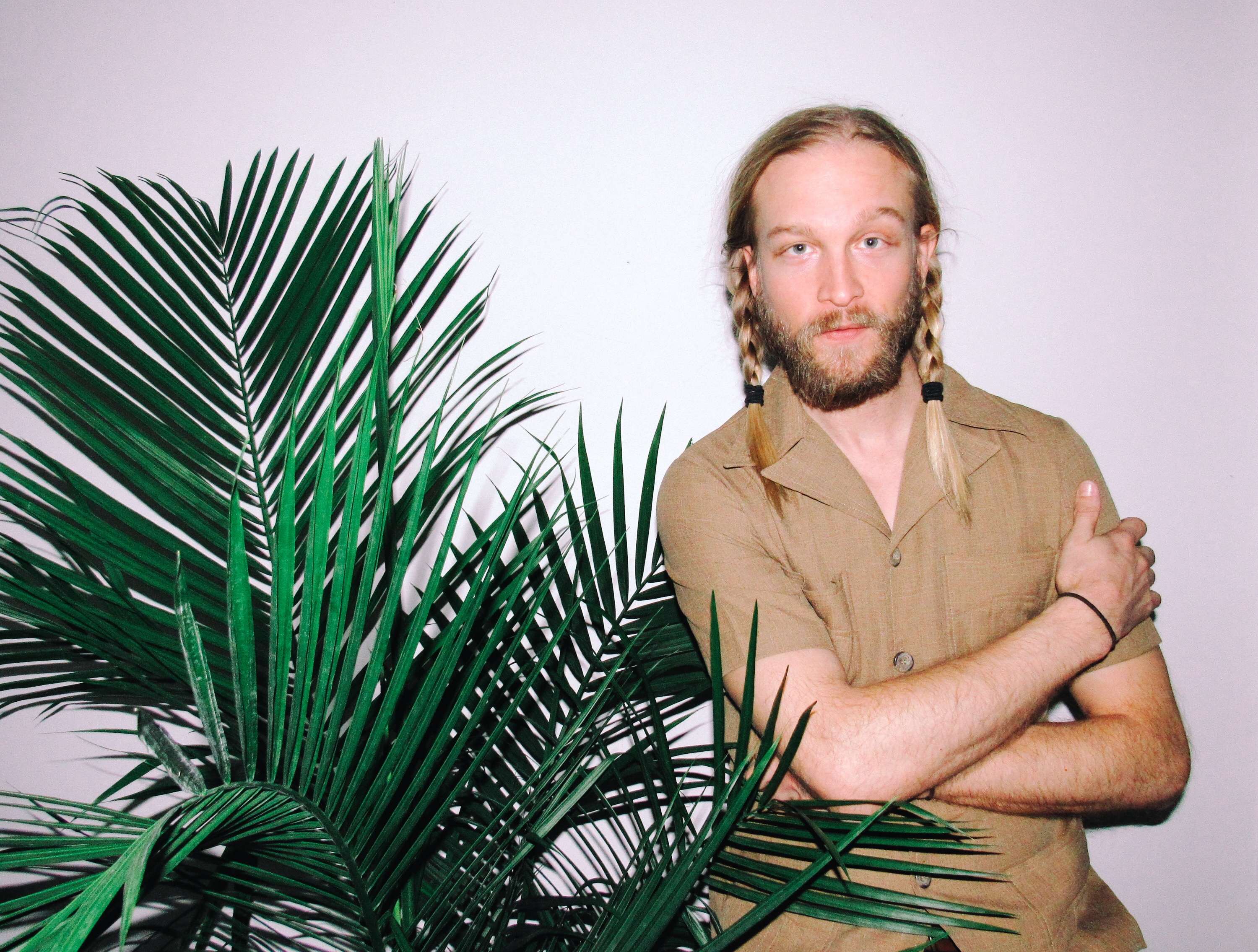
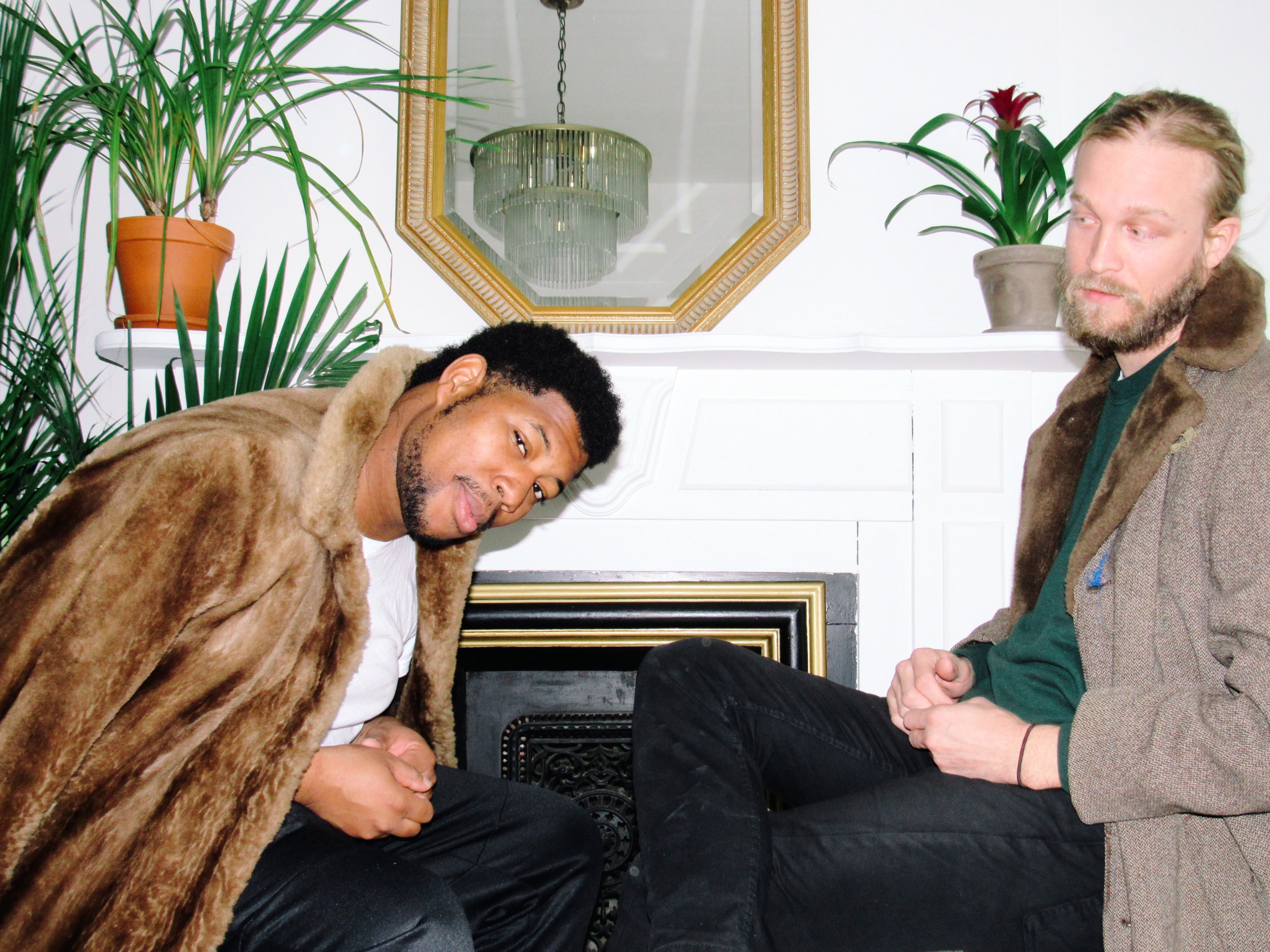
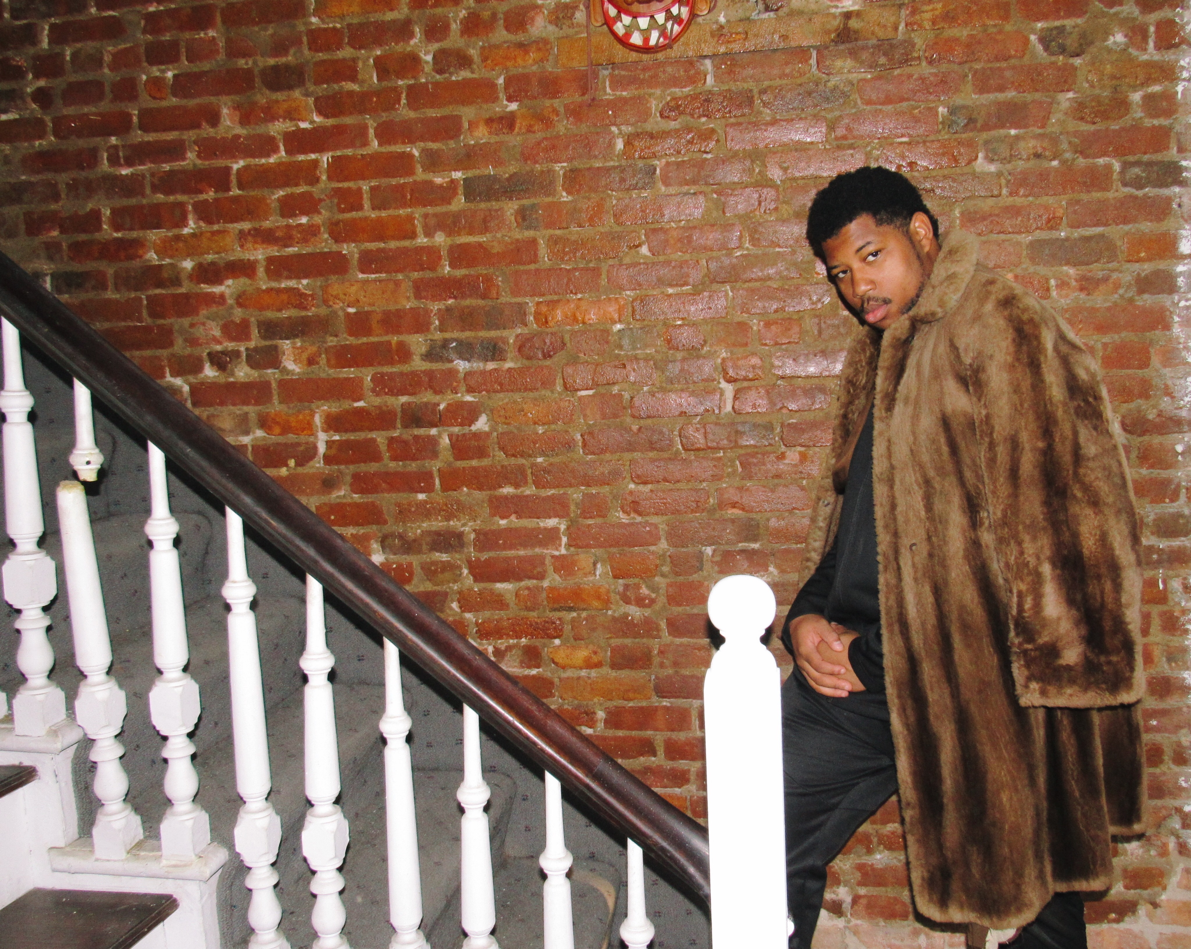
Mt. St. Helens Vietnam Band
Promotional photoshoot
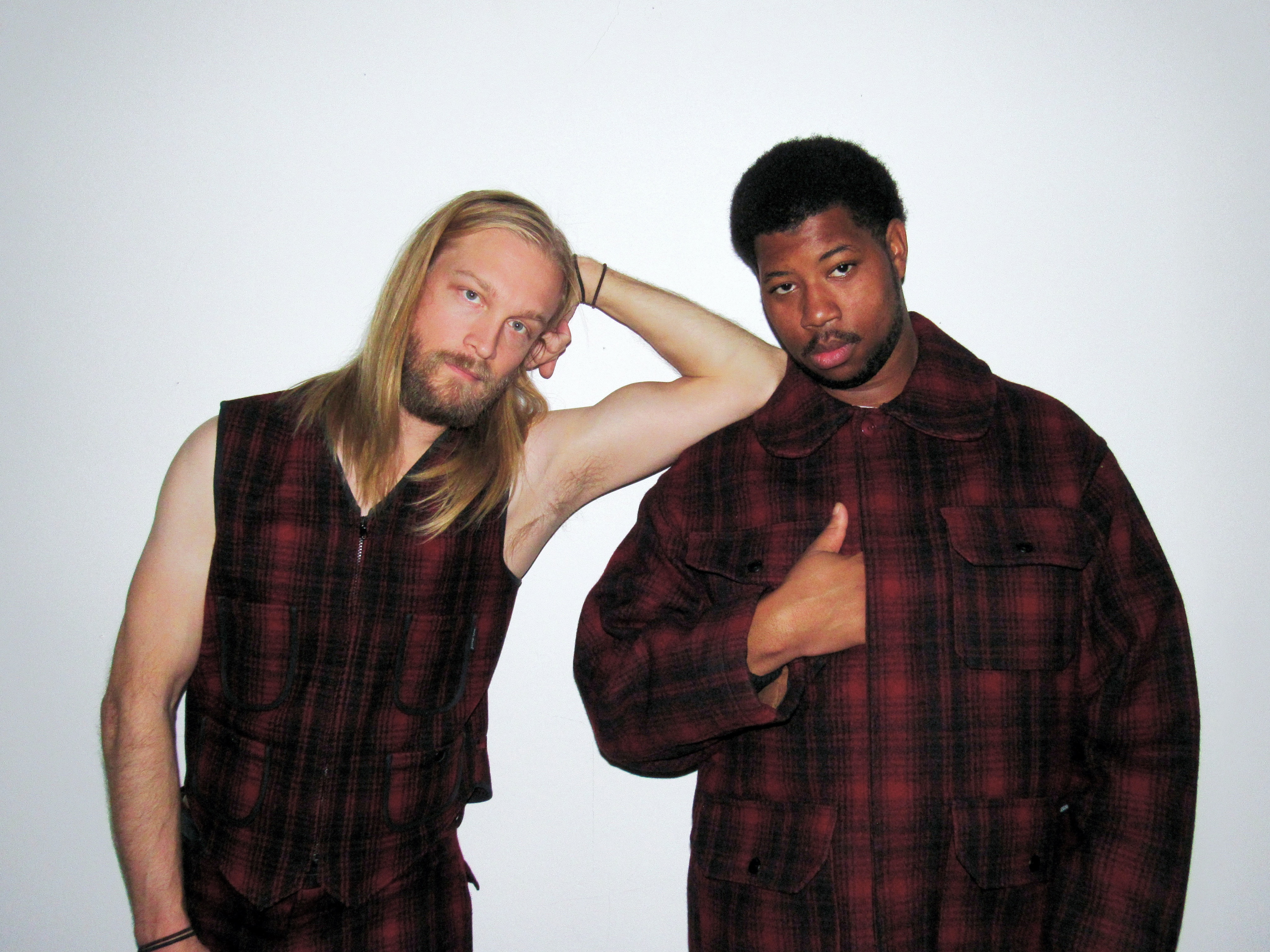
Served as art director, photographer, and stylist for a promotional photoshoot supporting the Mt. St. Helens Vietnam Band album release. All wardrobe elements were sourced from the band’s personal collection, grounding the imagery in authenticity and the artists’ own visual identity.
Mt. St. Helens Vietnam Band
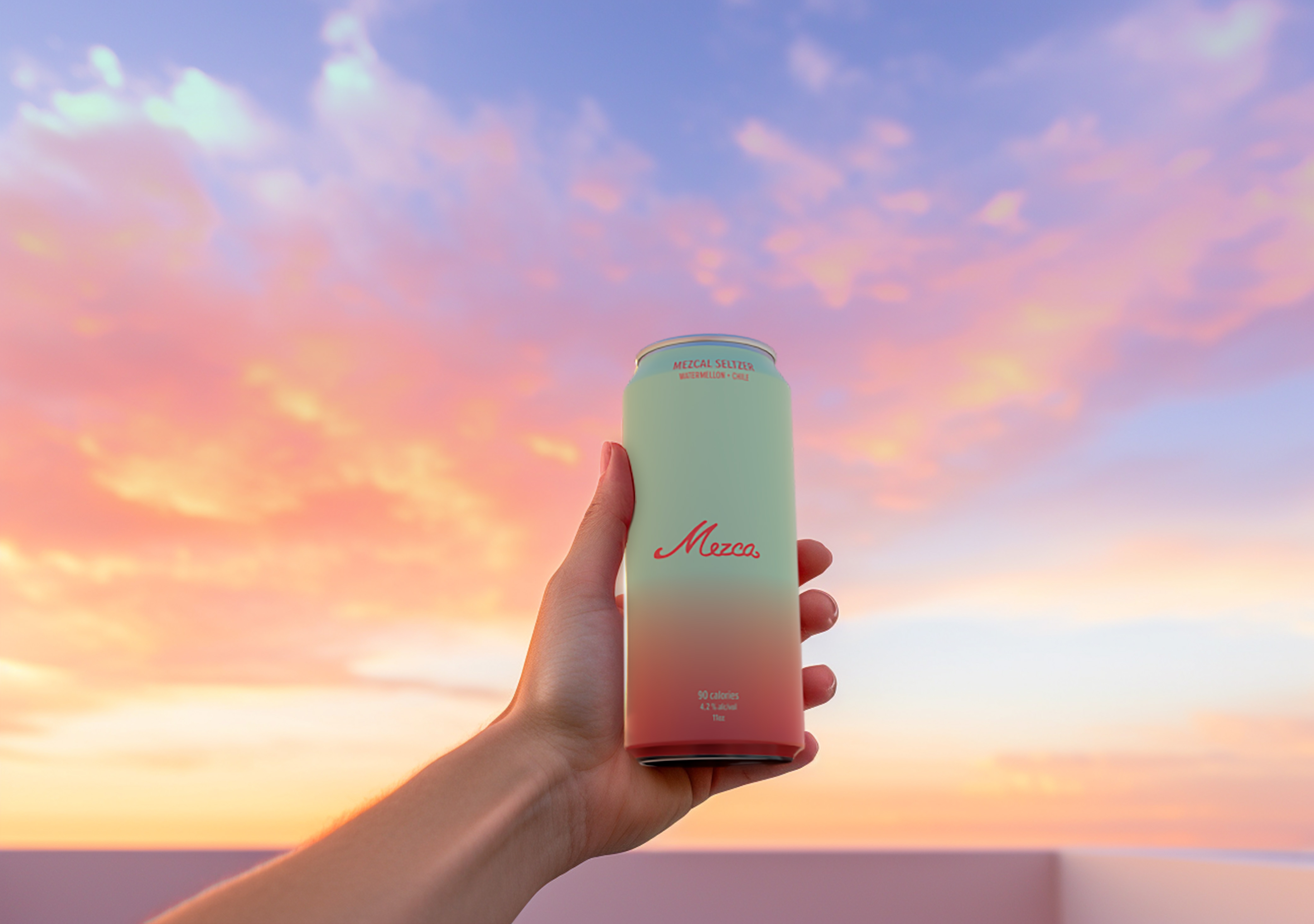
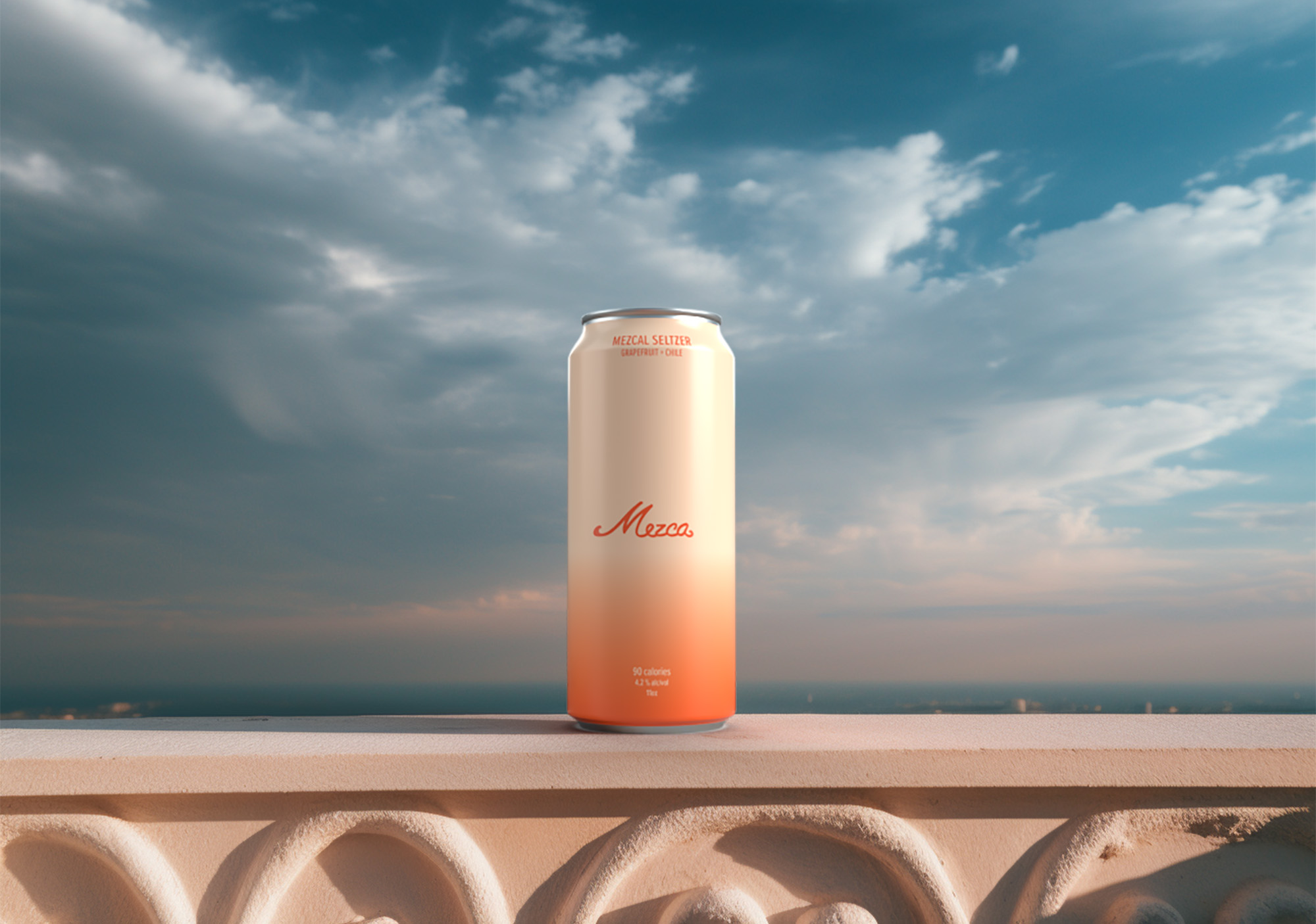
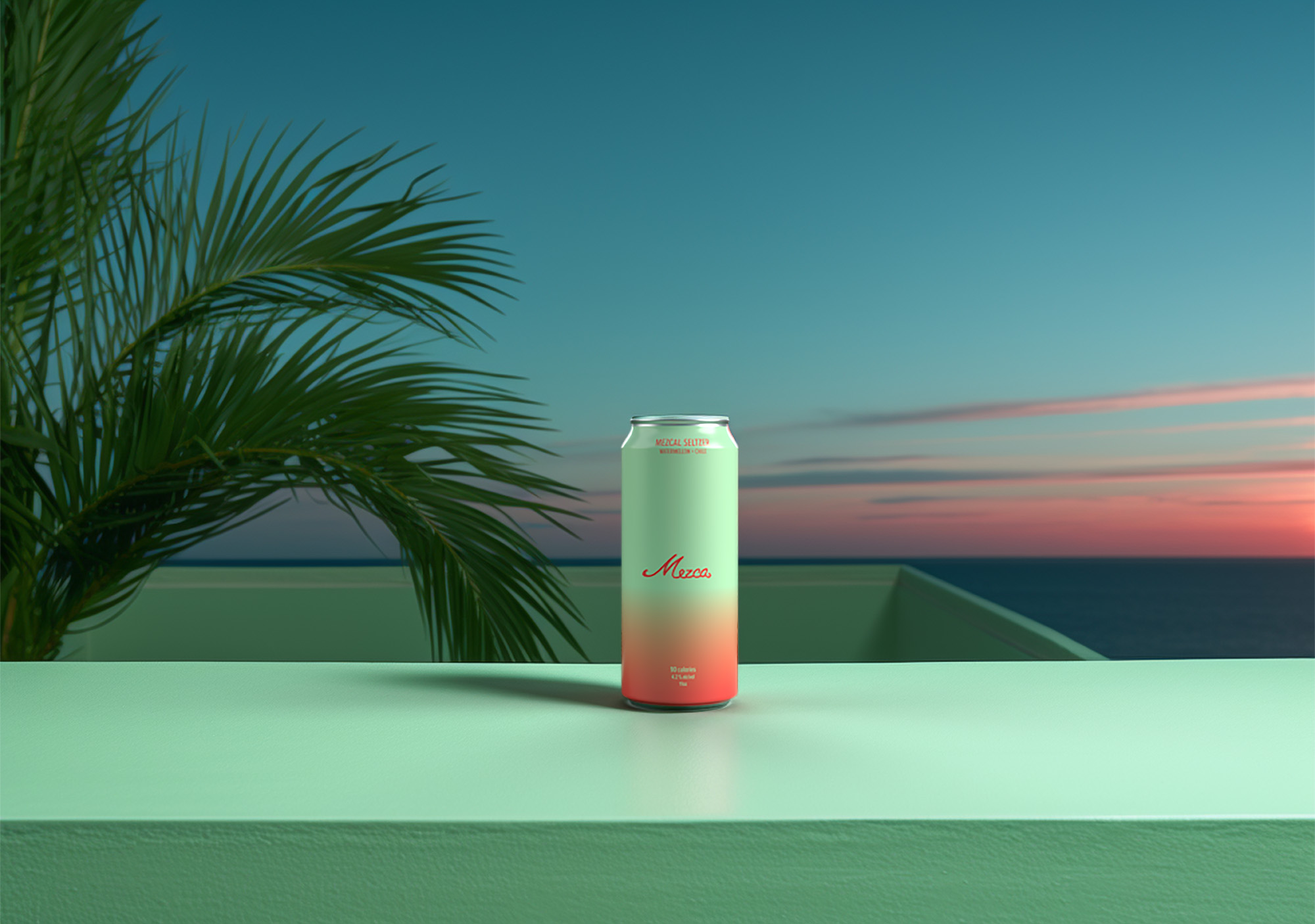
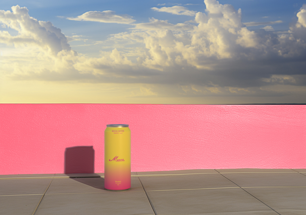
Mezca
Brand and packaging design
Lorem Ipsum is simply dummy text of the printing and typesetting industry. Lorem Ipsum has been the industry's standard dummy text ever since the 1500s, when an unknown printer took a galley of type and scrambled it to make a type specimen
Mezca
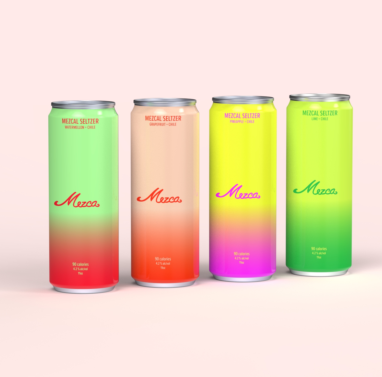
Led the branding and packaging design for Mezca, a canned cocktail brand built around mezcal. The logo pairs a classic script with contemporary detailing, establishing a distinct and approachable identity. Packaging was developed using expressive typography and color gradients to differentiate flavors while maintaining a cohesive system. The project also included art direction for a photoshoot set in a Miami beach setting, using muted tones to introduce a youthful, relaxed energy. Together, the work shaped a visual language that feels vibrant, intentional, and grounded in the product.
Mezca
Afterpay
Merchant guidelines
Led the development of comprehensive merchant guidelines for Afterpay, defining clear standards and visual examples across digital and physical touchpoints. The system covered web banners, checkout graphics, social media assets, in-store applications, and out-of-home advertising. The guidelines translated Afterpay’s brand consistently across platforms, balancing clarity with flexibility for partners. The project established a cohesive visual framework that strengthened brand recognition and ensured continuity across customer experiences.
Afterpay
Led the development of comprehensive merchant guidelines for Afterpay, defining clear standards and visual examples across digital and physical touchpoints. The system covered web banners, checkout graphics, social media assets, in-store applications, and out-of-home advertising. The guidelines translated Afterpay’s brand consistently across platforms, balancing clarity with flexibility for partners. The project established a cohesive visual framework that strengthened brand recognition and ensured continuity across customer experiences.
Afterpay
Led the development of comprehensive merchant guidelines for Afterpay, defining clear standards and visual examples across digital and physical touchpoints. The system covered web banners, checkout graphics, social media assets, in-store applications, and out-of-home advertising. The guidelines translated Afterpay’s brand consistently across platforms, balancing clarity with flexibility for partners. The project established a cohesive visual framework that strengthened brand recognition and ensured continuity across customer experiences.
Afterpay
Led the development of comprehensive merchant guidelines for Afterpay, defining clear standards and visual examples across digital and physical touchpoints. The system covered web banners, checkout graphics, social media assets, in-store applications, and out-of-home advertising. The guidelines translated Afterpay’s brand consistently across platforms, balancing clarity with flexibility for partners. The project established a cohesive visual framework that strengthened brand recognition and ensured continuity across customer experiences.
Afterpay
Led the development of comprehensive merchant guidelines for Afterpay, defining clear standards and visual examples across digital and physical touchpoints. The system covered web banners, checkout graphics, social media assets, in-store applications, and out-of-home advertising. The guidelines translated Afterpay’s brand consistently across platforms, balancing clarity with flexibility for partners. The project established a cohesive visual framework that strengthened brand recognition and ensured continuity across customer experiences.
Afterpay
Bloomingdale's
From Italy With Love
As part of Bloomingdale’s From Italy With Love campaign, conceived and executed a full facade wrap for the New York flagship. Designed all visual elements, including a vibrant vinyl skin and dimensional archways inspired by Giorgio de Chirico, transforming the building into an immersive streetscape along Lexington Avenue. The project spanned concept, design, and on-site installation, extending the campaign beyond the store interior and into the city itself. The result elevated the brand’s presence, drove increased foot traffic, and generated meaningful press attention and sales impact.
Bloomingdale's
Mt. St. Helens Vietnam Band
Promotional photoshoot
Served as art director, photographer, and stylist for a promotional photoshoot supporting the Mt. St. Helens Vietnam Band album release. All wardrobe elements were sourced from the band’s personal collection, grounding the imagery in authenticity and the artists’ own visual identity.
Mt. St. Helens Vietnam Band
Bloomingdale's
150th Anniversary
The Bloomingdale’s 150th Campaign marked the retailer’s 150th anniversary with a celebratory, forward-looking approach. As Senior Design Manager, led graphic design and art direction for the experiential pop-up, shaping a cohesive visual language across the space. The work balanced Bloomingdale’s heritage with a contemporary sensibility, creating an immersive brand experience that extended across physical and digital touchpoints. The campaign honored the brand’s legacy while remaining relevant to both longtime customers and new audiences.
Bloomingdale's
Mt. St. Helens Vietnam Band
Promotional photoshoot
Served as art director, photographer, and stylist for a promotional photoshoot supporting the Mt. St. Helens Vietnam Band album release. All wardrobe elements were sourced from the band’s personal collection, grounding the imagery in authenticity and the artists’ own visual identity.
Mt. St. Helens Vietnam Band
Served as art director, photographer, and stylist for a promotional photoshoot supporting the Mt. St. Helens Vietnam Band album release. All wardrobe elements were sourced from the band’s personal collection, grounding the imagery in authenticity and the artists’ own visual identity.
Mt. St. Helens Vietnam Band
Served as art director, photographer, and stylist for a promotional photoshoot supporting the Mt. St. Helens Vietnam Band album release. All wardrobe elements were sourced from the band’s personal collection, grounding the imagery in authenticity and the artists’ own visual identity.
Mt. St. Helens Vietnam Band
Served as art director, photographer, and stylist for a promotional photoshoot supporting the Mt. St. Helens Vietnam Band album release. All wardrobe elements were sourced from the band’s personal collection, grounding the imagery in authenticity and the artists’ own visual identity.
Mt. St. Helens Vietnam Band
HashiCorp
AWS re:Invent 2025
Designed and art directed a full-scale experiential booth for AWS re:Invent 2025, translating the brand’s core ideas of infrastructure, cloud, and automation into a physical environment. The centerpiece was a suspended overhead structure built from LED scaffolding and wrapped in sheer, stretched fabric, creating a layered, luminous form that shifted between solid and immaterial. The space featured interactive activations, including a functioning screen constructed from LED keyboards and a curated collection of vintage IBM computers that attendees could actively use, connecting the history of computing to its present and future. The project extended beyond the convention floor with a series of out-of-home advertisements placed throughout the Las Vegas Strip, creating a cohesive presence across the city.
HashiCorp
Designed and art directed a full-scale experiential booth for AWS re:Invent 2025, translating the brand’s core ideas of infrastructure, cloud, and automation into a physical environment. The centerpiece was a suspended overhead structure built from LED scaffolding and wrapped in sheer, stretched fabric, creating a layered, luminous form that shifted between solid and immaterial. The space featured interactive activations, including a functioning screen constructed from LED keyboards and a curated collection of vintage IBM computers that attendees could actively use, connecting the history of computing to its present and future. The project extended beyond the convention floor with a series of out-of-home advertisements placed throughout the Las Vegas Strip, creating a cohesive presence across the city.
HashiCorp
Saks Fifth Avenue
Iconic Beauty windows
Designed window displays for the Saks Iconic Beauty celebration, highlighting the retailer’s most influential luxury beauty and fragrance brands. Drawing inspiration from the light-based installations of James Turrell, each brand was invited to select a single color and define a silhouette of its most recognizable product. The resulting windows balanced light, shadow, and color to create a bold yet restrained visual language that felt both immersive and precise, celebrating individual brand identities while maintaining a cohesive presence across the facade.
Saks Fifth Avenue
Designed window displays for the Saks Iconic Beauty celebration, highlighting the retailer’s most influential luxury beauty and fragrance brands. Drawing inspiration from the light-based installations of James Turrell, each brand was invited to select a single color and define a silhouette of its most recognizable product. The resulting windows balanced light, shadow, and color to create a bold yet restrained visual language that felt both immersive and precise, celebrating individual brand identities while maintaining a cohesive presence across the facade.
Saks Fifth Avenue
Designed window displays for the Saks Iconic Beauty celebration, highlighting the retailer’s most influential luxury beauty and fragrance brands. Drawing inspiration from the light-based installations of James Turrell, each brand was invited to select a single color and define a silhouette of its most recognizable product. The resulting windows balanced light, shadow, and color to create a bold yet restrained visual language that felt both immersive and precise, celebrating individual brand identities while maintaining a cohesive presence across the facade.
Saks Fifth Avenue
Designed window displays for the Saks Iconic Beauty celebration, highlighting the retailer’s most influential luxury beauty and fragrance brands. Drawing inspiration from the light-based installations of James Turrell, each brand was invited to select a single color and define a silhouette of its most recognizable product. The resulting windows balanced light, shadow, and color to create a bold yet restrained visual language that felt both immersive and precise, celebrating individual brand identities while maintaining a cohesive presence across the facade.
Saks Fifth Avenue
Designed window displays for the Saks Iconic Beauty celebration, highlighting the retailer’s most influential luxury beauty and fragrance brands. Drawing inspiration from the light-based installations of James Turrell, each brand was invited to select a single color and define a silhouette of its most recognizable product. The resulting windows balanced light, shadow, and color to create a bold yet restrained visual language that felt both immersive and precise, celebrating individual brand identities while maintaining a cohesive presence across the facade.
Saks Fifth Avenue
Bloomingdale's
150th Anniversary
The Bloomingdale’s 150th Campaign marked the retailer’s 150th anniversary with a celebratory, forward-looking approach. As Senior Design Manager, led graphic design and art direction for the experiential pop-up, shaping a cohesive visual language across the space. The work balanced Bloomingdale’s heritage with a contemporary sensibility, creating an immersive brand experience that extended across physical and digital touchpoints. The campaign honored the brand’s legacy while remaining relevant to both longtime customers and new audiences.
Bloomingdale's
The Bloomingdale’s 150th Campaign marked the retailer’s 150th anniversary with a celebratory, forward-looking approach. As Senior Design Manager, led graphic design and art direction for the experiential pop-up, shaping a cohesive visual language across the space. The work balanced Bloomingdale’s heritage with a contemporary sensibility, creating an immersive brand experience that extended across physical and digital touchpoints. The campaign honored the brand’s legacy while remaining relevant to both longtime customers and new audiences.
Bloomingdale's
The Bloomingdale’s 150th Campaign marked the retailer’s 150th anniversary with a celebratory, forward-looking approach. As Senior Design Manager, led graphic design and art direction for the experiential pop-up, shaping a cohesive visual language across the space. The work balanced Bloomingdale’s heritage with a contemporary sensibility, creating an immersive brand experience that extended across physical and digital touchpoints. The campaign honored the brand’s legacy while remaining relevant to both longtime customers and new audiences.
Bloomingdale's
The Bloomingdale’s 150th Campaign marked the retailer’s 150th anniversary with a celebratory, forward-looking approach. As Senior Design Manager, led graphic design and art direction for the experiential pop-up, shaping a cohesive visual language across the space. The work balanced Bloomingdale’s heritage with a contemporary sensibility, creating an immersive brand experience that extended across physical and digital touchpoints. The campaign honored the brand’s legacy while remaining relevant to both longtime customers and new audiences.
Bloomingdale's
The Bloomingdale’s 150th Campaign marked the retailer’s 150th anniversary with a celebratory, forward-looking approach. As Senior Design Manager, led graphic design and art direction for the experiential pop-up, shaping a cohesive visual language across the space. The work balanced Bloomingdale’s heritage with a contemporary sensibility, creating an immersive brand experience that extended across physical and digital touchpoints. The campaign honored the brand’s legacy while remaining relevant to both longtime customers and new audiences.
Bloomingdale's
.jpg)
Rabbits
Test shoot
.jpg)
Art directed a personal test shoot centered on a handmade papier-mâché mask. Created as an exploratory project, it remains one of my favorite studies.
Rabbits
.jpg)
Art directed a personal test shoot centered on a handmade papier-mâché mask. Created as an exploratory project, it remains one of my favorite studies.
Rabbits
.jpg)
Art directed a personal test shoot centered on a handmade papier-mâché mask. Created as an exploratory project, it remains one of my favorite studies.
Rabbits
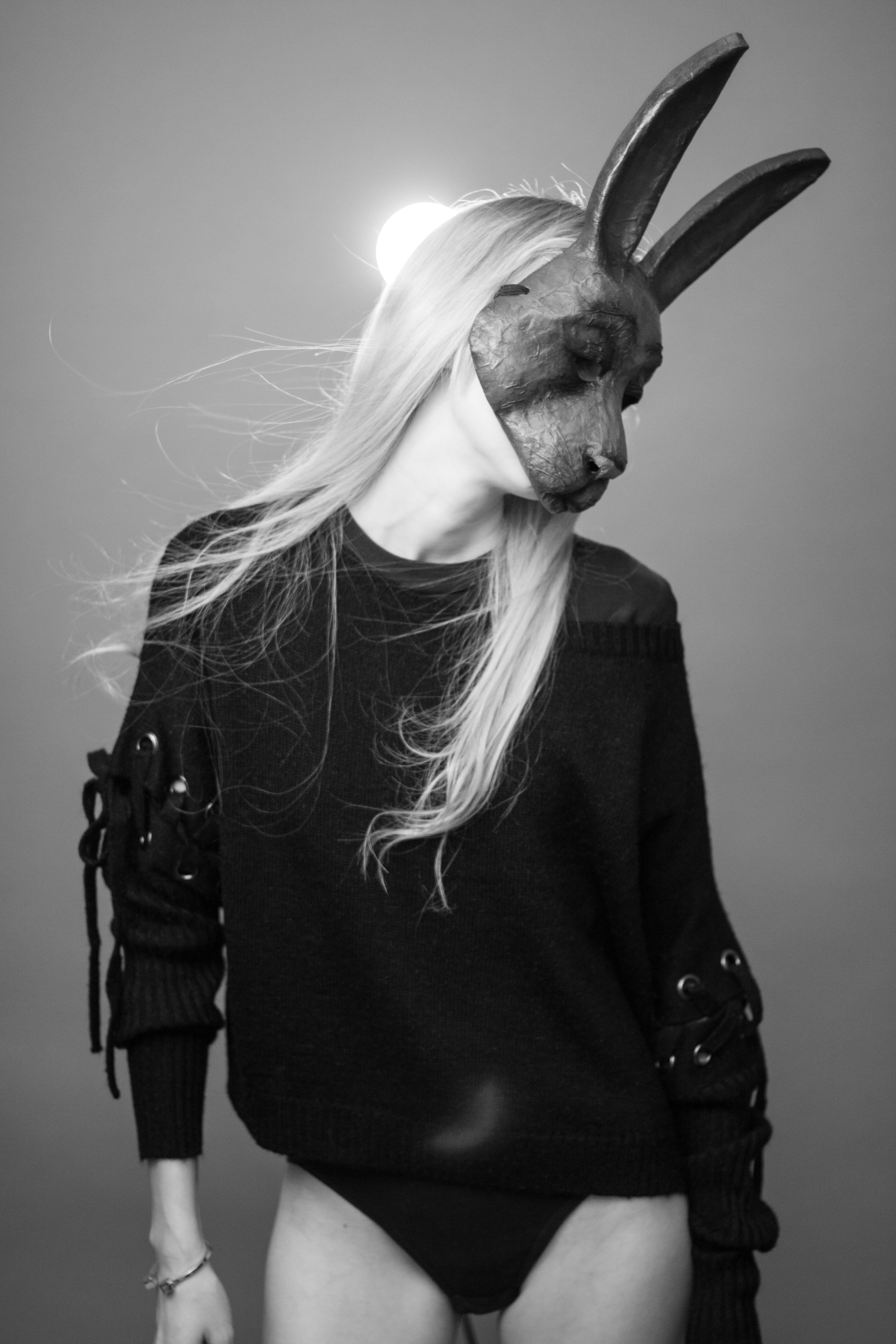
Art directed a personal test shoot centered on a handmade papier-mâché mask. Created as an exploratory project, it remains one of my favorite studies.
Rabbits
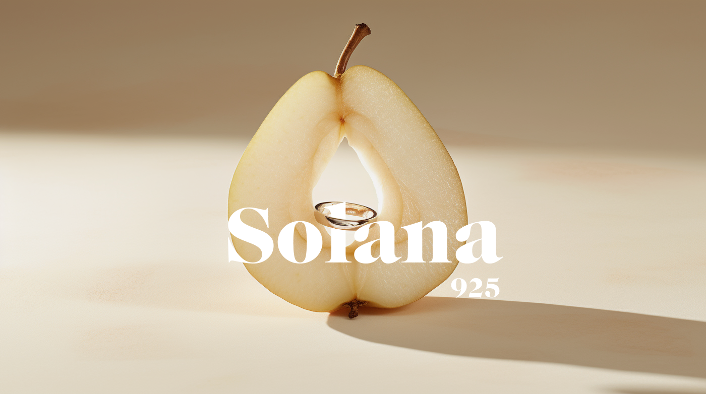
Solana
Brand, web, and packaging design
As Founder and Creative Director, led the complete creative direction for Solana, a contemporary jewelry brand. Oversaw brand identity, website design, campaign art direction, imagery, and packaging, shaping a cohesive visual system across all touchpoints. The work focused on building a clear, refined brand language that feels expressive and modern while remaining grounded in craftsmanship and authenticity.
Solana
As Founder and Creative Director, led the complete creative direction for Solana, a contemporary jewelry brand. Oversaw brand identity, website design, campaign art direction, imagery, and packaging, shaping a cohesive visual system across all touchpoints. The work focused on building a clear, refined brand language that feels expressive and modern while remaining grounded in craftsmanship and authenticity.
Solana
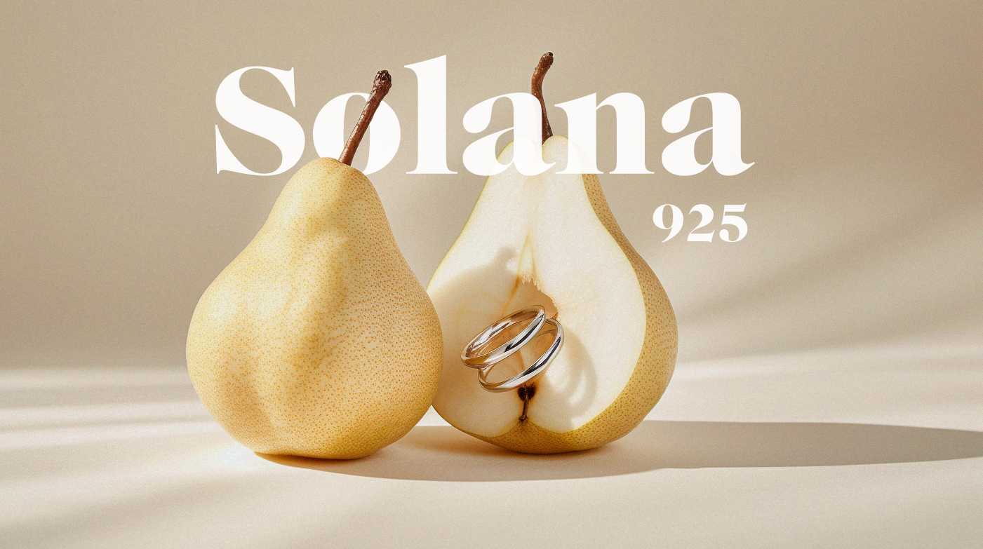
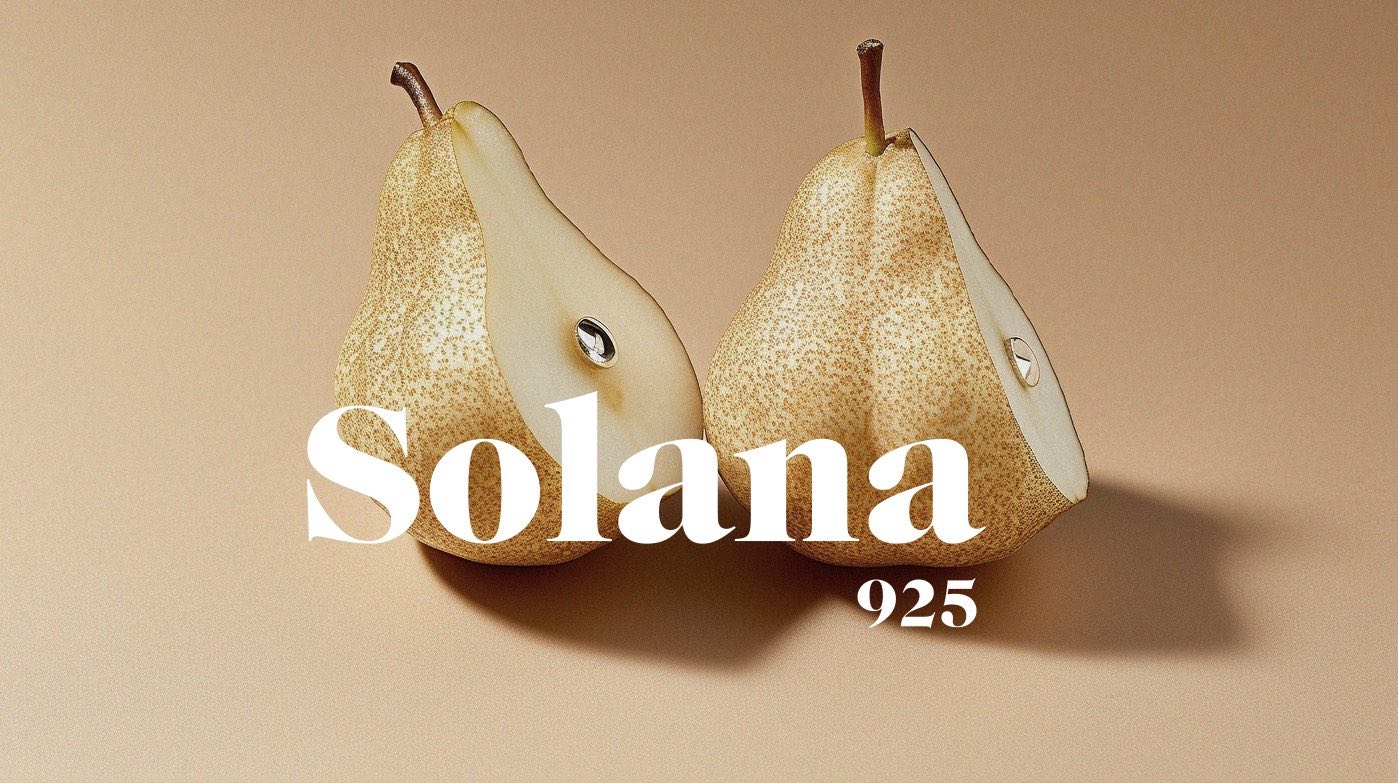
HashiCorp
HashiConf 2025
Designed the physical environment for HashiConf 2025, including the main booths, entrance structure, and a wide range of branding elements throughout the space. The work encompassed large-scale installations, hanging signs, banners, and supporting graphics, creating a clear and cohesive visual system across the conference. The design translated HashiCorp’s Beauty Works Better ethos into a physical experience that felt structured, approachable, and consistent from entry to show floor.
HashiCorp
Designed the physical environment for HashiConf 2025, including the main booths, entrance structure, and a wide range of branding elements throughout the space. The work encompassed large-scale installations, hanging signs, banners, and supporting graphics, creating a clear and cohesive visual system across the conference. The design translated HashiCorp’s Beauty Works Better ethos into a physical experience that felt structured, approachable, and consistent from entry to show floor.
HashiCorp
Designed the physical environment for HashiConf 2025, including the main booths, entrance structure, and a wide range of branding elements throughout the space. The work encompassed large-scale installations, hanging signs, banners, and supporting graphics, creating a clear and cohesive visual system across the conference. The design translated HashiCorp’s Beauty Works Better ethos into a physical experience that felt structured, approachable, and consistent from entry to show floor.
HashiCorp
Designed the physical environment for HashiConf 2025, including the main booths, entrance structure, and a wide range of branding elements throughout the space. The work encompassed large-scale installations, hanging signs, banners, and supporting graphics, creating a clear and cohesive visual system across the conference. The design translated HashiCorp’s Beauty Works Better ethos into a physical experience that felt structured, approachable, and consistent from entry to show floor.
HashiCorp
Designed the physical environment for HashiConf 2025, including the main booths, entrance structure, and a wide range of branding elements throughout the space. The work encompassed large-scale installations, hanging signs, banners, and supporting graphics, creating a clear and cohesive visual system across the conference. The design translated HashiCorp’s Beauty Works Better ethos into a physical experience that felt structured, approachable, and consistent from entry to show floor.
HashiCorp
Afterpay
Merchant guidelines
Led the development of comprehensive merchant guidelines for Afterpay, defining clear standards and visual examples across digital and physical touchpoints. The system covered web banners, checkout graphics, social media assets, in-store applications, and out-of-home advertising. The guidelines translated Afterpay’s brand consistently across platforms, balancing clarity with flexibility for partners. The project established a cohesive visual framework that strengthened brand recognition and ensured continuity across customer experiences.
Afterpay
Led the development of comprehensive merchant guidelines for Afterpay, defining clear standards and visual examples across digital and physical touchpoints. The system covered web banners, checkout graphics, social media assets, in-store applications, and out-of-home advertising. The guidelines translated Afterpay’s brand consistently across platforms, balancing clarity with flexibility for partners. The project established a cohesive visual framework that strengthened brand recognition and ensured continuity across customer experiences.
Afterpay
Led the development of comprehensive merchant guidelines for Afterpay, defining clear standards and visual examples across digital and physical touchpoints. The system covered web banners, checkout graphics, social media assets, in-store applications, and out-of-home advertising. The guidelines translated Afterpay’s brand consistently across platforms, balancing clarity with flexibility for partners. The project established a cohesive visual framework that strengthened brand recognition and ensured continuity across customer experiences.
Afterpay
Led the development of comprehensive merchant guidelines for Afterpay, defining clear standards and visual examples across digital and physical touchpoints. The system covered web banners, checkout graphics, social media assets, in-store applications, and out-of-home advertising. The guidelines translated Afterpay’s brand consistently across platforms, balancing clarity with flexibility for partners. The project established a cohesive visual framework that strengthened brand recognition and ensured continuity across customer experiences.
Afterpay
Led the development of comprehensive merchant guidelines for Afterpay, defining clear standards and visual examples across digital and physical touchpoints. The system covered web banners, checkout graphics, social media assets, in-store applications, and out-of-home advertising. The guidelines translated Afterpay’s brand consistently across platforms, balancing clarity with flexibility for partners. The project established a cohesive visual framework that strengthened brand recognition and ensured continuity across customer experiences.
Afterpay
Mt. St. Helens Vietnam Band
Promotional photoshoot
Served as art director, photographer, and stylist for a promotional photoshoot supporting the Mt. St. Helens Vietnam Band album release. All wardrobe elements were sourced from the band’s personal collection, grounding the imagery in authenticity and the artists’ own visual identity.
Mt. St. Helens Vietnam Band
Served as art director, photographer, and stylist for a promotional photoshoot supporting the Mt. St. Helens Vietnam Band album release. All wardrobe elements were sourced from the band’s personal collection, grounding the imagery in authenticity and the artists’ own visual identity.
Mt. St. Helens Vietnam Band
Served as art director, photographer, and stylist for a promotional photoshoot supporting the Mt. St. Helens Vietnam Band album release. All wardrobe elements were sourced from the band’s personal collection, grounding the imagery in authenticity and the artists’ own visual identity.
Mt. St. Helens Vietnam Band
Served as art director, photographer, and stylist for a promotional photoshoot supporting the Mt. St. Helens Vietnam Band album release. All wardrobe elements were sourced from the band’s personal collection, grounding the imagery in authenticity and the artists’ own visual identity.
Mt. St. Helens Vietnam Band
HashiCorp
HashiConf 2025
Designed the physical environment for HashiConf 2025, including the main booths, entrance structure, and a wide range of branding elements throughout the space. The work encompassed large-scale installations, hanging signs, banners, and supporting graphics, creating a clear and cohesive visual system across the conference. The design translated HashiCorp’s Beauty Works Better ethos into a physical experience that felt structured, approachable, and consistent from entry to show floor.
HashiCorp
Designed the physical environment for HashiConf 2025, including the main booths, entrance structure, and a wide range of branding elements throughout the space. The work encompassed large-scale installations, hanging signs, banners, and supporting graphics, creating a clear and cohesive visual system across the conference. The design translated HashiCorp’s Beauty Works Better ethos into a physical experience that felt structured, approachable, and consistent from entry to show floor.
HashiCorp
Designed the physical environment for HashiConf 2025, including the main booths, entrance structure, and a wide range of branding elements throughout the space. The work encompassed large-scale installations, hanging signs, banners, and supporting graphics, creating a clear and cohesive visual system across the conference. The design translated HashiCorp’s Beauty Works Better ethos into a physical experience that felt structured, approachable, and consistent from entry to show floor.
HashiCorp
Designed the physical environment for HashiConf 2025, including the main booths, entrance structure, and a wide range of branding elements throughout the space. The work encompassed large-scale installations, hanging signs, banners, and supporting graphics, creating a clear and cohesive visual system across the conference. The design translated HashiCorp’s Beauty Works Better ethos into a physical experience that felt structured, approachable, and consistent from entry to show floor.
HashiCorp
Designed the physical environment for HashiConf 2025, including the main booths, entrance structure, and a wide range of branding elements throughout the space. The work encompassed large-scale installations, hanging signs, banners, and supporting graphics, creating a clear and cohesive visual system across the conference. The design translated HashiCorp’s Beauty Works Better ethos into a physical experience that felt structured, approachable, and consistent from entry to show floor.
HashiCorp
HashiCorp
AWS re:Invent 2025
Designed and art directed a full-scale experiential booth for AWS re:Invent 2025, translating the brand’s core ideas of infrastructure, cloud, and automation into a physical environment. The centerpiece was a suspended overhead structure built from LED scaffolding and wrapped in sheer, stretched fabric, creating a layered, luminous form that shifted between solid and immaterial. The space featured interactive activations, including a functioning screen constructed from LED keyboards and a curated collection of vintage IBM computers that attendees could actively use, connecting the history of computing to its present and future. The project extended beyond the convention floor with a series of out-of-home advertisements placed throughout the Las Vegas Strip, creating a cohesive presence across the city.
HashiCorp
Designed and art directed a full-scale experiential booth for AWS re:Invent 2025, translating the brand’s core ideas of infrastructure, cloud, and automation into a physical environment. The centerpiece was a suspended overhead structure built from LED scaffolding and wrapped in sheer, stretched fabric, creating a layered, luminous form that shifted between solid and immaterial. The space featured interactive activations, including a functioning screen constructed from LED keyboards and a curated collection of vintage IBM computers that attendees could actively use, connecting the history of computing to its present and future. The project extended beyond the convention floor with a series of out-of-home advertisements placed throughout the Las Vegas Strip, creating a cohesive presence across the city.
HashiCorp
Designed and art directed a full-scale experiential booth for AWS re:Invent 2025, translating the brand’s core ideas of infrastructure, cloud, and automation into a physical environment. The centerpiece was a suspended overhead structure built from LED scaffolding and wrapped in sheer, stretched fabric, creating a layered, luminous form that shifted between solid and immaterial. The space featured interactive activations, including a functioning screen constructed from LED keyboards and a curated collection of vintage IBM computers that attendees could actively use, connecting the history of computing to its present and future. The project extended beyond the convention floor with a series of out-of-home advertisements placed throughout the Las Vegas Strip, creating a cohesive presence across the city.
HashiCorp
Designed and art directed a full-scale experiential booth for AWS re:Invent 2025, translating the brand’s core ideas of infrastructure, cloud, and automation into a physical environment. The centerpiece was a suspended overhead structure built from LED scaffolding and wrapped in sheer, stretched fabric, creating a layered, luminous form that shifted between solid and immaterial. The space featured interactive activations, including a functioning screen constructed from LED keyboards and a curated collection of vintage IBM computers that attendees could actively use, connecting the history of computing to its present and future. The project extended beyond the convention floor with a series of out-of-home advertisements placed throughout the Las Vegas Strip, creating a cohesive presence across the city.
HashiCorp
Designed and art directed a full-scale experiential booth for AWS re:Invent 2025, translating the brand’s core ideas of infrastructure, cloud, and automation into a physical environment. The centerpiece was a suspended overhead structure built from LED scaffolding and wrapped in sheer, stretched fabric, creating a layered, luminous form that shifted between solid and immaterial. The space featured interactive activations, including a functioning screen constructed from LED keyboards and a curated collection of vintage IBM computers that attendees could actively use, connecting the history of computing to its present and future. The project extended beyond the convention floor with a series of out-of-home advertisements placed throughout the Las Vegas Strip, creating a cohesive presence across the city.
HashiCorp
Mt. St. Helens Vietnam Band
Promotional photoshoot
Served as art director, photographer, and stylist for a promotional photoshoot supporting the Mt. St. Helens Vietnam Band album release. All wardrobe elements were sourced from the band’s personal collection, grounding the imagery in authenticity and the artists’ own visual identity.
Mt. St. Helens Vietnam Band
Served as art director, photographer, and stylist for a promotional photoshoot supporting the Mt. St. Helens Vietnam Band album release. All wardrobe elements were sourced from the band’s personal collection, grounding the imagery in authenticity and the artists’ own visual identity.
Mt. St. Helens Vietnam Band
Served as art director, photographer, and stylist for a promotional photoshoot supporting the Mt. St. Helens Vietnam Band album release. All wardrobe elements were sourced from the band’s personal collection, grounding the imagery in authenticity and the artists’ own visual identity.
Mt. St. Helens Vietnam Band
Served as art director, photographer, and stylist for a promotional photoshoot supporting the Mt. St. Helens Vietnam Band album release. All wardrobe elements were sourced from the band’s personal collection, grounding the imagery in authenticity and the artists’ own visual identity.
Mt. St. Helens Vietnam Band
Served as art director, photographer, and stylist for a promotional photoshoot supporting the Mt. St. Helens Vietnam Band album release. All wardrobe elements were sourced from the band’s personal collection, grounding the imagery in authenticity and the artists’ own visual identity.
Mt. St. Helens Vietnam Band
Saks Fifth Avenue
Iconic Beauty windows
Designed window displays for the Saks Iconic Beauty celebration, highlighting the retailer’s most influential luxury beauty and fragrance brands. Drawing inspiration from the light-based installations of James Turrell, each brand was invited to select a single color and define a silhouette of its most recognizable product. The resulting windows balanced light, shadow, and color to create a bold yet restrained visual language that felt both immersive and precise, celebrating individual brand identities while maintaining a cohesive presence across the facade.
Saks Fifth Avenue
Designed window displays for the Saks Iconic Beauty celebration, highlighting the retailer’s most influential luxury beauty and fragrance brands. Drawing inspiration from the light-based installations of James Turrell, each brand was invited to select a single color and define a silhouette of its most recognizable product. The resulting windows balanced light, shadow, and color to create a bold yet restrained visual language that felt both immersive and precise, celebrating individual brand identities while maintaining a cohesive presence across the facade.
Saks Fifth Avenue
Designed window displays for the Saks Iconic Beauty celebration, highlighting the retailer’s most influential luxury beauty and fragrance brands. Drawing inspiration from the light-based installations of James Turrell, each brand was invited to select a single color and define a silhouette of its most recognizable product. The resulting windows balanced light, shadow, and color to create a bold yet restrained visual language that felt both immersive and precise, celebrating individual brand identities while maintaining a cohesive presence across the facade.
Saks Fifth Avenue
Designed window displays for the Saks Iconic Beauty celebration, highlighting the retailer’s most influential luxury beauty and fragrance brands. Drawing inspiration from the light-based installations of James Turrell, each brand was invited to select a single color and define a silhouette of its most recognizable product. The resulting windows balanced light, shadow, and color to create a bold yet restrained visual language that felt both immersive and precise, celebrating individual brand identities while maintaining a cohesive presence across the facade.
Saks Fifth Avenue
Designed window displays for the Saks Iconic Beauty celebration, highlighting the retailer’s most influential luxury beauty and fragrance brands. Drawing inspiration from the light-based installations of James Turrell, each brand was invited to select a single color and define a silhouette of its most recognizable product. The resulting windows balanced light, shadow, and color to create a bold yet restrained visual language that felt both immersive and precise, celebrating individual brand identities while maintaining a cohesive presence across the facade.
Saks Fifth Avenue
HashiCorp
AWS re:Invent 2025
Designed and art directed a full-scale experiential booth for AWS re:Invent 2025, translating the brand’s core ideas of infrastructure, cloud, and automation into a physical environment. The centerpiece was a suspended overhead structure built from LED scaffolding and wrapped in sheer, stretched fabric, creating a layered, luminous form that shifted between solid and immaterial. The space featured interactive activations, including a functioning screen constructed from LED keyboards and a curated collection of vintage IBM computers that attendees could actively use, connecting the history of computing to its present and future. The project extended beyond the convention floor with a series of out-of-home advertisements placed throughout the Las Vegas Strip, creating a cohesive presence across the city.
HashiCorp
Designed and art directed a full-scale experiential booth for AWS re:Invent 2025, translating the brand’s core ideas of infrastructure, cloud, and automation into a physical environment. The centerpiece was a suspended overhead structure built from LED scaffolding and wrapped in sheer, stretched fabric, creating a layered, luminous form that shifted between solid and immaterial. The space featured interactive activations, including a functioning screen constructed from LED keyboards and a curated collection of vintage IBM computers that attendees could actively use, connecting the history of computing to its present and future. The project extended beyond the convention floor with a series of out-of-home advertisements placed throughout the Las Vegas Strip, creating a cohesive presence across the city.
HashiCorp
Designed and art directed a full-scale experiential booth for AWS re:Invent 2025, translating the brand’s core ideas of infrastructure, cloud, and automation into a physical environment. The centerpiece was a suspended overhead structure built from LED scaffolding and wrapped in sheer, stretched fabric, creating a layered, luminous form that shifted between solid and immaterial. The space featured interactive activations, including a functioning screen constructed from LED keyboards and a curated collection of vintage IBM computers that attendees could actively use, connecting the history of computing to its present and future. The project extended beyond the convention floor with a series of out-of-home advertisements placed throughout the Las Vegas Strip, creating a cohesive presence across the city.
HashiCorp
Designed and art directed a full-scale experiential booth for AWS re:Invent 2025, translating the brand’s core ideas of infrastructure, cloud, and automation into a physical environment. The centerpiece was a suspended overhead structure built from LED scaffolding and wrapped in sheer, stretched fabric, creating a layered, luminous form that shifted between solid and immaterial. The space featured interactive activations, including a functioning screen constructed from LED keyboards and a curated collection of vintage IBM computers that attendees could actively use, connecting the history of computing to its present and future. The project extended beyond the convention floor with a series of out-of-home advertisements placed throughout the Las Vegas Strip, creating a cohesive presence across the city.
HashiCorp
Designed and art directed a full-scale experiential booth for AWS re:Invent 2025, translating the brand’s core ideas of infrastructure, cloud, and automation into a physical environment. The centerpiece was a suspended overhead structure built from LED scaffolding and wrapped in sheer, stretched fabric, creating a layered, luminous form that shifted between solid and immaterial. The space featured interactive activations, including a functioning screen constructed from LED keyboards and a curated collection of vintage IBM computers that attendees could actively use, connecting the history of computing to its present and future. The project extended beyond the convention floor with a series of out-of-home advertisements placed throughout the Las Vegas Strip, creating a cohesive presence across the city.
HashiCorp
Rabbits
Test shoot
Art directed a personal test shoot centered on a handmade papier-mâché mask. Created as an exploratory project, it remains one of my favorite studies.
Rabbits
Art directed a personal test shoot centered on a handmade papier-mâché mask. Created as an exploratory project, it remains one of my favorite studies.
Rabbits
Art directed a personal test shoot centered on a handmade papier-mâché mask. Created as an exploratory project, it remains one of my favorite studies.
Rabbits
Art directed a personal test shoot centered on a handmade papier-mâché mask. Created as an exploratory project, it remains one of my favorite studies.
Rabbits
HashiCorp
AWS re:Invent 2025
Designed and art directed a full-scale experiential booth for AWS re:Invent 2025, translating the brand’s core ideas of infrastructure, cloud, and automation into a physical environment. The centerpiece was a suspended overhead structure built from LED scaffolding and wrapped in sheer, stretched fabric, creating a layered, luminous form that shifted between solid and immaterial. The space featured interactive activations, including a functioning screen constructed from LED keyboards and a curated collection of vintage IBM computers that attendees could actively use, connecting the history of computing to its present and future. The project extended beyond the convention floor with a series of out-of-home advertisements placed throughout the Las Vegas Strip, creating a cohesive presence across the city.
HashiCorp
Designed and art directed a full-scale experiential booth for AWS re:Invent 2025, translating the brand’s core ideas of infrastructure, cloud, and automation into a physical environment. The centerpiece was a suspended overhead structure built from LED scaffolding and wrapped in sheer, stretched fabric, creating a layered, luminous form that shifted between solid and immaterial. The space featured interactive activations, including a functioning screen constructed from LED keyboards and a curated collection of vintage IBM computers that attendees could actively use, connecting the history of computing to its present and future. The project extended beyond the convention floor with a series of out-of-home advertisements placed throughout the Las Vegas Strip, creating a cohesive presence across the city.
HashiCorp
Designed and art directed a full-scale experiential booth for AWS re:Invent 2025, translating the brand’s core ideas of infrastructure, cloud, and automation into a physical environment. The centerpiece was a suspended overhead structure built from LED scaffolding and wrapped in sheer, stretched fabric, creating a layered, luminous form that shifted between solid and immaterial. The space featured interactive activations, including a functioning screen constructed from LED keyboards and a curated collection of vintage IBM computers that attendees could actively use, connecting the history of computing to its present and future. The project extended beyond the convention floor with a series of out-of-home advertisements placed throughout the Las Vegas Strip, creating a cohesive presence across the city.
HashiCorp
Designed and art directed a full-scale experiential booth for AWS re:Invent 2025, translating the brand’s core ideas of infrastructure, cloud, and automation into a physical environment. The centerpiece was a suspended overhead structure built from LED scaffolding and wrapped in sheer, stretched fabric, creating a layered, luminous form that shifted between solid and immaterial. The space featured interactive activations, including a functioning screen constructed from LED keyboards and a curated collection of vintage IBM computers that attendees could actively use, connecting the history of computing to its present and future. The project extended beyond the convention floor with a series of out-of-home advertisements placed throughout the Las Vegas Strip, creating a cohesive presence across the city.
HashiCorp
Designed and art directed a full-scale experiential booth for AWS re:Invent 2025, translating the brand’s core ideas of infrastructure, cloud, and automation into a physical environment. The centerpiece was a suspended overhead structure built from LED scaffolding and wrapped in sheer, stretched fabric, creating a layered, luminous form that shifted between solid and immaterial. The space featured interactive activations, including a functioning screen constructed from LED keyboards and a curated collection of vintage IBM computers that attendees could actively use, connecting the history of computing to its present and future. The project extended beyond the convention floor with a series of out-of-home advertisements placed throughout the Las Vegas Strip, creating a cohesive presence across the city.
HashiCorp
Mezca
Brand and packaging design
Lorem Ipsum is simply dummy text of the printing and typesetting industry. Lorem Ipsum has been the industry's standard dummy text ever since the 1500s, when an unknown printer took a galley of type and scrambled it to make a type specimen
Mezca
Led the branding and packaging design for Mezca, a canned cocktail brand built around mezcal. The logo pairs a classic script with contemporary detailing, establishing a distinct and approachable identity. Packaging was developed using expressive typography and color gradients to differentiate flavors while maintaining a cohesive system. The project also included art direction for a photoshoot set in a Miami beach setting, using muted tones to introduce a youthful, relaxed energy. Together, the work shaped a visual language that feels vibrant, intentional, and grounded in the product.
Mezca
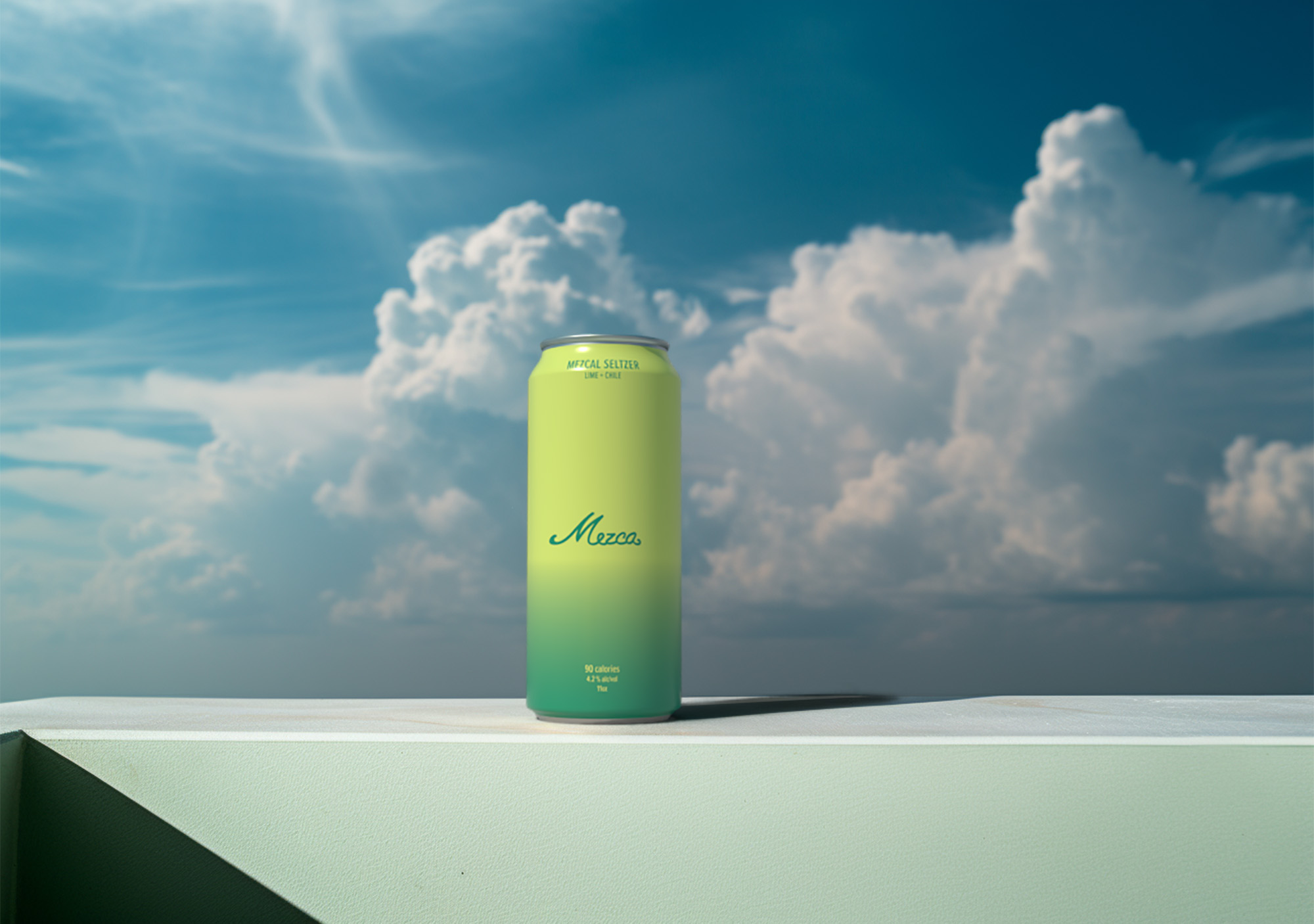
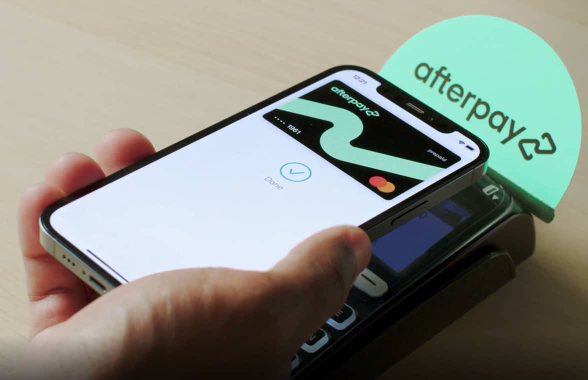
Afterpay
Merchant guidelines
Led the development of comprehensive merchant guidelines for Afterpay, defining clear standards and visual examples across digital and physical touchpoints. The system covered web banners, checkout graphics, social media assets, in-store applications, and out-of-home advertising. The guidelines translated Afterpay’s brand consistently across platforms, balancing clarity with flexibility for partners. The project established a cohesive visual framework that strengthened brand recognition and ensured continuity across customer experiences.
Afterpay
Led the development of comprehensive merchant guidelines for Afterpay, defining clear standards and visual examples across digital and physical touchpoints. The system covered web banners, checkout graphics, social media assets, in-store applications, and out-of-home advertising. The guidelines translated Afterpay’s brand consistently across platforms, balancing clarity with flexibility for partners. The project established a cohesive visual framework that strengthened brand recognition and ensured continuity across customer experiences.
Afterpay
Led the development of comprehensive merchant guidelines for Afterpay, defining clear standards and visual examples across digital and physical touchpoints. The system covered web banners, checkout graphics, social media assets, in-store applications, and out-of-home advertising. The guidelines translated Afterpay’s brand consistently across platforms, balancing clarity with flexibility for partners. The project established a cohesive visual framework that strengthened brand recognition and ensured continuity across customer experiences.
Afterpay
Led the development of comprehensive merchant guidelines for Afterpay, defining clear standards and visual examples across digital and physical touchpoints. The system covered web banners, checkout graphics, social media assets, in-store applications, and out-of-home advertising. The guidelines translated Afterpay’s brand consistently across platforms, balancing clarity with flexibility for partners. The project established a cohesive visual framework that strengthened brand recognition and ensured continuity across customer experiences.
Afterpay
Led the development of comprehensive merchant guidelines for Afterpay, defining clear standards and visual examples across digital and physical touchpoints. The system covered web banners, checkout graphics, social media assets, in-store applications, and out-of-home advertising. The guidelines translated Afterpay’s brand consistently across platforms, balancing clarity with flexibility for partners. The project established a cohesive visual framework that strengthened brand recognition and ensured continuity across customer experiences.
Afterpay
HashiCorp
HashiConf 2025
Designed the physical environment for HashiConf 2025, including the main booths, entrance structure, and a wide range of branding elements throughout the space. The work encompassed large-scale installations, hanging signs, banners, and supporting graphics, creating a clear and cohesive visual system across the conference. The design translated HashiCorp’s Beauty Works Better ethos into a physical experience that felt structured, approachable, and consistent from entry to show floor.
HashiCorp
Designed the physical environment for HashiConf 2025, including the main booths, entrance structure, and a wide range of branding elements throughout the space. The work encompassed large-scale installations, hanging signs, banners, and supporting graphics, creating a clear and cohesive visual system across the conference. The design translated HashiCorp’s Beauty Works Better ethos into a physical experience that felt structured, approachable, and consistent from entry to show floor.
HashiCorp
Designed the physical environment for HashiConf 2025, including the main booths, entrance structure, and a wide range of branding elements throughout the space. The work encompassed large-scale installations, hanging signs, banners, and supporting graphics, creating a clear and cohesive visual system across the conference. The design translated HashiCorp’s Beauty Works Better ethos into a physical experience that felt structured, approachable, and consistent from entry to show floor.
HashiCorp
Designed the physical environment for HashiConf 2025, including the main booths, entrance structure, and a wide range of branding elements throughout the space. The work encompassed large-scale installations, hanging signs, banners, and supporting graphics, creating a clear and cohesive visual system across the conference. The design translated HashiCorp’s Beauty Works Better ethos into a physical experience that felt structured, approachable, and consistent from entry to show floor.
HashiCorp
Designed the physical environment for HashiConf 2025, including the main booths, entrance structure, and a wide range of branding elements throughout the space. The work encompassed large-scale installations, hanging signs, banners, and supporting graphics, creating a clear and cohesive visual system across the conference. The design translated HashiCorp’s Beauty Works Better ethos into a physical experience that felt structured, approachable, and consistent from entry to show floor.
HashiCorp
Mezca
Brand and packaging design
Lorem Ipsum is simply dummy text of the printing and typesetting industry. Lorem Ipsum has been the industry's standard dummy text ever since the 1500s, when an unknown printer took a galley of type and scrambled it to make a type specimen
Mezca
Led the branding and packaging design for Mezca, a canned cocktail brand built around mezcal. The logo pairs a classic script with contemporary detailing, establishing a distinct and approachable identity. Packaging was developed using expressive typography and color gradients to differentiate flavors while maintaining a cohesive system. The project also included art direction for a photoshoot set in a Miami beach setting, using muted tones to introduce a youthful, relaxed energy. Together, the work shaped a visual language that feels vibrant, intentional, and grounded in the product.
Mezca
Led the branding and packaging design for Mezca, a canned cocktail brand built around mezcal. The logo pairs a classic script with contemporary detailing, establishing a distinct and approachable identity. Packaging was developed using expressive typography and color gradients to differentiate flavors while maintaining a cohesive system. The project also included art direction for a photoshoot set in a Miami beach setting, using muted tones to introduce a youthful, relaxed energy. Together, the work shaped a visual language that feels vibrant, intentional, and grounded in the product.
Mezca
Led the branding and packaging design for Mezca, a canned cocktail brand built around mezcal. The logo pairs a classic script with contemporary detailing, establishing a distinct and approachable identity. Packaging was developed using expressive typography and color gradients to differentiate flavors while maintaining a cohesive system. The project also included art direction for a photoshoot set in a Miami beach setting, using muted tones to introduce a youthful, relaxed energy. Together, the work shaped a visual language that feels vibrant, intentional, and grounded in the product.
Mezca
Bloomingdale's
From Italy With Love
As part of Bloomingdale’s From Italy With Love campaign, conceived and executed a full facade wrap for the New York flagship. Designed all visual elements, including a vibrant vinyl skin and dimensional archways inspired by Giorgio de Chirico, transforming the building into an immersive streetscape along Lexington Avenue. The project spanned concept, design, and on-site installation, extending the campaign beyond the store interior and into the city itself. The result elevated the brand’s presence, drove increased foot traffic, and generated meaningful press attention and sales impact.
Bloomingdale's
As part of Bloomingdale’s From Italy With Love campaign, conceived and executed a full facade wrap for the New York flagship. Designed all visual elements, including a vibrant vinyl skin and dimensional archways inspired by Giorgio de Chirico, transforming the building into an immersive streetscape along Lexington Avenue. The project spanned concept, design, and on-site installation, extending the campaign beyond the store interior and into the city itself. The result elevated the brand’s presence, drove increased foot traffic, and generated meaningful press attention and sales impact.
Bloomingdale's
As part of Bloomingdale’s From Italy With Love campaign, conceived and executed a full facade wrap for the New York flagship. Designed all visual elements, including a vibrant vinyl skin and dimensional archways inspired by Giorgio de Chirico, transforming the building into an immersive streetscape along Lexington Avenue. The project spanned concept, design, and on-site installation, extending the campaign beyond the store interior and into the city itself. The result elevated the brand’s presence, drove increased foot traffic, and generated meaningful press attention and sales impact.
Bloomingdale's
As part of Bloomingdale’s From Italy With Love campaign, conceived and executed a full facade wrap for the New York flagship. Designed all visual elements, including a vibrant vinyl skin and dimensional archways inspired by Giorgio de Chirico, transforming the building into an immersive streetscape along Lexington Avenue. The project spanned concept, design, and on-site installation, extending the campaign beyond the store interior and into the city itself. The result elevated the brand’s presence, drove increased foot traffic, and generated meaningful press attention and sales impact.
Bloomingdale's
As part of Bloomingdale’s From Italy With Love campaign, conceived and executed a full facade wrap for the New York flagship. Designed all visual elements, including a vibrant vinyl skin and dimensional archways inspired by Giorgio de Chirico, transforming the building into an immersive streetscape along Lexington Avenue. The project spanned concept, design, and on-site installation, extending the campaign beyond the store interior and into the city itself. The result elevated the brand’s presence, drove increased foot traffic, and generated meaningful press attention and sales impact.
Bloomingdale's
Bloomingdale's
150th Anniversary
The Bloomingdale’s 150th Campaign marked the retailer’s 150th anniversary with a celebratory, forward-looking approach. As Senior Design Manager, led graphic design and art direction for the experiential pop-up, shaping a cohesive visual language across the space. The work balanced Bloomingdale’s heritage with a contemporary sensibility, creating an immersive brand experience that extended across physical and digital touchpoints. The campaign honored the brand’s legacy while remaining relevant to both longtime customers and new audiences.
Bloomingdale's
The Bloomingdale’s 150th Campaign marked the retailer’s 150th anniversary with a celebratory, forward-looking approach. As Senior Design Manager, led graphic design and art direction for the experiential pop-up, shaping a cohesive visual language across the space. The work balanced Bloomingdale’s heritage with a contemporary sensibility, creating an immersive brand experience that extended across physical and digital touchpoints. The campaign honored the brand’s legacy while remaining relevant to both longtime customers and new audiences.
Bloomingdale's
The Bloomingdale’s 150th Campaign marked the retailer’s 150th anniversary with a celebratory, forward-looking approach. As Senior Design Manager, led graphic design and art direction for the experiential pop-up, shaping a cohesive visual language across the space. The work balanced Bloomingdale’s heritage with a contemporary sensibility, creating an immersive brand experience that extended across physical and digital touchpoints. The campaign honored the brand’s legacy while remaining relevant to both longtime customers and new audiences.
Bloomingdale's
The Bloomingdale’s 150th Campaign marked the retailer’s 150th anniversary with a celebratory, forward-looking approach. As Senior Design Manager, led graphic design and art direction for the experiential pop-up, shaping a cohesive visual language across the space. The work balanced Bloomingdale’s heritage with a contemporary sensibility, creating an immersive brand experience that extended across physical and digital touchpoints. The campaign honored the brand’s legacy while remaining relevant to both longtime customers and new audiences.
Bloomingdale's
The Bloomingdale’s 150th Campaign marked the retailer’s 150th anniversary with a celebratory, forward-looking approach. As Senior Design Manager, led graphic design and art direction for the experiential pop-up, shaping a cohesive visual language across the space. The work balanced Bloomingdale’s heritage with a contemporary sensibility, creating an immersive brand experience that extended across physical and digital touchpoints. The campaign honored the brand’s legacy while remaining relevant to both longtime customers and new audiences.
Bloomingdale's
Bloomingdale's
From Italy With Love
As part of Bloomingdale’s From Italy With Love campaign, conceived and executed a full facade wrap for the New York flagship. Designed all visual elements, including a vibrant vinyl skin and dimensional archways inspired by Giorgio de Chirico, transforming the building into an immersive streetscape along Lexington Avenue. The project spanned concept, design, and on-site installation, extending the campaign beyond the store interior and into the city itself. The result elevated the brand’s presence, drove increased foot traffic, and generated meaningful press attention and sales impact.
Bloomingdale's
As part of Bloomingdale’s From Italy With Love campaign, conceived and executed a full facade wrap for the New York flagship. Designed all visual elements, including a vibrant vinyl skin and dimensional archways inspired by Giorgio de Chirico, transforming the building into an immersive streetscape along Lexington Avenue. The project spanned concept, design, and on-site installation, extending the campaign beyond the store interior and into the city itself. The result elevated the brand’s presence, drove increased foot traffic, and generated meaningful press attention and sales impact.
Bloomingdale's
As part of Bloomingdale’s From Italy With Love campaign, conceived and executed a full facade wrap for the New York flagship. Designed all visual elements, including a vibrant vinyl skin and dimensional archways inspired by Giorgio de Chirico, transforming the building into an immersive streetscape along Lexington Avenue. The project spanned concept, design, and on-site installation, extending the campaign beyond the store interior and into the city itself. The result elevated the brand’s presence, drove increased foot traffic, and generated meaningful press attention and sales impact.
Bloomingdale's
As part of Bloomingdale’s From Italy With Love campaign, conceived and executed a full facade wrap for the New York flagship. Designed all visual elements, including a vibrant vinyl skin and dimensional archways inspired by Giorgio de Chirico, transforming the building into an immersive streetscape along Lexington Avenue. The project spanned concept, design, and on-site installation, extending the campaign beyond the store interior and into the city itself. The result elevated the brand’s presence, drove increased foot traffic, and generated meaningful press attention and sales impact.
Bloomingdale's
As part of Bloomingdale’s From Italy With Love campaign, conceived and executed a full facade wrap for the New York flagship. Designed all visual elements, including a vibrant vinyl skin and dimensional archways inspired by Giorgio de Chirico, transforming the building into an immersive streetscape along Lexington Avenue. The project spanned concept, design, and on-site installation, extending the campaign beyond the store interior and into the city itself. The result elevated the brand’s presence, drove increased foot traffic, and generated meaningful press attention and sales impact.
Bloomingdale's
.jpg)
Bloomingdale's
X Barbie
Led the art direction of an immersive pop-up shop for the Bloomingdale’s and Barbie: The Movie collaboration at the flagship store. The space reimagined Barbie’s iconic Dreamhouse within a luxury retail context, translating familiar forms and colors into a highly tactile, walk-through environment. From concept through execution, the project balanced nostalgia with polish, creating an experience that felt playful yet considered. The installation resonated in-store and across digital channels, bridging cultural iconography with Bloomingdale’s brand sensibility.
Bloomingdale's
Led the art direction of an immersive pop-up shop for the Bloomingdale’s and Barbie: The Movie collaboration at the flagship store. The space reimagined Barbie’s iconic Dreamhouse within a luxury retail context, translating familiar forms and colors into a highly tactile, walk-through environment. From concept through execution, the project balanced nostalgia with polish, creating an experience that felt playful yet considered. The installation resonated in-store and across digital channels, bridging cultural iconography with Bloomingdale’s brand sensibility.
Bloomingdale's
Led the art direction of an immersive pop-up shop for the Bloomingdale’s and Barbie: The Movie collaboration at the flagship store. The space reimagined Barbie’s iconic Dreamhouse within a luxury retail context, translating familiar forms and colors into a highly tactile, walk-through environment. From concept through execution, the project balanced nostalgia with polish, creating an experience that felt playful yet considered. The installation resonated in-store and across digital channels, bridging cultural iconography with Bloomingdale’s brand sensibility.
Bloomingdale's
Led the art direction of an immersive pop-up shop for the Bloomingdale’s and Barbie: The Movie collaboration at the flagship store. The space reimagined Barbie’s iconic Dreamhouse within a luxury retail context, translating familiar forms and colors into a highly tactile, walk-through environment. From concept through execution, the project balanced nostalgia with polish, creating an experience that felt playful yet considered. The installation resonated in-store and across digital channels, bridging cultural iconography with Bloomingdale’s brand sensibility.
Bloomingdale's
Led the art direction of an immersive pop-up shop for the Bloomingdale’s and Barbie: The Movie collaboration at the flagship store. The space reimagined Barbie’s iconic Dreamhouse within a luxury retail context, translating familiar forms and colors into a highly tactile, walk-through environment. From concept through execution, the project balanced nostalgia with polish, creating an experience that felt playful yet considered. The installation resonated in-store and across digital channels, bridging cultural iconography with Bloomingdale’s brand sensibility.
Bloomingdale's
%2034.png)
Bloomingdale's
150th Anniversary
The Bloomingdale’s 150th Campaign marked the retailer’s 150th anniversary with a celebratory, forward-looking approach. As Senior Design Manager, led graphic design and art direction for the experiential pop-up, shaping a cohesive visual language across the space. The work balanced Bloomingdale’s heritage with a contemporary sensibility, creating an immersive brand experience that extended across physical and digital touchpoints. The campaign honored the brand’s legacy while remaining relevant to both longtime customers and new audiences.
Bloomingdale's
The Bloomingdale’s 150th Campaign marked the retailer’s 150th anniversary with a celebratory, forward-looking approach. As Senior Design Manager, led graphic design and art direction for the experiential pop-up, shaping a cohesive visual language across the space. The work balanced Bloomingdale’s heritage with a contemporary sensibility, creating an immersive brand experience that extended across physical and digital touchpoints. The campaign honored the brand’s legacy while remaining relevant to both longtime customers and new audiences.
Bloomingdale's
The Bloomingdale’s 150th Campaign marked the retailer’s 150th anniversary with a celebratory, forward-looking approach. As Senior Design Manager, led graphic design and art direction for the experiential pop-up, shaping a cohesive visual language across the space. The work balanced Bloomingdale’s heritage with a contemporary sensibility, creating an immersive brand experience that extended across physical and digital touchpoints. The campaign honored the brand’s legacy while remaining relevant to both longtime customers and new audiences.
Bloomingdale's
The Bloomingdale’s 150th Campaign marked the retailer’s 150th anniversary with a celebratory, forward-looking approach. As Senior Design Manager, led graphic design and art direction for the experiential pop-up, shaping a cohesive visual language across the space. The work balanced Bloomingdale’s heritage with a contemporary sensibility, creating an immersive brand experience that extended across physical and digital touchpoints. The campaign honored the brand’s legacy while remaining relevant to both longtime customers and new audiences.
Bloomingdale's
The Bloomingdale’s 150th Campaign marked the retailer’s 150th anniversary with a celebratory, forward-looking approach. As Senior Design Manager, led graphic design and art direction for the experiential pop-up, shaping a cohesive visual language across the space. The work balanced Bloomingdale’s heritage with a contemporary sensibility, creating an immersive brand experience that extended across physical and digital touchpoints. The campaign honored the brand’s legacy while remaining relevant to both longtime customers and new audiences.
Bloomingdale's
Solana
Brand, web, and packaging design
As Founder and Creative Director, led the complete creative direction for Solana, a contemporary jewelry brand. Oversaw brand identity, website design, campaign art direction, imagery, and packaging, shaping a cohesive visual system across all touchpoints. The work focused on building a clear, refined brand language that feels expressive and modern while remaining grounded in craftsmanship and authenticity.
Solana
As Founder and Creative Director, led the complete creative direction for Solana, a contemporary jewelry brand. Oversaw brand identity, website design, campaign art direction, imagery, and packaging, shaping a cohesive visual system across all touchpoints. The work focused on building a clear, refined brand language that feels expressive and modern while remaining grounded in craftsmanship and authenticity.
Solana
Michael Kors
Galeries Lafayette popup
As design consultant, led the concept and design of the Jetsetter Activation for Michael Kors, blending retro-futurism and luxury with references to Eero Saarinen and Hajime Sorayama. The centerpiece was a life-sized chrome jet fuselage that merged mid-century forms with a distinctly futuristic finish. The project moved from hand sketches to detailed 3D renderings, which were presented to senior leadership. The final concept translated abstract references into a clear, high-impact environment designed to elevate the brand through spectacle and precision.
Michael Kors
As design consultant, led the concept and design of the Jetsetter Activation for Michael Kors, blending retro-futurism and luxury with references to Eero Saarinen and Hajime Sorayama. The centerpiece was a life-sized chrome jet fuselage that merged mid-century forms with a distinctly futuristic finish. The project moved from hand sketches to detailed 3D renderings, which were presented to senior leadership. The final concept translated abstract references into a clear, high-impact environment designed to elevate the brand through spectacle and precision.
Michael Kors
As design consultant, led the concept and design of the Jetsetter Activation for Michael Kors, blending retro-futurism and luxury with references to Eero Saarinen and Hajime Sorayama. The centerpiece was a life-sized chrome jet fuselage that merged mid-century forms with a distinctly futuristic finish. The project moved from hand sketches to detailed 3D renderings, which were presented to senior leadership. The final concept translated abstract references into a clear, high-impact environment designed to elevate the brand through spectacle and precision.
Michael Kors
Mt. St. Helens Vietnam Band
Promotional photoshoot
Served as art director, photographer, and stylist for a promotional photoshoot supporting the Mt. St. Helens Vietnam Band album release. All wardrobe elements were sourced from the band’s personal collection, grounding the imagery in authenticity and the artists’ own visual identity.
Mt. St. Helens Vietnam Band
Served as art director, photographer, and stylist for a promotional photoshoot supporting the Mt. St. Helens Vietnam Band album release. All wardrobe elements were sourced from the band’s personal collection, grounding the imagery in authenticity and the artists’ own visual identity.
Mt. St. Helens Vietnam Band
Served as art director, photographer, and stylist for a promotional photoshoot supporting the Mt. St. Helens Vietnam Band album release. All wardrobe elements were sourced from the band’s personal collection, grounding the imagery in authenticity and the artists’ own visual identity.
Mt. St. Helens Vietnam Band
Served as art director, photographer, and stylist for a promotional photoshoot supporting the Mt. St. Helens Vietnam Band album release. All wardrobe elements were sourced from the band’s personal collection, grounding the imagery in authenticity and the artists’ own visual identity.
Mt. St. Helens Vietnam Band
Served as art director, photographer, and stylist for a promotional photoshoot supporting the Mt. St. Helens Vietnam Band album release. All wardrobe elements were sourced from the band’s personal collection, grounding the imagery in authenticity and the artists’ own visual identity.
Mt. St. Helens Vietnam Band
HashiCorp
HashiConf 2025
Designed the physical environment for HashiConf 2025, including the main booths, entrance structure, and a wide range of branding elements throughout the space. The work encompassed large-scale installations, hanging signs, banners, and supporting graphics, creating a clear and cohesive visual system across the conference. The design translated HashiCorp’s Beauty Works Better ethos into a physical experience that felt structured, approachable, and consistent from entry to show floor.
HashiCorp
Designed the physical environment for HashiConf 2025, including the main booths, entrance structure, and a wide range of branding elements throughout the space. The work encompassed large-scale installations, hanging signs, banners, and supporting graphics, creating a clear and cohesive visual system across the conference. The design translated HashiCorp’s Beauty Works Better ethos into a physical experience that felt structured, approachable, and consistent from entry to show floor.
HashiCorp
Designed the physical environment for HashiConf 2025, including the main booths, entrance structure, and a wide range of branding elements throughout the space. The work encompassed large-scale installations, hanging signs, banners, and supporting graphics, creating a clear and cohesive visual system across the conference. The design translated HashiCorp’s Beauty Works Better ethos into a physical experience that felt structured, approachable, and consistent from entry to show floor.
HashiCorp
Designed the physical environment for HashiConf 2025, including the main booths, entrance structure, and a wide range of branding elements throughout the space. The work encompassed large-scale installations, hanging signs, banners, and supporting graphics, creating a clear and cohesive visual system across the conference. The design translated HashiCorp’s Beauty Works Better ethos into a physical experience that felt structured, approachable, and consistent from entry to show floor.
HashiCorp
Designed the physical environment for HashiConf 2025, including the main booths, entrance structure, and a wide range of branding elements throughout the space. The work encompassed large-scale installations, hanging signs, banners, and supporting graphics, creating a clear and cohesive visual system across the conference. The design translated HashiCorp’s Beauty Works Better ethos into a physical experience that felt structured, approachable, and consistent from entry to show floor.
HashiCorp
Solana
Brand, web, and packaging design
As Founder and Creative Director, led the complete creative direction for Solana, a contemporary jewelry brand. Oversaw brand identity, website design, campaign art direction, imagery, and packaging, shaping a cohesive visual system across all touchpoints. The work focused on building a clear, refined brand language that feels expressive and modern while remaining grounded in craftsmanship and authenticity.
Solana
As Founder and Creative Director, led the complete creative direction for Solana, a contemporary jewelry brand. Oversaw brand identity, website design, campaign art direction, imagery, and packaging, shaping a cohesive visual system across all touchpoints. The work focused on building a clear, refined brand language that feels expressive and modern while remaining grounded in craftsmanship and authenticity.
Solana
As Founder and Creative Director, led the complete creative direction for Solana, a contemporary jewelry brand. Oversaw brand identity, website design, campaign art direction, imagery, and packaging, shaping a cohesive visual system across all touchpoints. The work focused on building a clear, refined brand language that feels expressive and modern while remaining grounded in craftsmanship and authenticity.
Solana
As Founder and Creative Director, led the complete creative direction for Solana, a contemporary jewelry brand. Oversaw brand identity, website design, campaign art direction, imagery, and packaging, shaping a cohesive visual system across all touchpoints. The work focused on building a clear, refined brand language that feels expressive and modern while remaining grounded in craftsmanship and authenticity.
Solana
As Founder and Creative Director, led the complete creative direction for Solana, a contemporary jewelry brand. Oversaw brand identity, website design, campaign art direction, imagery, and packaging, shaping a cohesive visual system across all touchpoints. The work focused on building a clear, refined brand language that feels expressive and modern while remaining grounded in craftsmanship and authenticity.
Solana
Rabbits
Test shoot
Art directed a personal test shoot centered on a handmade papier-mâché mask. Created as an exploratory project, it remains one of my favorite studies.
Rabbits
Art directed a personal test shoot centered on a handmade papier-mâché mask. Created as an exploratory project, it remains one of my favorite studies.
Rabbits
Art directed a personal test shoot centered on a handmade papier-mâché mask. Created as an exploratory project, it remains one of my favorite studies.
Rabbits
Art directed a personal test shoot centered on a handmade papier-mâché mask. Created as an exploratory project, it remains one of my favorite studies.
Rabbits
Bloomingdale's
X Barbie
Led the art direction of an immersive pop-up shop for the Bloomingdale’s and Barbie: The Movie collaboration at the flagship store. The space reimagined Barbie’s iconic Dreamhouse within a luxury retail context, translating familiar forms and colors into a highly tactile, walk-through environment. From concept through execution, the project balanced nostalgia with polish, creating an experience that felt playful yet considered. The installation resonated in-store and across digital channels, bridging cultural iconography with Bloomingdale’s brand sensibility.
Bloomingdale's
Led the art direction of an immersive pop-up shop for the Bloomingdale’s and Barbie: The Movie collaboration at the flagship store. The space reimagined Barbie’s iconic Dreamhouse within a luxury retail context, translating familiar forms and colors into a highly tactile, walk-through environment. From concept through execution, the project balanced nostalgia with polish, creating an experience that felt playful yet considered. The installation resonated in-store and across digital channels, bridging cultural iconography with Bloomingdale’s brand sensibility.
Bloomingdale's
Led the art direction of an immersive pop-up shop for the Bloomingdale’s and Barbie: The Movie collaboration at the flagship store. The space reimagined Barbie’s iconic Dreamhouse within a luxury retail context, translating familiar forms and colors into a highly tactile, walk-through environment. From concept through execution, the project balanced nostalgia with polish, creating an experience that felt playful yet considered. The installation resonated in-store and across digital channels, bridging cultural iconography with Bloomingdale’s brand sensibility.
Bloomingdale's
Led the art direction of an immersive pop-up shop for the Bloomingdale’s and Barbie: The Movie collaboration at the flagship store. The space reimagined Barbie’s iconic Dreamhouse within a luxury retail context, translating familiar forms and colors into a highly tactile, walk-through environment. From concept through execution, the project balanced nostalgia with polish, creating an experience that felt playful yet considered. The installation resonated in-store and across digital channels, bridging cultural iconography with Bloomingdale’s brand sensibility.
Bloomingdale's
Led the art direction of an immersive pop-up shop for the Bloomingdale’s and Barbie: The Movie collaboration at the flagship store. The space reimagined Barbie’s iconic Dreamhouse within a luxury retail context, translating familiar forms and colors into a highly tactile, walk-through environment. From concept through execution, the project balanced nostalgia with polish, creating an experience that felt playful yet considered. The installation resonated in-store and across digital channels, bridging cultural iconography with Bloomingdale’s brand sensibility.
Bloomingdale's
No Place
Brand and web design
No Place is a Web3 hospitality platform rethinking short-term stays through an on-chain membership model. Access to locations and amenities is granted via a unique NFT that functions as a digital membership card, merging hospitality with blockchain-native infrastructure. The website was designed to be simple and modern, with visual cues that subtly signal Web3 without overwhelming the experience. Working closely with the client, I translated their vision into a clear, intuitive interface that balances emerging technology with approachability and reflects the brand’s forward-looking ethos.
No Place
Rabbits
Test shoot
Art directed a personal test shoot centered on a handmade papier-mâché mask. Created as an exploratory project, it remains one of my favorite studies.
Rabbits
Art directed a personal test shoot centered on a handmade papier-mâché mask. Created as an exploratory project, it remains one of my favorite studies.
Rabbits
Art directed a personal test shoot centered on a handmade papier-mâché mask. Created as an exploratory project, it remains one of my favorite studies.
Rabbits
Art directed a personal test shoot centered on a handmade papier-mâché mask. Created as an exploratory project, it remains one of my favorite studies.
Rabbits
Mezca
Brand and packaging design
Led the branding and packaging design for Mezca, a canned cocktail brand built around mezcal. The logo pairs a classic script with contemporary detailing, establishing a distinct and approachable identity. Packaging was developed using expressive typography and color gradients to differentiate flavors while maintaining a cohesive system. The project also included art direction for a photoshoot set in a Miami beach setting, using muted tones to introduce a youthful, relaxed energy. Together, the work shaped a visual language that feels vibrant, intentional, and grounded in the product.
Mezca
Solana
Brand, web, and packaging design
As Founder and Creative Director, led the complete creative direction for Solana, a contemporary jewelry brand. Oversaw brand identity, website design, campaign art direction, imagery, and packaging, shaping a cohesive visual system across all touchpoints. The work focused on building a clear, refined brand language that feels expressive and modern while remaining grounded in craftsmanship and authenticity.
Solana
As Founder and Creative Director, led the complete creative direction for Solana, a contemporary jewelry brand. Oversaw brand identity, website design, campaign art direction, imagery, and packaging, shaping a cohesive visual system across all touchpoints. The work focused on building a clear, refined brand language that feels expressive and modern while remaining grounded in craftsmanship and authenticity.
Solana
As Founder and Creative Director, led the complete creative direction for Solana, a contemporary jewelry brand. Oversaw brand identity, website design, campaign art direction, imagery, and packaging, shaping a cohesive visual system across all touchpoints. The work focused on building a clear, refined brand language that feels expressive and modern while remaining grounded in craftsmanship and authenticity.
Solana
As Founder and Creative Director, led the complete creative direction for Solana, a contemporary jewelry brand. Oversaw brand identity, website design, campaign art direction, imagery, and packaging, shaping a cohesive visual system across all touchpoints. The work focused on building a clear, refined brand language that feels expressive and modern while remaining grounded in craftsmanship and authenticity.
Solana
As Founder and Creative Director, led the complete creative direction for Solana, a contemporary jewelry brand. Oversaw brand identity, website design, campaign art direction, imagery, and packaging, shaping a cohesive visual system across all touchpoints. The work focused on building a clear, refined brand language that feels expressive and modern while remaining grounded in craftsmanship and authenticity.
Solana
HashiCorp
AWS re:Invent 2025
Designed and art directed a full-scale experiential booth for AWS re:Invent 2025, translating the brand’s core ideas of infrastructure, cloud, and automation into a physical environment. The centerpiece was a suspended overhead structure built from LED scaffolding and wrapped in sheer, stretched fabric, creating a layered, luminous form that shifted between solid and immaterial. The space featured interactive activations, including a functioning screen constructed from LED keyboards and a curated collection of vintage IBM computers that attendees could actively use, connecting the history of computing to its present and future. The project extended beyond the convention floor with a series of out-of-home advertisements placed throughout the Las Vegas Strip, creating a cohesive presence across the city.
HashiCorp
Designed and art directed a full-scale experiential booth for AWS re:Invent 2025, translating the brand’s core ideas of infrastructure, cloud, and automation into a physical environment. The centerpiece was a suspended overhead structure built from LED scaffolding and wrapped in sheer, stretched fabric, creating a layered, luminous form that shifted between solid and immaterial. The space featured interactive activations, including a functioning screen constructed from LED keyboards and a curated collection of vintage IBM computers that attendees could actively use, connecting the history of computing to its present and future. The project extended beyond the convention floor with a series of out-of-home advertisements placed throughout the Las Vegas Strip, creating a cohesive presence across the city.
HashiCorp
Designed and art directed a full-scale experiential booth for AWS re:Invent 2025, translating the brand’s core ideas of infrastructure, cloud, and automation into a physical environment. The centerpiece was a suspended overhead structure built from LED scaffolding and wrapped in sheer, stretched fabric, creating a layered, luminous form that shifted between solid and immaterial. The space featured interactive activations, including a functioning screen constructed from LED keyboards and a curated collection of vintage IBM computers that attendees could actively use, connecting the history of computing to its present and future. The project extended beyond the convention floor with a series of out-of-home advertisements placed throughout the Las Vegas Strip, creating a cohesive presence across the city.
HashiCorp
Designed and art directed a full-scale experiential booth for AWS re:Invent 2025, translating the brand’s core ideas of infrastructure, cloud, and automation into a physical environment. The centerpiece was a suspended overhead structure built from LED scaffolding and wrapped in sheer, stretched fabric, creating a layered, luminous form that shifted between solid and immaterial. The space featured interactive activations, including a functioning screen constructed from LED keyboards and a curated collection of vintage IBM computers that attendees could actively use, connecting the history of computing to its present and future. The project extended beyond the convention floor with a series of out-of-home advertisements placed throughout the Las Vegas Strip, creating a cohesive presence across the city.
HashiCorp
Designed and art directed a full-scale experiential booth for AWS re:Invent 2025, translating the brand’s core ideas of infrastructure, cloud, and automation into a physical environment. The centerpiece was a suspended overhead structure built from LED scaffolding and wrapped in sheer, stretched fabric, creating a layered, luminous form that shifted between solid and immaterial. The space featured interactive activations, including a functioning screen constructed from LED keyboards and a curated collection of vintage IBM computers that attendees could actively use, connecting the history of computing to its present and future. The project extended beyond the convention floor with a series of out-of-home advertisements placed throughout the Las Vegas Strip, creating a cohesive presence across the city.
HashiCorp

Bloomingdale's
From Italy With Love
As part of Bloomingdale’s From Italy With Love campaign, conceived and executed a full facade wrap for the New York flagship. Designed all visual elements, including a vibrant vinyl skin and dimensional archways inspired by Giorgio de Chirico, transforming the building into an immersive streetscape along Lexington Avenue. The project spanned concept, design, and on-site installation, extending the campaign beyond the store interior and into the city itself. The result elevated the brand’s presence, drove increased foot traffic, and generated meaningful press attention and sales impact.
Bloomingdale's
As part of Bloomingdale’s From Italy With Love campaign, conceived and executed a full facade wrap for the New York flagship. Designed all visual elements, including a vibrant vinyl skin and dimensional archways inspired by Giorgio de Chirico, transforming the building into an immersive streetscape along Lexington Avenue. The project spanned concept, design, and on-site installation, extending the campaign beyond the store interior and into the city itself. The result elevated the brand’s presence, drove increased foot traffic, and generated meaningful press attention and sales impact.
Bloomingdale's
As part of Bloomingdale’s From Italy With Love campaign, conceived and executed a full facade wrap for the New York flagship. Designed all visual elements, including a vibrant vinyl skin and dimensional archways inspired by Giorgio de Chirico, transforming the building into an immersive streetscape along Lexington Avenue. The project spanned concept, design, and on-site installation, extending the campaign beyond the store interior and into the city itself. The result elevated the brand’s presence, drove increased foot traffic, and generated meaningful press attention and sales impact.
Bloomingdale's
As part of Bloomingdale’s From Italy With Love campaign, conceived and executed a full facade wrap for the New York flagship. Designed all visual elements, including a vibrant vinyl skin and dimensional archways inspired by Giorgio de Chirico, transforming the building into an immersive streetscape along Lexington Avenue. The project spanned concept, design, and on-site installation, extending the campaign beyond the store interior and into the city itself. The result elevated the brand’s presence, drove increased foot traffic, and generated meaningful press attention and sales impact.
Bloomingdale's
As part of Bloomingdale’s From Italy With Love campaign, conceived and executed a full facade wrap for the New York flagship. Designed all visual elements, including a vibrant vinyl skin and dimensional archways inspired by Giorgio de Chirico, transforming the building into an immersive streetscape along Lexington Avenue. The project spanned concept, design, and on-site installation, extending the campaign beyond the store interior and into the city itself. The result elevated the brand’s presence, drove increased foot traffic, and generated meaningful press attention and sales impact.
Bloomingdale's
.jpg)
Bloomingdale's
X Barbie
Led the art direction of an immersive pop-up shop for the Bloomingdale’s and Barbie: The Movie collaboration at the flagship store. The space reimagined Barbie’s iconic Dreamhouse within a luxury retail context, translating familiar forms and colors into a highly tactile, walk-through environment. From concept through execution, the project balanced nostalgia with polish, creating an experience that felt playful yet considered. The installation resonated in-store and across digital channels, bridging cultural iconography with Bloomingdale’s brand sensibility.
Bloomingdale's
Led the art direction of an immersive pop-up shop for the Bloomingdale’s and Barbie: The Movie collaboration at the flagship store. The space reimagined Barbie’s iconic Dreamhouse within a luxury retail context, translating familiar forms and colors into a highly tactile, walk-through environment. From concept through execution, the project balanced nostalgia with polish, creating an experience that felt playful yet considered. The installation resonated in-store and across digital channels, bridging cultural iconography with Bloomingdale’s brand sensibility.
Bloomingdale's
Led the art direction of an immersive pop-up shop for the Bloomingdale’s and Barbie: The Movie collaboration at the flagship store. The space reimagined Barbie’s iconic Dreamhouse within a luxury retail context, translating familiar forms and colors into a highly tactile, walk-through environment. From concept through execution, the project balanced nostalgia with polish, creating an experience that felt playful yet considered. The installation resonated in-store and across digital channels, bridging cultural iconography with Bloomingdale’s brand sensibility.
Bloomingdale's
Led the art direction of an immersive pop-up shop for the Bloomingdale’s and Barbie: The Movie collaboration at the flagship store. The space reimagined Barbie’s iconic Dreamhouse within a luxury retail context, translating familiar forms and colors into a highly tactile, walk-through environment. From concept through execution, the project balanced nostalgia with polish, creating an experience that felt playful yet considered. The installation resonated in-store and across digital channels, bridging cultural iconography with Bloomingdale’s brand sensibility.
Bloomingdale's
Led the art direction of an immersive pop-up shop for the Bloomingdale’s and Barbie: The Movie collaboration at the flagship store. The space reimagined Barbie’s iconic Dreamhouse within a luxury retail context, translating familiar forms and colors into a highly tactile, walk-through environment. From concept through execution, the project balanced nostalgia with polish, creating an experience that felt playful yet considered. The installation resonated in-store and across digital channels, bridging cultural iconography with Bloomingdale’s brand sensibility.
Bloomingdale's

Afterpay
Merchant guidelines
Led the development of comprehensive merchant guidelines for Afterpay, defining clear standards and visual examples across digital and physical touchpoints. The system covered web banners, checkout graphics, social media assets, in-store applications, and out-of-home advertising. The guidelines translated Afterpay’s brand consistently across platforms, balancing clarity with flexibility for partners. The project established a cohesive visual framework that strengthened brand recognition and ensured continuity across customer experiences.
Afterpay
Led the development of comprehensive merchant guidelines for Afterpay, defining clear standards and visual examples across digital and physical touchpoints. The system covered web banners, checkout graphics, social media assets, in-store applications, and out-of-home advertising. The guidelines translated Afterpay’s brand consistently across platforms, balancing clarity with flexibility for partners. The project established a cohesive visual framework that strengthened brand recognition and ensured continuity across customer experiences.
Afterpay
Led the development of comprehensive merchant guidelines for Afterpay, defining clear standards and visual examples across digital and physical touchpoints. The system covered web banners, checkout graphics, social media assets, in-store applications, and out-of-home advertising. The guidelines translated Afterpay’s brand consistently across platforms, balancing clarity with flexibility for partners. The project established a cohesive visual framework that strengthened brand recognition and ensured continuity across customer experiences.
Afterpay
Led the development of comprehensive merchant guidelines for Afterpay, defining clear standards and visual examples across digital and physical touchpoints. The system covered web banners, checkout graphics, social media assets, in-store applications, and out-of-home advertising. The guidelines translated Afterpay’s brand consistently across platforms, balancing clarity with flexibility for partners. The project established a cohesive visual framework that strengthened brand recognition and ensured continuity across customer experiences.
Afterpay
Led the development of comprehensive merchant guidelines for Afterpay, defining clear standards and visual examples across digital and physical touchpoints. The system covered web banners, checkout graphics, social media assets, in-store applications, and out-of-home advertising. The guidelines translated Afterpay’s brand consistently across platforms, balancing clarity with flexibility for partners. The project established a cohesive visual framework that strengthened brand recognition and ensured continuity across customer experiences.
Afterpay
No Place
Brand and web design
No Place is a Web3 hospitality platform rethinking short-term stays through an on-chain membership model. Access to locations and amenities is granted via a unique NFT that functions as a digital membership card, merging hospitality with blockchain-native infrastructure. The website was designed to be simple and modern, with visual cues that subtly signal Web3 without overwhelming the experience. Working closely with the client, I translated their vision into a clear, intuitive interface that balances emerging technology with approachability and reflects the brand’s forward-looking ethos.
No Place
No Place is a Web3 hospitality platform rethinking short-term stays through an on-chain membership model. Access to locations and amenities is granted via a unique NFT that functions as a digital membership card, merging hospitality with blockchain-native infrastructure. The website was designed to be simple and modern, with visual cues that subtly signal Web3 without overwhelming the experience. Working closely with the client, I translated their vision into a clear, intuitive interface that balances emerging technology with approachability and reflects the brand’s forward-looking ethos.
No Place
No Place is a Web3 hospitality platform rethinking short-term stays through an on-chain membership model. Access to locations and amenities is granted via a unique NFT that functions as a digital membership card, merging hospitality with blockchain-native infrastructure. The website was designed to be simple and modern, with visual cues that subtly signal Web3 without overwhelming the experience. Working closely with the client, I translated their vision into a clear, intuitive interface that balances emerging technology with approachability and reflects the brand’s forward-looking ethos.
No Place
No Place is a Web3 hospitality platform rethinking short-term stays through an on-chain membership model. Access to locations and amenities is granted via a unique NFT that functions as a digital membership card, merging hospitality with blockchain-native infrastructure. The website was designed to be simple and modern, with visual cues that subtly signal Web3 without overwhelming the experience. Working closely with the client, I translated their vision into a clear, intuitive interface that balances emerging technology with approachability and reflects the brand’s forward-looking ethos.
No Place
No Place
Brand and web design
No Place is a Web3 hospitality platform rethinking short-term stays through an on-chain membership model. Access to locations and amenities is granted via a unique NFT that functions as a digital membership card, merging hospitality with blockchain-native infrastructure. The website was designed to be simple and modern, with visual cues that subtly signal Web3 without overwhelming the experience. Working closely with the client, I translated their vision into a clear, intuitive interface that balances emerging technology with approachability and reflects the brand’s forward-looking ethos.
No Place
No Place is a Web3 hospitality platform rethinking short-term stays through an on-chain membership model. Access to locations and amenities is granted via a unique NFT that functions as a digital membership card, merging hospitality with blockchain-native infrastructure. The website was designed to be simple and modern, with visual cues that subtly signal Web3 without overwhelming the experience. Working closely with the client, I translated their vision into a clear, intuitive interface that balances emerging technology with approachability and reflects the brand’s forward-looking ethos.
No Place
No Place is a Web3 hospitality platform rethinking short-term stays through an on-chain membership model. Access to locations and amenities is granted via a unique NFT that functions as a digital membership card, merging hospitality with blockchain-native infrastructure. The website was designed to be simple and modern, with visual cues that subtly signal Web3 without overwhelming the experience. Working closely with the client, I translated their vision into a clear, intuitive interface that balances emerging technology with approachability and reflects the brand’s forward-looking ethos.
No Place
No Place is a Web3 hospitality platform rethinking short-term stays through an on-chain membership model. Access to locations and amenities is granted via a unique NFT that functions as a digital membership card, merging hospitality with blockchain-native infrastructure. The website was designed to be simple and modern, with visual cues that subtly signal Web3 without overwhelming the experience. Working closely with the client, I translated their vision into a clear, intuitive interface that balances emerging technology with approachability and reflects the brand’s forward-looking ethos.
No Place
No Place is a Web3 hospitality platform rethinking short-term stays through an on-chain membership model. Access to locations and amenities is granted via a unique NFT that functions as a digital membership card, merging hospitality with blockchain-native infrastructure. The website was designed to be simple and modern, with visual cues that subtly signal Web3 without overwhelming the experience. Working closely with the client, I translated their vision into a clear, intuitive interface that balances emerging technology with approachability and reflects the brand’s forward-looking ethos.
No Place
Saks Fifth Avenue
Iconic Beauty windows
Designed window displays for the Saks Iconic Beauty celebration, highlighting the retailer’s most influential luxury beauty and fragrance brands. Drawing inspiration from the light-based installations of James Turrell, each brand was invited to select a single color and define a silhouette of its most recognizable product. The resulting windows balanced light, shadow, and color to create a bold yet restrained visual language that felt both immersive and precise, celebrating individual brand identities while maintaining a cohesive presence across the facade.
Saks Fifth Avenue
Designed window displays for the Saks Iconic Beauty celebration, highlighting the retailer’s most influential luxury beauty and fragrance brands. Drawing inspiration from the light-based installations of James Turrell, each brand was invited to select a single color and define a silhouette of its most recognizable product. The resulting windows balanced light, shadow, and color to create a bold yet restrained visual language that felt both immersive and precise, celebrating individual brand identities while maintaining a cohesive presence across the facade.
Saks Fifth Avenue
Designed window displays for the Saks Iconic Beauty celebration, highlighting the retailer’s most influential luxury beauty and fragrance brands. Drawing inspiration from the light-based installations of James Turrell, each brand was invited to select a single color and define a silhouette of its most recognizable product. The resulting windows balanced light, shadow, and color to create a bold yet restrained visual language that felt both immersive and precise, celebrating individual brand identities while maintaining a cohesive presence across the facade.
Saks Fifth Avenue
Designed window displays for the Saks Iconic Beauty celebration, highlighting the retailer’s most influential luxury beauty and fragrance brands. Drawing inspiration from the light-based installations of James Turrell, each brand was invited to select a single color and define a silhouette of its most recognizable product. The resulting windows balanced light, shadow, and color to create a bold yet restrained visual language that felt both immersive and precise, celebrating individual brand identities while maintaining a cohesive presence across the facade.
Saks Fifth Avenue
Designed window displays for the Saks Iconic Beauty celebration, highlighting the retailer’s most influential luxury beauty and fragrance brands. Drawing inspiration from the light-based installations of James Turrell, each brand was invited to select a single color and define a silhouette of its most recognizable product. The resulting windows balanced light, shadow, and color to create a bold yet restrained visual language that felt both immersive and precise, celebrating individual brand identities while maintaining a cohesive presence across the facade.
Saks Fifth Avenue
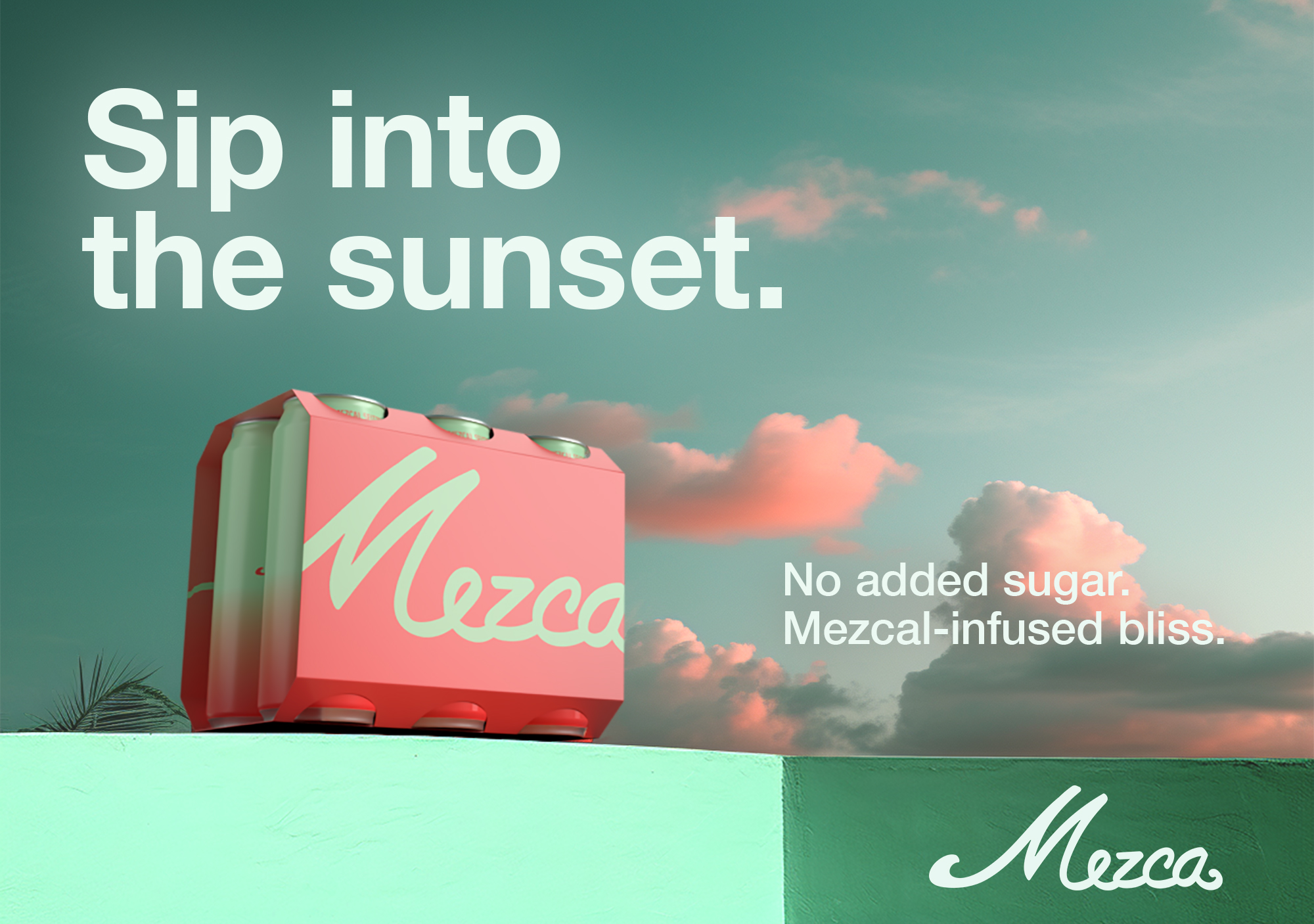
Mezca
Brand and packaging design
Lorem Ipsum is simply dummy text of the printing and typesetting industry. Lorem Ipsum has been the industry's standard dummy text ever since the 1500s, when an unknown printer took a galley of type and scrambled it to make a type specimen
Mezca
Led the branding and packaging design for Mezca, a canned cocktail brand built around mezcal. The logo pairs a classic script with contemporary detailing, establishing a distinct and approachable identity. Packaging was developed using expressive typography and color gradients to differentiate flavors while maintaining a cohesive system. The project also included art direction for a photoshoot set in a Miami beach setting, using muted tones to introduce a youthful, relaxed energy. Together, the work shaped a visual language that feels vibrant, intentional, and grounded in the product.
Mezca
Led the branding and packaging design for Mezca, a canned cocktail brand built around mezcal. The logo pairs a classic script with contemporary detailing, establishing a distinct and approachable identity. Packaging was developed using expressive typography and color gradients to differentiate flavors while maintaining a cohesive system. The project also included art direction for a photoshoot set in a Miami beach setting, using muted tones to introduce a youthful, relaxed energy. Together, the work shaped a visual language that feels vibrant, intentional, and grounded in the product.
Mezca
Led the branding and packaging design for Mezca, a canned cocktail brand built around mezcal. The logo pairs a classic script with contemporary detailing, establishing a distinct and approachable identity. Packaging was developed using expressive typography and color gradients to differentiate flavors while maintaining a cohesive system. The project also included art direction for a photoshoot set in a Miami beach setting, using muted tones to introduce a youthful, relaxed energy. Together, the work shaped a visual language that feels vibrant, intentional, and grounded in the product.
Mezca
Led the branding and packaging design for Mezca, a canned cocktail brand built around mezcal. The logo pairs a classic script with contemporary detailing, establishing a distinct and approachable identity. Packaging was developed using expressive typography and color gradients to differentiate flavors while maintaining a cohesive system. The project also included art direction for a photoshoot set in a Miami beach setting, using muted tones to introduce a youthful, relaxed energy. Together, the work shaped a visual language that feels vibrant, intentional, and grounded in the product.
Mezca
Saks Fifth Avenue
Iconic Beauty windows
Designed window displays for the Saks Iconic Beauty celebration, highlighting the retailer’s most influential luxury beauty and fragrance brands. Drawing inspiration from the light-based installations of James Turrell, each brand was invited to select a single color and define a silhouette of its most recognizable product. The resulting windows balanced light, shadow, and color to create a bold yet restrained visual language that felt both immersive and precise, celebrating individual brand identities while maintaining a cohesive presence across the facade.
Saks Fifth Avenue
Designed window displays for the Saks Iconic Beauty celebration, highlighting the retailer’s most influential luxury beauty and fragrance brands. Drawing inspiration from the light-based installations of James Turrell, each brand was invited to select a single color and define a silhouette of its most recognizable product. The resulting windows balanced light, shadow, and color to create a bold yet restrained visual language that felt both immersive and precise, celebrating individual brand identities while maintaining a cohesive presence across the facade.
Saks Fifth Avenue
Designed window displays for the Saks Iconic Beauty celebration, highlighting the retailer’s most influential luxury beauty and fragrance brands. Drawing inspiration from the light-based installations of James Turrell, each brand was invited to select a single color and define a silhouette of its most recognizable product. The resulting windows balanced light, shadow, and color to create a bold yet restrained visual language that felt both immersive and precise, celebrating individual brand identities while maintaining a cohesive presence across the facade.
Saks Fifth Avenue
Designed window displays for the Saks Iconic Beauty celebration, highlighting the retailer’s most influential luxury beauty and fragrance brands. Drawing inspiration from the light-based installations of James Turrell, each brand was invited to select a single color and define a silhouette of its most recognizable product. The resulting windows balanced light, shadow, and color to create a bold yet restrained visual language that felt both immersive and precise, celebrating individual brand identities while maintaining a cohesive presence across the facade.
Saks Fifth Avenue
Designed window displays for the Saks Iconic Beauty celebration, highlighting the retailer’s most influential luxury beauty and fragrance brands. Drawing inspiration from the light-based installations of James Turrell, each brand was invited to select a single color and define a silhouette of its most recognizable product. The resulting windows balanced light, shadow, and color to create a bold yet restrained visual language that felt both immersive and precise, celebrating individual brand identities while maintaining a cohesive presence across the facade.
Saks Fifth Avenue
Bloomingdale's
X Barbie
Led the art direction of an immersive pop-up shop for the Bloomingdale’s and Barbie: The Movie collaboration at the flagship store. The space reimagined Barbie’s iconic Dreamhouse within a luxury retail context, translating familiar forms and colors into a highly tactile, walk-through environment. From concept through execution, the project balanced nostalgia with polish, creating an experience that felt playful yet considered. The installation resonated in-store and across digital channels, bridging cultural iconography with Bloomingdale’s brand sensibility.
Bloomingdale's
Led the art direction of an immersive pop-up shop for the Bloomingdale’s and Barbie: The Movie collaboration at the flagship store. The space reimagined Barbie’s iconic Dreamhouse within a luxury retail context, translating familiar forms and colors into a highly tactile, walk-through environment. From concept through execution, the project balanced nostalgia with polish, creating an experience that felt playful yet considered. The installation resonated in-store and across digital channels, bridging cultural iconography with Bloomingdale’s brand sensibility.
Bloomingdale's
Led the art direction of an immersive pop-up shop for the Bloomingdale’s and Barbie: The Movie collaboration at the flagship store. The space reimagined Barbie’s iconic Dreamhouse within a luxury retail context, translating familiar forms and colors into a highly tactile, walk-through environment. From concept through execution, the project balanced nostalgia with polish, creating an experience that felt playful yet considered. The installation resonated in-store and across digital channels, bridging cultural iconography with Bloomingdale’s brand sensibility.
Bloomingdale's
Led the art direction of an immersive pop-up shop for the Bloomingdale’s and Barbie: The Movie collaboration at the flagship store. The space reimagined Barbie’s iconic Dreamhouse within a luxury retail context, translating familiar forms and colors into a highly tactile, walk-through environment. From concept through execution, the project balanced nostalgia with polish, creating an experience that felt playful yet considered. The installation resonated in-store and across digital channels, bridging cultural iconography with Bloomingdale’s brand sensibility.
Bloomingdale's
Led the art direction of an immersive pop-up shop for the Bloomingdale’s and Barbie: The Movie collaboration at the flagship store. The space reimagined Barbie’s iconic Dreamhouse within a luxury retail context, translating familiar forms and colors into a highly tactile, walk-through environment. From concept through execution, the project balanced nostalgia with polish, creating an experience that felt playful yet considered. The installation resonated in-store and across digital channels, bridging cultural iconography with Bloomingdale’s brand sensibility.
Bloomingdale's
HashiCorp
AWS re:Invent 2025
Designed and art directed a full-scale experiential booth for AWS re:Invent 2025, translating the brand’s core ideas of infrastructure, cloud, and automation into a physical environment. The centerpiece was a suspended overhead structure built from LED scaffolding and wrapped in sheer, stretched fabric, creating a layered, luminous form that shifted between solid and immaterial. The space featured interactive activations, including a functioning screen constructed from LED keyboards and a curated collection of vintage IBM computers that attendees could actively use, connecting the history of computing to its present and future. The project extended beyond the convention floor with a series of out-of-home advertisements placed throughout the Las Vegas Strip, creating a cohesive presence across the city.
HashiCorp
Designed and art directed a full-scale experiential booth for AWS re:Invent 2025, translating the brand’s core ideas of infrastructure, cloud, and automation into a physical environment. The centerpiece was a suspended overhead structure built from LED scaffolding and wrapped in sheer, stretched fabric, creating a layered, luminous form that shifted between solid and immaterial. The space featured interactive activations, including a functioning screen constructed from LED keyboards and a curated collection of vintage IBM computers that attendees could actively use, connecting the history of computing to its present and future. The project extended beyond the convention floor with a series of out-of-home advertisements placed throughout the Las Vegas Strip, creating a cohesive presence across the city.
HashiCorp
Designed and art directed a full-scale experiential booth for AWS re:Invent 2025, translating the brand’s core ideas of infrastructure, cloud, and automation into a physical environment. The centerpiece was a suspended overhead structure built from LED scaffolding and wrapped in sheer, stretched fabric, creating a layered, luminous form that shifted between solid and immaterial. The space featured interactive activations, including a functioning screen constructed from LED keyboards and a curated collection of vintage IBM computers that attendees could actively use, connecting the history of computing to its present and future. The project extended beyond the convention floor with a series of out-of-home advertisements placed throughout the Las Vegas Strip, creating a cohesive presence across the city.
HashiCorp
Designed and art directed a full-scale experiential booth for AWS re:Invent 2025, translating the brand’s core ideas of infrastructure, cloud, and automation into a physical environment. The centerpiece was a suspended overhead structure built from LED scaffolding and wrapped in sheer, stretched fabric, creating a layered, luminous form that shifted between solid and immaterial. The space featured interactive activations, including a functioning screen constructed from LED keyboards and a curated collection of vintage IBM computers that attendees could actively use, connecting the history of computing to its present and future. The project extended beyond the convention floor with a series of out-of-home advertisements placed throughout the Las Vegas Strip, creating a cohesive presence across the city.
HashiCorp
Designed and art directed a full-scale experiential booth for AWS re:Invent 2025, translating the brand’s core ideas of infrastructure, cloud, and automation into a physical environment. The centerpiece was a suspended overhead structure built from LED scaffolding and wrapped in sheer, stretched fabric, creating a layered, luminous form that shifted between solid and immaterial. The space featured interactive activations, including a functioning screen constructed from LED keyboards and a curated collection of vintage IBM computers that attendees could actively use, connecting the history of computing to its present and future. The project extended beyond the convention floor with a series of out-of-home advertisements placed throughout the Las Vegas Strip, creating a cohesive presence across the city.
HashiCorp
Solana
Brand, web, and packaging design
As Founder and Creative Director, led the complete creative direction for Solana, a contemporary jewelry brand. Oversaw brand identity, website design, campaign art direction, imagery, and packaging, shaping a cohesive visual system across all touchpoints. The work focused on building a clear, refined brand language that feels expressive and modern while remaining grounded in craftsmanship and authenticity.
Solana
As Founder and Creative Director, led the complete creative direction for Solana, a contemporary jewelry brand. Oversaw brand identity, website design, campaign art direction, imagery, and packaging, shaping a cohesive visual system across all touchpoints. The work focused on building a clear, refined brand language that feels expressive and modern while remaining grounded in craftsmanship and authenticity.
Solana
As Founder and Creative Director, led the complete creative direction for Solana, a contemporary jewelry brand. Oversaw brand identity, website design, campaign art direction, imagery, and packaging, shaping a cohesive visual system across all touchpoints. The work focused on building a clear, refined brand language that feels expressive and modern while remaining grounded in craftsmanship and authenticity.
Solana
As Founder and Creative Director, led the complete creative direction for Solana, a contemporary jewelry brand. Oversaw brand identity, website design, campaign art direction, imagery, and packaging, shaping a cohesive visual system across all touchpoints. The work focused on building a clear, refined brand language that feels expressive and modern while remaining grounded in craftsmanship and authenticity.
Solana
As Founder and Creative Director, led the complete creative direction for Solana, a contemporary jewelry brand. Oversaw brand identity, website design, campaign art direction, imagery, and packaging, shaping a cohesive visual system across all touchpoints. The work focused on building a clear, refined brand language that feels expressive and modern while remaining grounded in craftsmanship and authenticity.
Solana
Bloomingdale's
150th Anniversary
The Bloomingdale’s 150th Campaign marked the retailer’s 150th anniversary with a celebratory, forward-looking approach. As Senior Design Manager, led graphic design and art direction for the experiential pop-up, shaping a cohesive visual language across the space. The work balanced Bloomingdale’s heritage with a contemporary sensibility, creating an immersive brand experience that extended across physical and digital touchpoints. The campaign honored the brand’s legacy while remaining relevant to both longtime customers and new audiences.
Bloomingdale's
The Bloomingdale’s 150th Campaign marked the retailer’s 150th anniversary with a celebratory, forward-looking approach. As Senior Design Manager, led graphic design and art direction for the experiential pop-up, shaping a cohesive visual language across the space. The work balanced Bloomingdale’s heritage with a contemporary sensibility, creating an immersive brand experience that extended across physical and digital touchpoints. The campaign honored the brand’s legacy while remaining relevant to both longtime customers and new audiences.
Bloomingdale's
The Bloomingdale’s 150th Campaign marked the retailer’s 150th anniversary with a celebratory, forward-looking approach. As Senior Design Manager, led graphic design and art direction for the experiential pop-up, shaping a cohesive visual language across the space. The work balanced Bloomingdale’s heritage with a contemporary sensibility, creating an immersive brand experience that extended across physical and digital touchpoints. The campaign honored the brand’s legacy while remaining relevant to both longtime customers and new audiences.
Bloomingdale's
The Bloomingdale’s 150th Campaign marked the retailer’s 150th anniversary with a celebratory, forward-looking approach. As Senior Design Manager, led graphic design and art direction for the experiential pop-up, shaping a cohesive visual language across the space. The work balanced Bloomingdale’s heritage with a contemporary sensibility, creating an immersive brand experience that extended across physical and digital touchpoints. The campaign honored the brand’s legacy while remaining relevant to both longtime customers and new audiences.
Bloomingdale's
The Bloomingdale’s 150th Campaign marked the retailer’s 150th anniversary with a celebratory, forward-looking approach. As Senior Design Manager, led graphic design and art direction for the experiential pop-up, shaping a cohesive visual language across the space. The work balanced Bloomingdale’s heritage with a contemporary sensibility, creating an immersive brand experience that extended across physical and digital touchpoints. The campaign honored the brand’s legacy while remaining relevant to both longtime customers and new audiences.
Bloomingdale's
Bloomingdale's
X Barbie
Led the art direction of an immersive pop-up shop for the Bloomingdale’s and Barbie: The Movie collaboration at the flagship store. The space reimagined Barbie’s iconic Dreamhouse within a luxury retail context, translating familiar forms and colors into a highly tactile, walk-through environment. From concept through execution, the project balanced nostalgia with polish, creating an experience that felt playful yet considered. The installation resonated in-store and across digital channels, bridging cultural iconography with Bloomingdale’s brand sensibility.
Bloomingdale's
Led the art direction of an immersive pop-up shop for the Bloomingdale’s and Barbie: The Movie collaboration at the flagship store. The space reimagined Barbie’s iconic Dreamhouse within a luxury retail context, translating familiar forms and colors into a highly tactile, walk-through environment. From concept through execution, the project balanced nostalgia with polish, creating an experience that felt playful yet considered. The installation resonated in-store and across digital channels, bridging cultural iconography with Bloomingdale’s brand sensibility.
Bloomingdale's
Led the art direction of an immersive pop-up shop for the Bloomingdale’s and Barbie: The Movie collaboration at the flagship store. The space reimagined Barbie’s iconic Dreamhouse within a luxury retail context, translating familiar forms and colors into a highly tactile, walk-through environment. From concept through execution, the project balanced nostalgia with polish, creating an experience that felt playful yet considered. The installation resonated in-store and across digital channels, bridging cultural iconography with Bloomingdale’s brand sensibility.
Bloomingdale's
Led the art direction of an immersive pop-up shop for the Bloomingdale’s and Barbie: The Movie collaboration at the flagship store. The space reimagined Barbie’s iconic Dreamhouse within a luxury retail context, translating familiar forms and colors into a highly tactile, walk-through environment. From concept through execution, the project balanced nostalgia with polish, creating an experience that felt playful yet considered. The installation resonated in-store and across digital channels, bridging cultural iconography with Bloomingdale’s brand sensibility.
Bloomingdale's
Led the art direction of an immersive pop-up shop for the Bloomingdale’s and Barbie: The Movie collaboration at the flagship store. The space reimagined Barbie’s iconic Dreamhouse within a luxury retail context, translating familiar forms and colors into a highly tactile, walk-through environment. From concept through execution, the project balanced nostalgia with polish, creating an experience that felt playful yet considered. The installation resonated in-store and across digital channels, bridging cultural iconography with Bloomingdale’s brand sensibility.
Bloomingdale's
HashiCorp
AWS re:Invent 2025
Designed and art directed a full-scale experiential booth for AWS re:Invent 2025, translating the brand’s core ideas of infrastructure, cloud, and automation into a physical environment. The centerpiece was a suspended overhead structure built from LED scaffolding and wrapped in sheer, stretched fabric, creating a layered, luminous form that shifted between solid and immaterial. The space featured interactive activations, including a functioning screen constructed from LED keyboards and a curated collection of vintage IBM computers that attendees could actively use, connecting the history of computing to its present and future. The project extended beyond the convention floor with a series of out-of-home advertisements placed throughout the Las Vegas Strip, creating a cohesive presence across the city.
HashiCorp
Designed and art directed a full-scale experiential booth for AWS re:Invent 2025, translating the brand’s core ideas of infrastructure, cloud, and automation into a physical environment. The centerpiece was a suspended overhead structure built from LED scaffolding and wrapped in sheer, stretched fabric, creating a layered, luminous form that shifted between solid and immaterial. The space featured interactive activations, including a functioning screen constructed from LED keyboards and a curated collection of vintage IBM computers that attendees could actively use, connecting the history of computing to its present and future. The project extended beyond the convention floor with a series of out-of-home advertisements placed throughout the Las Vegas Strip, creating a cohesive presence across the city.
HashiCorp
Designed and art directed a full-scale experiential booth for AWS re:Invent 2025, translating the brand’s core ideas of infrastructure, cloud, and automation into a physical environment. The centerpiece was a suspended overhead structure built from LED scaffolding and wrapped in sheer, stretched fabric, creating a layered, luminous form that shifted between solid and immaterial. The space featured interactive activations, including a functioning screen constructed from LED keyboards and a curated collection of vintage IBM computers that attendees could actively use, connecting the history of computing to its present and future. The project extended beyond the convention floor with a series of out-of-home advertisements placed throughout the Las Vegas Strip, creating a cohesive presence across the city.
HashiCorp
Designed and art directed a full-scale experiential booth for AWS re:Invent 2025, translating the brand’s core ideas of infrastructure, cloud, and automation into a physical environment. The centerpiece was a suspended overhead structure built from LED scaffolding and wrapped in sheer, stretched fabric, creating a layered, luminous form that shifted between solid and immaterial. The space featured interactive activations, including a functioning screen constructed from LED keyboards and a curated collection of vintage IBM computers that attendees could actively use, connecting the history of computing to its present and future. The project extended beyond the convention floor with a series of out-of-home advertisements placed throughout the Las Vegas Strip, creating a cohesive presence across the city.
HashiCorp
Designed and art directed a full-scale experiential booth for AWS re:Invent 2025, translating the brand’s core ideas of infrastructure, cloud, and automation into a physical environment. The centerpiece was a suspended overhead structure built from LED scaffolding and wrapped in sheer, stretched fabric, creating a layered, luminous form that shifted between solid and immaterial. The space featured interactive activations, including a functioning screen constructed from LED keyboards and a curated collection of vintage IBM computers that attendees could actively use, connecting the history of computing to its present and future. The project extended beyond the convention floor with a series of out-of-home advertisements placed throughout the Las Vegas Strip, creating a cohesive presence across the city.
HashiCorp
HashiCorp
AWS re:Invent 2025
Designed and art directed a full-scale experiential booth for AWS re:Invent 2025, translating the brand’s core ideas of infrastructure, cloud, and automation into a physical environment. The centerpiece was a suspended overhead structure built from LED scaffolding and wrapped in sheer, stretched fabric, creating a layered, luminous form that shifted between solid and immaterial. The space featured interactive activations, including a functioning screen constructed from LED keyboards and a curated collection of vintage IBM computers that attendees could actively use, connecting the history of computing to its present and future. The project extended beyond the convention floor with a series of out-of-home advertisements placed throughout the Las Vegas Strip, creating a cohesive presence across the city.
HashiCorp
Designed and art directed a full-scale experiential booth for AWS re:Invent 2025, translating the brand’s core ideas of infrastructure, cloud, and automation into a physical environment. The centerpiece was a suspended overhead structure built from LED scaffolding and wrapped in sheer, stretched fabric, creating a layered, luminous form that shifted between solid and immaterial. The space featured interactive activations, including a functioning screen constructed from LED keyboards and a curated collection of vintage IBM computers that attendees could actively use, connecting the history of computing to its present and future. The project extended beyond the convention floor with a series of out-of-home advertisements placed throughout the Las Vegas Strip, creating a cohesive presence across the city.
HashiCorp
Designed and art directed a full-scale experiential booth for AWS re:Invent 2025, translating the brand’s core ideas of infrastructure, cloud, and automation into a physical environment. The centerpiece was a suspended overhead structure built from LED scaffolding and wrapped in sheer, stretched fabric, creating a layered, luminous form that shifted between solid and immaterial. The space featured interactive activations, including a functioning screen constructed from LED keyboards and a curated collection of vintage IBM computers that attendees could actively use, connecting the history of computing to its present and future. The project extended beyond the convention floor with a series of out-of-home advertisements placed throughout the Las Vegas Strip, creating a cohesive presence across the city.
HashiCorp
Designed and art directed a full-scale experiential booth for AWS re:Invent 2025, translating the brand’s core ideas of infrastructure, cloud, and automation into a physical environment. The centerpiece was a suspended overhead structure built from LED scaffolding and wrapped in sheer, stretched fabric, creating a layered, luminous form that shifted between solid and immaterial. The space featured interactive activations, including a functioning screen constructed from LED keyboards and a curated collection of vintage IBM computers that attendees could actively use, connecting the history of computing to its present and future. The project extended beyond the convention floor with a series of out-of-home advertisements placed throughout the Las Vegas Strip, creating a cohesive presence across the city.
HashiCorp
Designed and art directed a full-scale experiential booth for AWS re:Invent 2025, translating the brand’s core ideas of infrastructure, cloud, and automation into a physical environment. The centerpiece was a suspended overhead structure built from LED scaffolding and wrapped in sheer, stretched fabric, creating a layered, luminous form that shifted between solid and immaterial. The space featured interactive activations, including a functioning screen constructed from LED keyboards and a curated collection of vintage IBM computers that attendees could actively use, connecting the history of computing to its present and future. The project extended beyond the convention floor with a series of out-of-home advertisements placed throughout the Las Vegas Strip, creating a cohesive presence across the city.
HashiCorp
Bloomingdale's
From Italy With Love
As part of Bloomingdale’s From Italy With Love campaign, conceived and executed a full facade wrap for the New York flagship. Designed all visual elements, including a vibrant vinyl skin and dimensional archways inspired by Giorgio de Chirico, transforming the building into an immersive streetscape along Lexington Avenue. The project spanned concept, design, and on-site installation, extending the campaign beyond the store interior and into the city itself. The result elevated the brand’s presence, drove increased foot traffic, and generated meaningful press attention and sales impact.
Bloomingdale's
As part of Bloomingdale’s From Italy With Love campaign, conceived and executed a full facade wrap for the New York flagship. Designed all visual elements, including a vibrant vinyl skin and dimensional archways inspired by Giorgio de Chirico, transforming the building into an immersive streetscape along Lexington Avenue. The project spanned concept, design, and on-site installation, extending the campaign beyond the store interior and into the city itself. The result elevated the brand’s presence, drove increased foot traffic, and generated meaningful press attention and sales impact.
Bloomingdale's
As part of Bloomingdale’s From Italy With Love campaign, conceived and executed a full facade wrap for the New York flagship. Designed all visual elements, including a vibrant vinyl skin and dimensional archways inspired by Giorgio de Chirico, transforming the building into an immersive streetscape along Lexington Avenue. The project spanned concept, design, and on-site installation, extending the campaign beyond the store interior and into the city itself. The result elevated the brand’s presence, drove increased foot traffic, and generated meaningful press attention and sales impact.
Bloomingdale's
As part of Bloomingdale’s From Italy With Love campaign, conceived and executed a full facade wrap for the New York flagship. Designed all visual elements, including a vibrant vinyl skin and dimensional archways inspired by Giorgio de Chirico, transforming the building into an immersive streetscape along Lexington Avenue. The project spanned concept, design, and on-site installation, extending the campaign beyond the store interior and into the city itself. The result elevated the brand’s presence, drove increased foot traffic, and generated meaningful press attention and sales impact.
Bloomingdale's
As part of Bloomingdale’s From Italy With Love campaign, conceived and executed a full facade wrap for the New York flagship. Designed all visual elements, including a vibrant vinyl skin and dimensional archways inspired by Giorgio de Chirico, transforming the building into an immersive streetscape along Lexington Avenue. The project spanned concept, design, and on-site installation, extending the campaign beyond the store interior and into the city itself. The result elevated the brand’s presence, drove increased foot traffic, and generated meaningful press attention and sales impact.
Bloomingdale's
Solana
Brand, web, and packaging design
As Founder and Creative Director, led the complete creative direction for Solana, a contemporary jewelry brand. Oversaw brand identity, website design, campaign art direction, imagery, and packaging, shaping a cohesive visual system across all touchpoints. The work focused on building a clear, refined brand language that feels expressive and modern while remaining grounded in craftsmanship and authenticity.
Solana
As Founder and Creative Director, led the complete creative direction for Solana, a contemporary jewelry brand. Oversaw brand identity, website design, campaign art direction, imagery, and packaging, shaping a cohesive visual system across all touchpoints. The work focused on building a clear, refined brand language that feels expressive and modern while remaining grounded in craftsmanship and authenticity.
Solana
As Founder and Creative Director, led the complete creative direction for Solana, a contemporary jewelry brand. Oversaw brand identity, website design, campaign art direction, imagery, and packaging, shaping a cohesive visual system across all touchpoints. The work focused on building a clear, refined brand language that feels expressive and modern while remaining grounded in craftsmanship and authenticity.
Solana
As Founder and Creative Director, led the complete creative direction for Solana, a contemporary jewelry brand. Oversaw brand identity, website design, campaign art direction, imagery, and packaging, shaping a cohesive visual system across all touchpoints. The work focused on building a clear, refined brand language that feels expressive and modern while remaining grounded in craftsmanship and authenticity.
Solana
As Founder and Creative Director, led the complete creative direction for Solana, a contemporary jewelry brand. Oversaw brand identity, website design, campaign art direction, imagery, and packaging, shaping a cohesive visual system across all touchpoints. The work focused on building a clear, refined brand language that feels expressive and modern while remaining grounded in craftsmanship and authenticity.
Solana
Mt. St. Helens Vietnam Band
Promotional photoshoot
Served as art director, photographer, and stylist for a promotional photoshoot supporting the Mt. St. Helens Vietnam Band album release. All wardrobe elements were sourced from the band’s personal collection, grounding the imagery in authenticity and the artists’ own visual identity.
Mt. St. Helens Vietnam Band
Served as art director, photographer, and stylist for a promotional photoshoot supporting the Mt. St. Helens Vietnam Band album release. All wardrobe elements were sourced from the band’s personal collection, grounding the imagery in authenticity and the artists’ own visual identity.
Mt. St. Helens Vietnam Band
Served as art director, photographer, and stylist for a promotional photoshoot supporting the Mt. St. Helens Vietnam Band album release. All wardrobe elements were sourced from the band’s personal collection, grounding the imagery in authenticity and the artists’ own visual identity.
Mt. St. Helens Vietnam Band
Served as art director, photographer, and stylist for a promotional photoshoot supporting the Mt. St. Helens Vietnam Band album release. All wardrobe elements were sourced from the band’s personal collection, grounding the imagery in authenticity and the artists’ own visual identity.
Mt. St. Helens Vietnam Band
Served as art director, photographer, and stylist for a promotional photoshoot supporting the Mt. St. Helens Vietnam Band album release. All wardrobe elements were sourced from the band’s personal collection, grounding the imagery in authenticity and the artists’ own visual identity.
Mt. St. Helens Vietnam Band
Rabbits
Test shoot
Art directed a personal test shoot centered on a handmade papier-mâché mask. Created as an exploratory project, it remains one of my favorite studies.
Rabbits
Art directed a personal test shoot centered on a handmade papier-mâché mask. Created as an exploratory project, it remains one of my favorite studies.
Rabbits
Art directed a personal test shoot centered on a handmade papier-mâché mask. Created as an exploratory project, it remains one of my favorite studies.
Rabbits
Art directed a personal test shoot centered on a handmade papier-mâché mask. Created as an exploratory project, it remains one of my favorite studies.
Rabbits
Solana
Brand, web, and packaging design
As Founder and Creative Director, led the complete creative direction for Solana, a contemporary jewelry brand. Oversaw brand identity, website design, campaign art direction, imagery, and packaging, shaping a cohesive visual system across all touchpoints. The work focused on building a clear, refined brand language that feels expressive and modern while remaining grounded in craftsmanship and authenticity.
Solana
As Founder and Creative Director, led the complete creative direction for Solana, a contemporary jewelry brand. Oversaw brand identity, website design, campaign art direction, imagery, and packaging, shaping a cohesive visual system across all touchpoints. The work focused on building a clear, refined brand language that feels expressive and modern while remaining grounded in craftsmanship and authenticity.
Solana
As Founder and Creative Director, led the complete creative direction for Solana, a contemporary jewelry brand. Oversaw brand identity, website design, campaign art direction, imagery, and packaging, shaping a cohesive visual system across all touchpoints. The work focused on building a clear, refined brand language that feels expressive and modern while remaining grounded in craftsmanship and authenticity.
Solana
As Founder and Creative Director, led the complete creative direction for Solana, a contemporary jewelry brand. Oversaw brand identity, website design, campaign art direction, imagery, and packaging, shaping a cohesive visual system across all touchpoints. The work focused on building a clear, refined brand language that feels expressive and modern while remaining grounded in craftsmanship and authenticity.
Solana
As Founder and Creative Director, led the complete creative direction for Solana, a contemporary jewelry brand. Oversaw brand identity, website design, campaign art direction, imagery, and packaging, shaping a cohesive visual system across all touchpoints. The work focused on building a clear, refined brand language that feels expressive and modern while remaining grounded in craftsmanship and authenticity.
Solana
Afterpay
Merchant guidelines
Led the development of comprehensive merchant guidelines for Afterpay, defining clear standards and visual examples across digital and physical touchpoints. The system covered web banners, checkout graphics, social media assets, in-store applications, and out-of-home advertising. The guidelines translated Afterpay’s brand consistently across platforms, balancing clarity with flexibility for partners. The project established a cohesive visual framework that strengthened brand recognition and ensured continuity across customer experiences.
Afterpay
Led the development of comprehensive merchant guidelines for Afterpay, defining clear standards and visual examples across digital and physical touchpoints. The system covered web banners, checkout graphics, social media assets, in-store applications, and out-of-home advertising. The guidelines translated Afterpay’s brand consistently across platforms, balancing clarity with flexibility for partners. The project established a cohesive visual framework that strengthened brand recognition and ensured continuity across customer experiences.
Afterpay
Led the development of comprehensive merchant guidelines for Afterpay, defining clear standards and visual examples across digital and physical touchpoints. The system covered web banners, checkout graphics, social media assets, in-store applications, and out-of-home advertising. The guidelines translated Afterpay’s brand consistently across platforms, balancing clarity with flexibility for partners. The project established a cohesive visual framework that strengthened brand recognition and ensured continuity across customer experiences.
Afterpay
Led the development of comprehensive merchant guidelines for Afterpay, defining clear standards and visual examples across digital and physical touchpoints. The system covered web banners, checkout graphics, social media assets, in-store applications, and out-of-home advertising. The guidelines translated Afterpay’s brand consistently across platforms, balancing clarity with flexibility for partners. The project established a cohesive visual framework that strengthened brand recognition and ensured continuity across customer experiences.
Afterpay
Led the development of comprehensive merchant guidelines for Afterpay, defining clear standards and visual examples across digital and physical touchpoints. The system covered web banners, checkout graphics, social media assets, in-store applications, and out-of-home advertising. The guidelines translated Afterpay’s brand consistently across platforms, balancing clarity with flexibility for partners. The project established a cohesive visual framework that strengthened brand recognition and ensured continuity across customer experiences.
Afterpay
No Place
Brand and web design
No Place is a Web3 hospitality platform rethinking short-term stays through an on-chain membership model. Access to locations and amenities is granted via a unique NFT that functions as a digital membership card, merging hospitality with blockchain-native infrastructure. The website was designed to be simple and modern, with visual cues that subtly signal Web3 without overwhelming the experience. Working closely with the client, I translated their vision into a clear, intuitive interface that balances emerging technology with approachability and reflects the brand’s forward-looking ethos.
No Place
No Place is a Web3 hospitality platform rethinking short-term stays through an on-chain membership model. Access to locations and amenities is granted via a unique NFT that functions as a digital membership card, merging hospitality with blockchain-native infrastructure. The website was designed to be simple and modern, with visual cues that subtly signal Web3 without overwhelming the experience. Working closely with the client, I translated their vision into a clear, intuitive interface that balances emerging technology with approachability and reflects the brand’s forward-looking ethos.
No Place
No Place is a Web3 hospitality platform rethinking short-term stays through an on-chain membership model. Access to locations and amenities is granted via a unique NFT that functions as a digital membership card, merging hospitality with blockchain-native infrastructure. The website was designed to be simple and modern, with visual cues that subtly signal Web3 without overwhelming the experience. Working closely with the client, I translated their vision into a clear, intuitive interface that balances emerging technology with approachability and reflects the brand’s forward-looking ethos.
No Place
No Place is a Web3 hospitality platform rethinking short-term stays through an on-chain membership model. Access to locations and amenities is granted via a unique NFT that functions as a digital membership card, merging hospitality with blockchain-native infrastructure. The website was designed to be simple and modern, with visual cues that subtly signal Web3 without overwhelming the experience. Working closely with the client, I translated their vision into a clear, intuitive interface that balances emerging technology with approachability and reflects the brand’s forward-looking ethos.
No Place
No Place is a Web3 hospitality platform rethinking short-term stays through an on-chain membership model. Access to locations and amenities is granted via a unique NFT that functions as a digital membership card, merging hospitality with blockchain-native infrastructure. The website was designed to be simple and modern, with visual cues that subtly signal Web3 without overwhelming the experience. Working closely with the client, I translated their vision into a clear, intuitive interface that balances emerging technology with approachability and reflects the brand’s forward-looking ethos.
No Place
Bloomingdale's
150th Anniversary
The Bloomingdale’s 150th Campaign marked the retailer’s 150th anniversary with a celebratory, forward-looking approach. As Senior Design Manager, led graphic design and art direction for the experiential pop-up, shaping a cohesive visual language across the space. The work balanced Bloomingdale’s heritage with a contemporary sensibility, creating an immersive brand experience that extended across physical and digital touchpoints. The campaign honored the brand’s legacy while remaining relevant to both longtime customers and new audiences.
Bloomingdale's
The Bloomingdale’s 150th Campaign marked the retailer’s 150th anniversary with a celebratory, forward-looking approach. As Senior Design Manager, led graphic design and art direction for the experiential pop-up, shaping a cohesive visual language across the space. The work balanced Bloomingdale’s heritage with a contemporary sensibility, creating an immersive brand experience that extended across physical and digital touchpoints. The campaign honored the brand’s legacy while remaining relevant to both longtime customers and new audiences.
Bloomingdale's
The Bloomingdale’s 150th Campaign marked the retailer’s 150th anniversary with a celebratory, forward-looking approach. As Senior Design Manager, led graphic design and art direction for the experiential pop-up, shaping a cohesive visual language across the space. The work balanced Bloomingdale’s heritage with a contemporary sensibility, creating an immersive brand experience that extended across physical and digital touchpoints. The campaign honored the brand’s legacy while remaining relevant to both longtime customers and new audiences.
Bloomingdale's
The Bloomingdale’s 150th Campaign marked the retailer’s 150th anniversary with a celebratory, forward-looking approach. As Senior Design Manager, led graphic design and art direction for the experiential pop-up, shaping a cohesive visual language across the space. The work balanced Bloomingdale’s heritage with a contemporary sensibility, creating an immersive brand experience that extended across physical and digital touchpoints. The campaign honored the brand’s legacy while remaining relevant to both longtime customers and new audiences.
Bloomingdale's
The Bloomingdale’s 150th Campaign marked the retailer’s 150th anniversary with a celebratory, forward-looking approach. As Senior Design Manager, led graphic design and art direction for the experiential pop-up, shaping a cohesive visual language across the space. The work balanced Bloomingdale’s heritage with a contemporary sensibility, creating an immersive brand experience that extended across physical and digital touchpoints. The campaign honored the brand’s legacy while remaining relevant to both longtime customers and new audiences.
Bloomingdale's
Solana
Brand, web, and packaging design
As Founder and Creative Director, led the complete creative direction for Solana, a contemporary jewelry brand. Oversaw brand identity, website design, campaign art direction, imagery, and packaging, shaping a cohesive visual system across all touchpoints. The work focused on building a clear, refined brand language that feels expressive and modern while remaining grounded in craftsmanship and authenticity.
Solana
As Founder and Creative Director, led the complete creative direction for Solana, a contemporary jewelry brand. Oversaw brand identity, website design, campaign art direction, imagery, and packaging, shaping a cohesive visual system across all touchpoints. The work focused on building a clear, refined brand language that feels expressive and modern while remaining grounded in craftsmanship and authenticity.
Solana
As Founder and Creative Director, led the complete creative direction for Solana, a contemporary jewelry brand. Oversaw brand identity, website design, campaign art direction, imagery, and packaging, shaping a cohesive visual system across all touchpoints. The work focused on building a clear, refined brand language that feels expressive and modern while remaining grounded in craftsmanship and authenticity.
Solana
As Founder and Creative Director, led the complete creative direction for Solana, a contemporary jewelry brand. Oversaw brand identity, website design, campaign art direction, imagery, and packaging, shaping a cohesive visual system across all touchpoints. The work focused on building a clear, refined brand language that feels expressive and modern while remaining grounded in craftsmanship and authenticity.
Solana
As Founder and Creative Director, led the complete creative direction for Solana, a contemporary jewelry brand. Oversaw brand identity, website design, campaign art direction, imagery, and packaging, shaping a cohesive visual system across all touchpoints. The work focused on building a clear, refined brand language that feels expressive and modern while remaining grounded in craftsmanship and authenticity.
Solana
Mezca
Brand and packaging design
Lorem Ipsum is simply dummy text of the printing and typesetting industry. Lorem Ipsum has been the industry's standard dummy text ever since the 1500s, when an unknown printer took a galley of type and scrambled it to make a type specimen
Mezca
Led the branding and packaging design for Mezca, a canned cocktail brand built around mezcal. The logo pairs a classic script with contemporary detailing, establishing a distinct and approachable identity. Packaging was developed using expressive typography and color gradients to differentiate flavors while maintaining a cohesive system. The project also included art direction for a photoshoot set in a Miami beach setting, using muted tones to introduce a youthful, relaxed energy. Together, the work shaped a visual language that feels vibrant, intentional, and grounded in the product.
Mezca
Led the branding and packaging design for Mezca, a canned cocktail brand built around mezcal. The logo pairs a classic script with contemporary detailing, establishing a distinct and approachable identity. Packaging was developed using expressive typography and color gradients to differentiate flavors while maintaining a cohesive system. The project also included art direction for a photoshoot set in a Miami beach setting, using muted tones to introduce a youthful, relaxed energy. Together, the work shaped a visual language that feels vibrant, intentional, and grounded in the product.
Mezca
Led the branding and packaging design for Mezca, a canned cocktail brand built around mezcal. The logo pairs a classic script with contemporary detailing, establishing a distinct and approachable identity. Packaging was developed using expressive typography and color gradients to differentiate flavors while maintaining a cohesive system. The project also included art direction for a photoshoot set in a Miami beach setting, using muted tones to introduce a youthful, relaxed energy. Together, the work shaped a visual language that feels vibrant, intentional, and grounded in the product.
Mezca
Led the branding and packaging design for Mezca, a canned cocktail brand built around mezcal. The logo pairs a classic script with contemporary detailing, establishing a distinct and approachable identity. Packaging was developed using expressive typography and color gradients to differentiate flavors while maintaining a cohesive system. The project also included art direction for a photoshoot set in a Miami beach setting, using muted tones to introduce a youthful, relaxed energy. Together, the work shaped a visual language that feels vibrant, intentional, and grounded in the product.
Mezca

No Place
Brand and web design
No Place is a Web3 hospitality platform rethinking short-term stays through an on-chain membership model. Access to locations and amenities is granted via a unique NFT that functions as a digital membership card, merging hospitality with blockchain-native infrastructure. The website was designed to be simple and modern, with visual cues that subtly signal Web3 without overwhelming the experience. Working closely with the client, I translated their vision into a clear, intuitive interface that balances emerging technology with approachability and reflects the brand’s forward-looking ethos.
No Place
No Place is a Web3 hospitality platform rethinking short-term stays through an on-chain membership model. Access to locations and amenities is granted via a unique NFT that functions as a digital membership card, merging hospitality with blockchain-native infrastructure. The website was designed to be simple and modern, with visual cues that subtly signal Web3 without overwhelming the experience. Working closely with the client, I translated their vision into a clear, intuitive interface that balances emerging technology with approachability and reflects the brand’s forward-looking ethos.
No Place
No Place is a Web3 hospitality platform rethinking short-term stays through an on-chain membership model. Access to locations and amenities is granted via a unique NFT that functions as a digital membership card, merging hospitality with blockchain-native infrastructure. The website was designed to be simple and modern, with visual cues that subtly signal Web3 without overwhelming the experience. Working closely with the client, I translated their vision into a clear, intuitive interface that balances emerging technology with approachability and reflects the brand’s forward-looking ethos.
No Place
No Place is a Web3 hospitality platform rethinking short-term stays through an on-chain membership model. Access to locations and amenities is granted via a unique NFT that functions as a digital membership card, merging hospitality with blockchain-native infrastructure. The website was designed to be simple and modern, with visual cues that subtly signal Web3 without overwhelming the experience. Working closely with the client, I translated their vision into a clear, intuitive interface that balances emerging technology with approachability and reflects the brand’s forward-looking ethos.
No Place
No Place is a Web3 hospitality platform rethinking short-term stays through an on-chain membership model. Access to locations and amenities is granted via a unique NFT that functions as a digital membership card, merging hospitality with blockchain-native infrastructure. The website was designed to be simple and modern, with visual cues that subtly signal Web3 without overwhelming the experience. Working closely with the client, I translated their vision into a clear, intuitive interface that balances emerging technology with approachability and reflects the brand’s forward-looking ethos.
No Place
Mezca
Brand and packaging design
Lorem Ipsum is simply dummy text of the printing and typesetting industry. Lorem Ipsum has been the industry's standard dummy text ever since the 1500s, when an unknown printer took a galley of type and scrambled it to make a type specimen
Mezca
Led the branding and packaging design for Mezca, a canned cocktail brand built around mezcal. The logo pairs a classic script with contemporary detailing, establishing a distinct and approachable identity. Packaging was developed using expressive typography and color gradients to differentiate flavors while maintaining a cohesive system. The project also included art direction for a photoshoot set in a Miami beach setting, using muted tones to introduce a youthful, relaxed energy. Together, the work shaped a visual language that feels vibrant, intentional, and grounded in the product.
Mezca
Led the branding and packaging design for Mezca, a canned cocktail brand built around mezcal. The logo pairs a classic script with contemporary detailing, establishing a distinct and approachable identity. Packaging was developed using expressive typography and color gradients to differentiate flavors while maintaining a cohesive system. The project also included art direction for a photoshoot set in a Miami beach setting, using muted tones to introduce a youthful, relaxed energy. Together, the work shaped a visual language that feels vibrant, intentional, and grounded in the product.
Mezca
Led the branding and packaging design for Mezca, a canned cocktail brand built around mezcal. The logo pairs a classic script with contemporary detailing, establishing a distinct and approachable identity. Packaging was developed using expressive typography and color gradients to differentiate flavors while maintaining a cohesive system. The project also included art direction for a photoshoot set in a Miami beach setting, using muted tones to introduce a youthful, relaxed energy. Together, the work shaped a visual language that feels vibrant, intentional, and grounded in the product.
Mezca
Led the branding and packaging design for Mezca, a canned cocktail brand built around mezcal. The logo pairs a classic script with contemporary detailing, establishing a distinct and approachable identity. Packaging was developed using expressive typography and color gradients to differentiate flavors while maintaining a cohesive system. The project also included art direction for a photoshoot set in a Miami beach setting, using muted tones to introduce a youthful, relaxed energy. Together, the work shaped a visual language that feels vibrant, intentional, and grounded in the product.
Mezca
Bloomingdale's
From Italy With Love
As part of Bloomingdale’s From Italy With Love campaign, conceived and executed a full facade wrap for the New York flagship. Designed all visual elements, including a vibrant vinyl skin and dimensional archways inspired by Giorgio de Chirico, transforming the building into an immersive streetscape along Lexington Avenue. The project spanned concept, design, and on-site installation, extending the campaign beyond the store interior and into the city itself. The result elevated the brand’s presence, drove increased foot traffic, and generated meaningful press attention and sales impact.
Bloomingdale's
As part of Bloomingdale’s From Italy With Love campaign, conceived and executed a full facade wrap for the New York flagship. Designed all visual elements, including a vibrant vinyl skin and dimensional archways inspired by Giorgio de Chirico, transforming the building into an immersive streetscape along Lexington Avenue. The project spanned concept, design, and on-site installation, extending the campaign beyond the store interior and into the city itself. The result elevated the brand’s presence, drove increased foot traffic, and generated meaningful press attention and sales impact.
Bloomingdale's
As part of Bloomingdale’s From Italy With Love campaign, conceived and executed a full facade wrap for the New York flagship. Designed all visual elements, including a vibrant vinyl skin and dimensional archways inspired by Giorgio de Chirico, transforming the building into an immersive streetscape along Lexington Avenue. The project spanned concept, design, and on-site installation, extending the campaign beyond the store interior and into the city itself. The result elevated the brand’s presence, drove increased foot traffic, and generated meaningful press attention and sales impact.
Bloomingdale's
As part of Bloomingdale’s From Italy With Love campaign, conceived and executed a full facade wrap for the New York flagship. Designed all visual elements, including a vibrant vinyl skin and dimensional archways inspired by Giorgio de Chirico, transforming the building into an immersive streetscape along Lexington Avenue. The project spanned concept, design, and on-site installation, extending the campaign beyond the store interior and into the city itself. The result elevated the brand’s presence, drove increased foot traffic, and generated meaningful press attention and sales impact.
Bloomingdale's
As part of Bloomingdale’s From Italy With Love campaign, conceived and executed a full facade wrap for the New York flagship. Designed all visual elements, including a vibrant vinyl skin and dimensional archways inspired by Giorgio de Chirico, transforming the building into an immersive streetscape along Lexington Avenue. The project spanned concept, design, and on-site installation, extending the campaign beyond the store interior and into the city itself. The result elevated the brand’s presence, drove increased foot traffic, and generated meaningful press attention and sales impact.
Bloomingdale's
Mezca
Brand and packaging design
Lorem Ipsum is simply dummy text of the printing and typesetting industry. Lorem Ipsum has been the industry's standard dummy text ever since the 1500s, when an unknown printer took a galley of type and scrambled it to make a type specimen
Mezca
Led the branding and packaging design for Mezca, a canned cocktail brand built around mezcal. The logo pairs a classic script with contemporary detailing, establishing a distinct and approachable identity. Packaging was developed using expressive typography and color gradients to differentiate flavors while maintaining a cohesive system. The project also included art direction for a photoshoot set in a Miami beach setting, using muted tones to introduce a youthful, relaxed energy. Together, the work shaped a visual language that feels vibrant, intentional, and grounded in the product.
Mezca
Led the branding and packaging design for Mezca, a canned cocktail brand built around mezcal. The logo pairs a classic script with contemporary detailing, establishing a distinct and approachable identity. Packaging was developed using expressive typography and color gradients to differentiate flavors while maintaining a cohesive system. The project also included art direction for a photoshoot set in a Miami beach setting, using muted tones to introduce a youthful, relaxed energy. Together, the work shaped a visual language that feels vibrant, intentional, and grounded in the product.
Mezca
Led the branding and packaging design for Mezca, a canned cocktail brand built around mezcal. The logo pairs a classic script with contemporary detailing, establishing a distinct and approachable identity. Packaging was developed using expressive typography and color gradients to differentiate flavors while maintaining a cohesive system. The project also included art direction for a photoshoot set in a Miami beach setting, using muted tones to introduce a youthful, relaxed energy. Together, the work shaped a visual language that feels vibrant, intentional, and grounded in the product.
Mezca
Led the branding and packaging design for Mezca, a canned cocktail brand built around mezcal. The logo pairs a classic script with contemporary detailing, establishing a distinct and approachable identity. Packaging was developed using expressive typography and color gradients to differentiate flavors while maintaining a cohesive system. The project also included art direction for a photoshoot set in a Miami beach setting, using muted tones to introduce a youthful, relaxed energy. Together, the work shaped a visual language that feels vibrant, intentional, and grounded in the product.
Mezca

Afterpay
Merchant guidelines
Led the development of comprehensive merchant guidelines for Afterpay, defining clear standards and visual examples across digital and physical touchpoints. The system covered web banners, checkout graphics, social media assets, in-store applications, and out-of-home advertising. The guidelines translated Afterpay’s brand consistently across platforms, balancing clarity with flexibility for partners. The project established a cohesive visual framework that strengthened brand recognition and ensured continuity across customer experiences.
Afterpay
Led the development of comprehensive merchant guidelines for Afterpay, defining clear standards and visual examples across digital and physical touchpoints. The system covered web banners, checkout graphics, social media assets, in-store applications, and out-of-home advertising. The guidelines translated Afterpay’s brand consistently across platforms, balancing clarity with flexibility for partners. The project established a cohesive visual framework that strengthened brand recognition and ensured continuity across customer experiences.
Afterpay
Led the development of comprehensive merchant guidelines for Afterpay, defining clear standards and visual examples across digital and physical touchpoints. The system covered web banners, checkout graphics, social media assets, in-store applications, and out-of-home advertising. The guidelines translated Afterpay’s brand consistently across platforms, balancing clarity with flexibility for partners. The project established a cohesive visual framework that strengthened brand recognition and ensured continuity across customer experiences.
Afterpay
Led the development of comprehensive merchant guidelines for Afterpay, defining clear standards and visual examples across digital and physical touchpoints. The system covered web banners, checkout graphics, social media assets, in-store applications, and out-of-home advertising. The guidelines translated Afterpay’s brand consistently across platforms, balancing clarity with flexibility for partners. The project established a cohesive visual framework that strengthened brand recognition and ensured continuity across customer experiences.
Afterpay
Led the development of comprehensive merchant guidelines for Afterpay, defining clear standards and visual examples across digital and physical touchpoints. The system covered web banners, checkout graphics, social media assets, in-store applications, and out-of-home advertising. The guidelines translated Afterpay’s brand consistently across platforms, balancing clarity with flexibility for partners. The project established a cohesive visual framework that strengthened brand recognition and ensured continuity across customer experiences.
Afterpay
No Place
Brand and web design
No Place is a Web3 hospitality platform rethinking short-term stays through an on-chain membership model. Access to locations and amenities is granted via a unique NFT that functions as a digital membership card, merging hospitality with blockchain-native infrastructure. The website was designed to be simple and modern, with visual cues that subtly signal Web3 without overwhelming the experience. Working closely with the client, I translated their vision into a clear, intuitive interface that balances emerging technology with approachability and reflects the brand’s forward-looking ethos.
No Place
No Place is a Web3 hospitality platform rethinking short-term stays through an on-chain membership model. Access to locations and amenities is granted via a unique NFT that functions as a digital membership card, merging hospitality with blockchain-native infrastructure. The website was designed to be simple and modern, with visual cues that subtly signal Web3 without overwhelming the experience. Working closely with the client, I translated their vision into a clear, intuitive interface that balances emerging technology with approachability and reflects the brand’s forward-looking ethos.
No Place
No Place is a Web3 hospitality platform rethinking short-term stays through an on-chain membership model. Access to locations and amenities is granted via a unique NFT that functions as a digital membership card, merging hospitality with blockchain-native infrastructure. The website was designed to be simple and modern, with visual cues that subtly signal Web3 without overwhelming the experience. Working closely with the client, I translated their vision into a clear, intuitive interface that balances emerging technology with approachability and reflects the brand’s forward-looking ethos.
No Place
No Place is a Web3 hospitality platform rethinking short-term stays through an on-chain membership model. Access to locations and amenities is granted via a unique NFT that functions as a digital membership card, merging hospitality with blockchain-native infrastructure. The website was designed to be simple and modern, with visual cues that subtly signal Web3 without overwhelming the experience. Working closely with the client, I translated their vision into a clear, intuitive interface that balances emerging technology with approachability and reflects the brand’s forward-looking ethos.
No Place
No Place is a Web3 hospitality platform rethinking short-term stays through an on-chain membership model. Access to locations and amenities is granted via a unique NFT that functions as a digital membership card, merging hospitality with blockchain-native infrastructure. The website was designed to be simple and modern, with visual cues that subtly signal Web3 without overwhelming the experience. Working closely with the client, I translated their vision into a clear, intuitive interface that balances emerging technology with approachability and reflects the brand’s forward-looking ethos.
No Place
Saks Fifth Avenue
Iconic Beauty windows
Designed window displays for the Saks Iconic Beauty celebration, highlighting the retailer’s most influential luxury beauty and fragrance brands. Drawing inspiration from the light-based installations of James Turrell, each brand was invited to select a single color and define a silhouette of its most recognizable product. The resulting windows balanced light, shadow, and color to create a bold yet restrained visual language that felt both immersive and precise, celebrating individual brand identities while maintaining a cohesive presence across the facade.
Saks Fifth Avenue
Designed window displays for the Saks Iconic Beauty celebration, highlighting the retailer’s most influential luxury beauty and fragrance brands. Drawing inspiration from the light-based installations of James Turrell, each brand was invited to select a single color and define a silhouette of its most recognizable product. The resulting windows balanced light, shadow, and color to create a bold yet restrained visual language that felt both immersive and precise, celebrating individual brand identities while maintaining a cohesive presence across the facade.
Saks Fifth Avenue
Designed window displays for the Saks Iconic Beauty celebration, highlighting the retailer’s most influential luxury beauty and fragrance brands. Drawing inspiration from the light-based installations of James Turrell, each brand was invited to select a single color and define a silhouette of its most recognizable product. The resulting windows balanced light, shadow, and color to create a bold yet restrained visual language that felt both immersive and precise, celebrating individual brand identities while maintaining a cohesive presence across the facade.
Saks Fifth Avenue
Designed window displays for the Saks Iconic Beauty celebration, highlighting the retailer’s most influential luxury beauty and fragrance brands. Drawing inspiration from the light-based installations of James Turrell, each brand was invited to select a single color and define a silhouette of its most recognizable product. The resulting windows balanced light, shadow, and color to create a bold yet restrained visual language that felt both immersive and precise, celebrating individual brand identities while maintaining a cohesive presence across the facade.
Saks Fifth Avenue
Designed window displays for the Saks Iconic Beauty celebration, highlighting the retailer’s most influential luxury beauty and fragrance brands. Drawing inspiration from the light-based installations of James Turrell, each brand was invited to select a single color and define a silhouette of its most recognizable product. The resulting windows balanced light, shadow, and color to create a bold yet restrained visual language that felt both immersive and precise, celebrating individual brand identities while maintaining a cohesive presence across the facade.
Saks Fifth Avenue